
When you take the time to think about it, there are probably lots of brands you can think of that would benefit from a re-brand, or update to their brand identity. Some brands are timeless, which of course is the goal, but there are other brands and companies that weren’t necessarily thinking about longevity in the infancy of their companies.
This week, I was taking some time to think about brands that I come into contact with often. I’m a frequent restaurant-goer, and live in a very small part of Connecticut. It’s full of locals, and some of the brands and companies that I see or visit often, have probably never thought about branding to a wider audience. Until now, there wasn’t ever a need. With social media at the forefront of just about everything, it’s important that companies and brands are continuing to stay up-to-date with trends, while also having an active social media presence. When it came down to it, after thinking about all of the small and medium local businesses near me, I thought the one that would most benefit from a re-brand is a restaurant called The Courthouse.
The Courthouse has been around for 20+ years, and it shows. While the food is pretty good, the menu is extremely large and lacks direction. The building is a beautiful historic “block” (it used to be referred to as the courthouse block, because it actually was a courthouse in the 1800s), built with bricks and large storefront windows. The restaurant itself doesn’t get a lot of light inside, but I think they could use this to their advantage (more on that later). The ceilings are high and there’s lots of wood, but it’s stained orange, and the decor is extremely lacking. Even the TVs inside look like they’re from 2010.
I’m not here to shame The Courthouse, but instead propose how it could be rebranded to feel a bit more upscale, remain a local favorite with families, and stay relevant in the ongoing restaurant competition in downtown Putnam, Connecticut.
Logos and Why They’re Relevant
Logos are everything. They’re the face of a brand. They should encompass details of the brand and be recognizable. One of my favorite logo designs is one that everyone knows.

Genius, if you ask me.
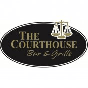
The Courthouse’s Logo Refresh
Let’s start with The Courthouse’s current logo. It’s clear and bold, which makes it feel traditional. The black, while also bold, feels a bit heavy. The justice scales are great for a courthouse theme, but even those feel outdated and “blocky”.
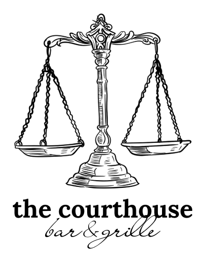
With a new logo, I wanted to convey the same courthouse theme, but make it feel a little more chic and upscale. If the restaurant is going to be updated, the logo should feel that way too. The justice scale has a more vintage feel, with lots of detail. I kept “The Courthouse” in all lowercase, to make the restaurant still feel casual, but mixed with the calligraphy typeface, feels a little fancier at the same time. I stuck with black and white for the first logo mock-up, but also think dark navy, which is included in the color palette rebrand, could be the primary color used for the logo.
Moving Forward
I’m extremely excited to continue documenting this restaurant rebrand, especially because it’s a local business. With an updated brand and more refined feel, the Courthouse is on it’s way to becoming the best restaurant in Putnam.

Leave a comment