When thinking about layouts in design, you might think of how photos and typography are arranged in a magazine. Or, you might think of a landing page on a website that perfectly aligns text, images, buttons, and calls to action.
One of the more interesting elements about layouts in design (to me), is the use (or not) of white space. Until now, I didn’t realize how controversial white space can be in the design world. Some love it, some hate it. To me — it works. You know when people say less is more? That’s the vibe white space gives. Let’s talk about it.
White Space 101
White space is “the area between design elements”. The space between the lines of this blog, for example. Or the space between the title and headers, and the other words, throughout this post. While “white space” sounds like it should always be white, white space can actually be any color, as long as it’s void of any text or design.
Many clients and designers will argue over the use of white space — clients claiming it’s wasted space and designers advocating for more use of it. When used correctly, white space can emphasize other elements of the design or layout. When white space is used on purpose, it’s called “active white space, and can separate and group elements in a design, which shows how elements are related to one another and helps viewers organize visual information better“.
Good vs. Bad Use of White Space
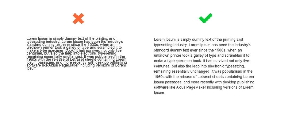
Let’s look at a few good and bad examples of white space. This photo of some text, for example, shows just how powerful white space can be when reading.

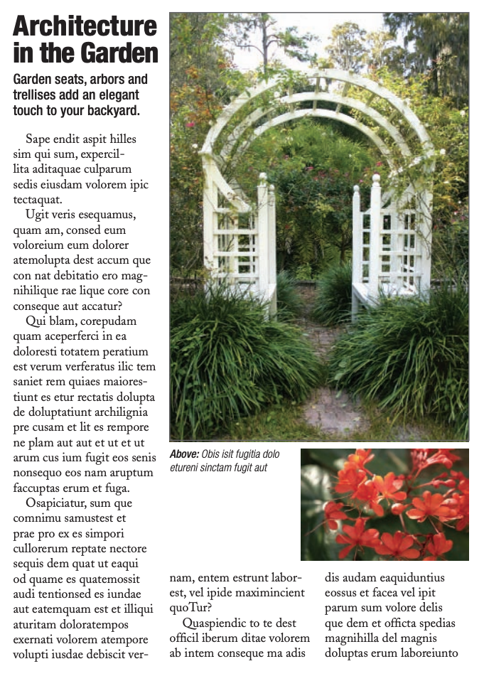
Funnily enough, think about what newspaper (digital or paper) text looks like versus the text in this blog. Newspaper text looks and feels more cluttered, right? “Mirroring paper newspapers, news websites tend to make scarce use of white space. Instead, they show their credibility through this high quantity of content on the page. They reflect how “happening” our world is!” I found this so interesting, because the lack of white space in newspapers, whether intentional or not, actually gives us information about what a newspaper is without even reading it. It tells us that there’s lots going on in the world and they have to fit as much as they can on each page.
In the example below, both ads have the exact same copy and image, but the use of white space is different. Which one looks better? You guessed it — the one on the right makes much better use of white space. It looks more elegant, cleaner, and luxurious.

The last and final example I’ll give has to do with trapped negative space. In design, you never want to have chunks or blobs of blank space surrounded by text. You want the white space to almost stretch off the page. It’s encouraged “to push extra negative space toward the outside edges of your layout. Trapped space is a puddle of negative space landlocked inside the layout. It’s like a bubble that can’t escape”.

Things to Consider with White Space in Design
To simplify, here are a few things to consider when it comes to using white space in design:
- Legibility: make sure you use enough space between letters and words where it’s readable.
- Tone and branding: what are you designing for? A spa that advertises relaxation and simplicity, would benefit from using lots of white space in their designs.
- Focus: where do you want the reader’s eyes to go? Use white space to direct them.
White space is your friend! Remember this the next time you design something.
Leave a comment