Tag: business

  • Rebuilding Spalding: A Strategic Blueprint for a Stronger Digital Presence

    Rebuilding Spalding: A Strategic Blueprint for a Stronger Digital Presence

    I spent about 5 weeks researching Spalding’s brand and social media presence. In short: I didn’t find much. I quickly realized that Spalding had a lot of work to do when it came to their digital identity, so I came up with a plan to help them.

    A Brand with Legacy, but Lacking Presence

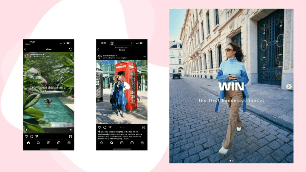
    Rather than make one single campaign that might help their engagement and success on social media, I analyzed the brand’s voice, what their goals were, the history of the brand, and how they can better portray that on social media. I focused more on longevity than one campaign. Spalding most appeals to young athletes, especially ones that play basketball, softball, or volleyball. They’ve been around for a long time, and are a credible sports brand that many people turn to if they’re putting up a basketball hoop at home or picking up practice equipment. However, they lack that young, fun, and trendy presence on social media, which is crucial when you consider their target audience.

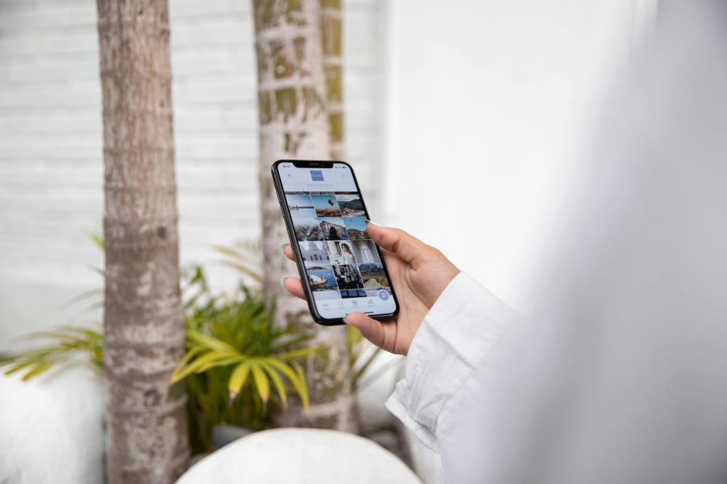
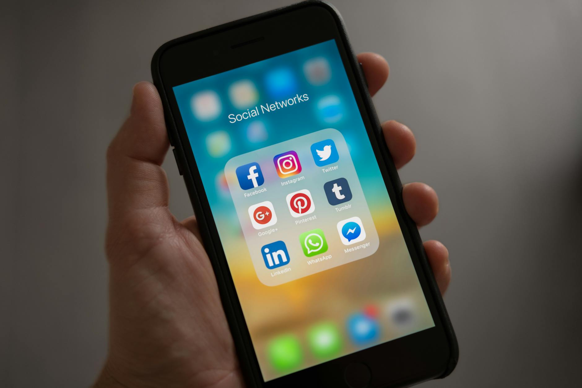
    Their social media presence is almost non-existent, and doesn’t reflect a player-first mentality. It has a cold, impersonal feeling that seems like they’re trying to market to arenas and gyms (which is okay if that was their only target audience, but it’s not). Sports and social media have such a strong relationship in today’s world, and lots of people who watch sports are most likely on social media. It’s crucial that Spalding up their game (pun-intended) if they want to stay relevant in the sports world.

    The Game Plan: How Spalding Can Win Online

    It would help to incorporate things like:

    • More athlete collaborations (college and pro athletes)
    • Social media takeovers
    • Collaborations with landscaping companies (to appeal to young athlete’s parents)
    • More participation in current trends/memes
    • Attempt to reach a larger audience by tapping into golf, softball, tennis, and volleyball worlds (their social media focuses heavily on basketball)
    • Celebrate the history of Spalding, which increases their credibility
    • Incorporate trends unrelated to sports with their sponsored athletes or teams, to reach a different audience

    Measuring Success: SMART Goals for Spalding

    To make sure that Spalding is reaching their goals, I implemented the SMART strategy to accurately measure growth. In short, the main goal would be to increase Spalding’s brand relevance and engagement among Gen Z and Millennial athletes, increase 100k+ followers on combined social platforms, achieve a 15% increase in Instagram and TikTok engagement rates, boost sales of basketballs by 20%, and other equipment by 10%. By leveraging their current partnerships and existing following, Spalding must post on a consistent schedule on Instagram, TikTok, and Youtube to resonate with their target audience — while keeping their brand voice in mind.

    Final Thoughts: A Brand Built for the Future

    It’s crucial that Spalding continues to evolve with the times. They’re legendary, but aren’t acting like it on their socials. With the right strategies implemented, they can increase their brand awareness on social media, appeal to their target audience, and increase sales. If you’d like to take a look at my project, it’s linked below!

  • Why No One’s Clicking Your Link: The Truth About Social Media Engagement

    Why No One’s Clicking Your Link: The Truth About Social Media Engagement

    This week, I’ve been thinking about how I respond when I see a link or a hashtag in a post. Most often, it doesn’t make a difference in whether or not I engage with the post. The only time I find them effective is when I’m interested in the topic of the post (maybe it’s a skincare routine or a recipe I want to make), and then I’m more inclined to click on that link.

    The Research Says: Stop Posting Links

    Interestingly enough, there’s been quite a bit of research done on whether or not links are effective in driving engagement on social media. The short answer: no. Let me tell you why.

    LinkedIn’s Sneaky Thumbnail Shrink

    LinkedIn, a site known for connecting professionals and finding jobs, recently decreased the size of the thumbnail when users share links in their posts. Instead of seeing a large image across your screen, there’s a small box directing you to the linked page. This seems like such a small change, but LinkedIn’s goal with this change is to keep people on their platform longer. The less likely users are to see a thumbnail, the less likely they’ll click on it to leave the platform.

    Meta’s Algorithm Has Other Plans

    Facebook and Instagram, both owned by Meta, want people to stay on their platforms for as long as possible. If you’re sharing links in your Facebook posts, the algorithm is very much against you. “Facebook’s algorithm clearly favors native content like Reels and videos. The staggering statistic that over 95% of posts displayed in user feeds don’t include external links speaks volumes.” Additionally, have you ever noticed that you really only ever see links in user’s Instagram stories, rather than in captions? This ensures that if links are shared, they’re really only seen by the poster’s followers, rather than reach a wider audience through something like a static post or Reel.

    The Solution: Link in Bio

    So, what should you do? You want to share a link or two, but also make sure your posts aren’t being hidden by any algorithms. This is where the “link in bio” trick comes in. Share whatever post you want, and at the end, write “Link in bio.” This will not only direct people to your profile, but allow your post to be seen by anyone — then guide them to the link you’ve attached in your bio. With other platforms and tools such as Linktree, you can also attach as many links as you want! The only downside to this, is that people who don’t want to take the time to go to your profile to then click on a link, probably won’t do that. But in that case, they’re probably not the target audience anyway.

    It’s not surprising that platforms want users to stay scrolling their feeds for as long as possible — it’s how they make money. If you or your business needs to share links from now on, avoid sharing links in your post, because they will most likely be hidden by the algorithm, or at least reach less people. Hop onto the “link in bio” trick, and you’re likely to get more engagement through your posts, while sharing links you want to share.

  • The Rise of AI and the Need for Transparency

    The Rise of AI and the Need for Transparency

    With AI becoming an everyday occurance in many of our lives, it’s becoming more important to be transparent when running a business or a brand. As you’re scrolling through social media, it’s also your responsible to be media literate, so you can differentiate between what’s AI and what’s real.

    What Builds Trust on Social Media?

    We’re entering a time where a product photo might be AI-generated, a caption might be written by a chatbot, and a face in a video may not even belong to a real person. While AI can definitely be used as a tool in businesses, it should not be the end-all-be-all. Now more than ever, being human, honest, and transparent on social media is what sets people and brands apart. Ask yourself — have you ever read a caption that you knew was AI-generated, and it turned you off of that brand completely? Or what if a brand is dealing with a scandal, and they don’t address it online? Does that make you trust the brand more, or less?

    We have to make authenticity the new standard. Show your face. Share the process, not just the product. Talk openly about what tools you use, including AI. People appreciate honesty, and when trust is built, the brand will grow. If there are issues, talk about them. When I worked in the restaurant industry, customers always loved the photos or moments shared in the kitchen or with the staff. The food would of course get lots of attention, but to mix up the social media feeds or encourage engagement, throw in a staff photo here and there!

    Be a Smart Consumer of Content

    On the other hand, as consumers of content, you need to stay sharp. Don’t take everything at face value. If something sounds off, it probably is. Part of being media literate in 2025 is being able to read something or see something, and understand if it’s real or not.

    If You’re Going to Take Away One Thing, Let It Be This

    If you’re a creator or brand, lean into your brand. Show your voice. Share the behind the scenes, and the raw moments because people do enjoy it. As technology and social media continue to evolve, we have to evolve our brands and businesses too. It’s okay to use AI, but use it strategically. Stay honest, transparent, and true to yourself and your brand.

  • Instagram > Everything Else: My Desert Island Social Pick

    Instagram > Everything Else: My Desert Island Social Pick

    Have you ever been asked about your “desert island” picks? Like, if you were stranded on a desert island, what 3 items would you take with you? Ever thought about your “desert island” social media pick? Mine, without a doubt, is Instagram. Here’s why.

    What IG Offers in 2025

    Personally, Instagram is my most-used social media platform. It’s a place to share information, advertise your business, shop, explore, and pretty much post whatever you want, when you want. It’s demographic skews more towards a younger audience, which is crucial in creating change. Instagram is constantly evolving — what started as a simple photo-sharing app, now has features like stories, lives, reels, in-app stores, private messaging, and even broadcast channels, which are a public, one-way messaging feature that allows creators to communicate with their followers in a much more direct and private environment. Also, 90% of the top 100 brands are on IG. What does that tell you?

    “With 2 billion monthly active users, it’s the third biggest social platform globally. Its demographic stats scream opportunity: 72% of U.S. teens and 76% of 18-29-year-olds are on it, making it the go-to spot for Gen Z. If your brand’s chasing younger audiences, this is your playground.” Statistics have shown that Gen Z is the hardest generation to advertise to, because most members of the generation are extremely media-literate, are skeptical, and have grown up in an era where digital advertising began and has evolved. If you’re a business in 2025, you want Gen Z on your side, and Instagram is the way to do that.

    Instagram is Where Young People Actually Pay Attention

    Instagram has an even split as far as gender demographics, which is unique in today’s social media platforms. It’s also one of the best way to create a following organically, and can be used to post and share “behind-the-scenes” content, as well as polished, paid content. Instagram is also riddled with influencers, who can promote your brand by sharing their experiences through images and video.

    As far as sales and shopping goes, Instagram Shop is now a popular way to try to sell to someone and increase profit. I don’t use it often, but can see why it’s beneficial because users don’t have to leave the app to buy something, and it doesn’t feel like products are being pushed on you when you’re scrolling. As an IG user, you can easily scroll past something that doesn’t interest you, or tailor your ad suggestions so that you get content that’s more unique to you.

    Curate Your Feed, Control Your Narrative

    Instagram is a highly visual platform, which gives businesses and brands the opportunity to showcase exactly what they want their users to see. With one look at an Instagram profile, users can decide whether or not they want to interact with that brand. Take the time to craft your Instagram feed and show your audience exactly what you want them to see. It has limitless features that will ultimately aid in brand awareness and reputation.

    Now – what’s your desert island social pick?

  • Where First Impressions Matter: The Five-Second Test in UX Design

    by UXtweak

    There are countless methods and techniques in the UX design process. And no method is right or wrong—it all depends on how you want to refine or change your design to achieve the best result. In my journey of learning more about user-centered design, I decided I wanted to research a method that caught my eye: the Five-Second Test.

    What’s the Five-Second Test?

    Research shows that users make decisions very quickly. The five-second test is a method used in UX design to test people’s first impressions. Five-second testing is used to collect qualitative data about a user’s first reaction (Maze.co, 2024). The design process isn’t linear, so prototypes are often made, tested, then changed, then tested again… and first impressions help refine prototypes based on what the user wants.

    When using the five-second test, users are shown whatever is being designed for just 5 seconds, and then the image or product is taken away. Then, users are asked questions in a survey that relates to their first impressions of the design.

    Some of these survey questions might be:

    • Can you remember the company(s)/product name?
    • What elements of the design stand out?
    • What message did you take away from the design/product?
    • What part of the design/product did you notice first?
    • What don’t you like about the design?

    Then, change your prototype based off of your targeted user’s response.

    by UXtweak

    Why 5 seconds?

    You may have heard that people visit a website for just 10-15 seconds before deciding if they want to continue scrolling. This isn’t surprising, as short-from content began taking over since Youtube and more recently, TikTok and Instagram reels. According to research, 5 seconds is the perfect amount of time to form a first impression, without the impression deviating from the user’s actual genuine impression (Kuric, 2023). Once you’ve passed the 5 second mark, “the participant’s perspective becomes more analytical and less task-driven. The five-second test lets you avoid overtly speculative feedback that nobody would give you under normal circumstances” (Kuric, 2023).

    The five-second method would not be appropriate for instances where you want the user to use your product or try to interact with your design, as it simply doesn’t offer enough time. It’s for first impressions only.

    When should I use this method?

    I thought it might be helpful to use some examples of studies or designs that were done using the five-second method, but I couldn’t find many designers or companies who shared the results of their experience with it. However, it’s best to use the five-second method when you’re testing out pages on a website, advertisements or app interfaces.

    Next time you’re scrolling on your phone or see an advertisement, test out the five-second method with yourself. See what elements of a design or ad you remember after 5 seconds, and research whether or not it was in the brand’s best interest.

  • Balancing User vs. Business Requirements in Design

    Photo by Photo By: Kaboompics.com on Pexels.com

    User Requirements

    User requirements are the features a product should have to ensure satisfaction from the user (Baxter et al., 2015). In design, it’s important that the products being created are properly serving the targeted users, because that’s what deems a product useful. For example, when I log onto a website to shop for clothes, it’s crucial that the website functions properly. I don’t want a cluttered landing page with flashing headlines. I want the navigation center to be clear and organized. I want the checkout process to go seamlessly. It may even be nice to browse a section where the website puts together outfits for me. I want to order a new outfit (or two!) and leave as a satisfied customer.

    In order to find out what’s important to users in the design process, we must conduct user experience research. Different methods can be used to collect data–– such as surveys, focus groups, field studies, card sorts, and more. Once we collect and analyze the data, we can create a user-centered design.

    Business Requirements

    When designing a useful product, we need to make sure that it also makes sense in business. Believe it or not, business requirements are often confused with user requirements, but these requirements apply to two different groups involved in the design process. “You cannot assume that what the salesperson wants to see in the sales product is the same as what the user wants to see in the product” (Baxter et al., 2015).

    Business requirements may be things like features that the marketing or sales team wants to add to a product to help it sell… even if those features aren’t what the actual user wants. A salesperson or marketer might want the product to be #1 on the market, or a tool to give the fastest results, but that isn’t always what’s most important to the user.

    Often times, business requirements revolve around money. Think about it this way: you’ve designed a product, with user requirements in mind, but you also want to make sure it sells, right?

    Does one come before the other?

    I decided to do some of my own research on the relationship between user requirements and business requirements, because I found myself wondering which should be prioritized. They’re both important, but how do you decide which requirements to favor if they differ?

    I found a YouTube short that summed it up perfectly. The key is to favor the user requirements. Since business requirements often revolve around money, the product or service needs to sell. So, in order to sell, the product needs to appeal to the user first. Think of the user requirements as augmenting the business requirements.

    Knowing this allows the designer to focus on satisfying the user requirements first, thus fulfilling the business requirements of the product or service. But remember—they aren’t one in the same!

    References: Baxter, K., Courage, C., & Caine, K. (2015). Understanding your users : a practical guide to user research methods. Elsevier, Morgan Kaufmann.
  • Promoting on Social Media: Instagram, Facebook, and LinkedIn

    Photo by Tracy Le Blanc on Pexels.com

    I’m currently writing an article on the WNBA and the rise of women’s sports. It’s something I’ve always had an interest in—but lately, the industry has been booming. In order to promote my article, I’ve made 3 posts that will go up on social media to encourage sharing, but each post has a different technique as far as copy and graphics.

    Instagram

    For Instagram, I wanted to keep it short and sweet. I chose to use one black and white image (no carousels, because I find that not everyone scrolls through them. I want to catch their attention right away). Everyone knows Caitlin Clark, So I thought the black and white, plus Clark, and the bright orange text might make someone stop. I took inspiration from some of the magazine accounts I follow who post on Instagram with links in their bios leading to the articles. I wanted to give some detail, but keep it “mysterious” to encourage them to click on the link to read.

    Facebook

    I associate Facebook with the older population. It’s not that young people don’t use Facebook, but it seems to be the most-used among older adults. I wanted to create a short post, with a video to capture their attention. The link to the article is located within the post, so the audience doesn’t have to navigate anywhere else to find the article. I thought a video might encourage Facebook users to stop and look. I want the focus to be more on the video and not on the copy. Keep in mind that if this was actually posted on Facebook, the arrow would not be there and the video would automatically start playing should the user hover over this post. (The actual video sample is here, on here, on Canva).

    LinkedIn

    While we associate LinkedIn with professionalism and business, I wanted to mix in a casual tone with my post. I kept the voice mostly sophisticated, but wanted to add a personal touch in saying that I was proud of the work I did on the article. Similar to Facebook, my LinkedIn post had a link to the article directly within the post (Instagram—when are we adding this feature?). The copy in this post was also longer than on Facebook and Instagram, as I’ve found that when users are scrolling through LinkedIn, they’re prepared to read a bit more!

    I’m prepared to actually share my LinkedIn post when my article is completed. Different social media calls for different techniques, and it’s important to lean into each a little differently.

  • Creating Customer Journey Maps

    Photo by Tiana on Pexels.com

    Customer journey maps are a tool used by many designers to learn more about their users and understand what may influence their decisions, and their journeys with specific products. With a customer journey map, the story is supposed to be told from the user’s perspective in a way that will inform designers. They’re useful to display information found when research is gathered.

    Elements of a Customer Journey Map

    According to UX Mastery, a customer journey map must have the following components:

    1. Personas: Remember when we talked about personas? They’re the main characters in the customer journey map.
    2. Timeline: How long is the process?
    3. Emotions: What emotions does the user (or persona) run into during different moments in the process? What feelings do they feel when they cross paths with your product?
    4. Touchpoints: Anything that the customer is doing.
    5. Channels: Where does the customer come into contact with your product? In person? Online? And in what context?

    Honorable mentions also include moments of truth and any supporting characters. Moments of truth can be any “eureka moment” that the customer will likely remember. It’s something that causes frustration or anxiety. Any supporting characters are exactly how it sounds— it’s anyone else involved in the decision-making process.

    The customer journey map should help work out all of the “kinks” that may be evident when a customer is interacting with your product. A Forbes article stated that “the map helps you see which touchpoints your customers love, so you can emphasize those, and where there are common pain points you want to improve. You can use the map to create standard operating procedures in your business, train your staff, help all team members better understand your customers, and improve your product or service for a better user experience.”

    Starbucks Customer Journey Map

    When creating my customer journey map, I wanted to walk through a routine that I go through often. For me, that’s getting coffee in the morning. I often make coffee at home, but when I do decide to buy one, there’s a lot of thought and context that goes into my decision making.

    Where do I want to go? What kind of coffee do I want? Do I have any coupons? Am I hungry too, or do I just want coffee? How much time do I have? Should I order ahead of time or when I get there? Do I want to go inside or through the drive-through?

    In my map, I included my entire routine, as well as a persona, moment of truth, touchpoints, and emotions I often feel while waiting for my coffee. The journey map helped me identify where I come in contact with Starbucks most, and issues that I often run into when I go to order coffee. I realized that the best way to go is to always order ahead of time. But, I’m always happy with my cold brew. If you’d like to see my journey map in full swing, look below! ☕️

  • Maximize Productivity with Asana: A Personal Review

    I love lists. Grocery lists. To-do lists. Packing lists. Affirmation lists. Homework lists.

    I’ve used an agenda for school since fourth grade and I don’t think I could have gotten through my middle and high school years without one. To this day, I appreciate my teachers who would require us to write everything in our agenda as part of the homework assignment. For me, it never felt like work. There’s something about seeing everything taken out of your brain and written on a sheet of paper that makes it seem more accomplishable. At the end of the day when it came time to fill my backpack with books, I’d know exactly what I’d be taking home and what could be saved for later. And the best feeling is when you get to cross something off your list of scribbles (and never think of it again!).

    This week, I decided to use an online version of a to-do list/task management system called Asana. I’ve had experience using Asana in previous internships and loved it. I enjoy how you can organize everything. It reminds me a bit of Notion, which is another website you can use for organization and to-do lists. Asana, however, feels much more work- and project-related.

    I decided to set up my Asana so that it’s strictly project-focused and separated my schoolwork and business into different folders. I run a small business on Etsy and create digital artwork. It’s something I genuinely enjoy doing because it allows me to be as creative as I please. This week, I had a few custom pieces to create for customers. I used Asana to input each order, the steps I had to take to complete the orders, and the days I needed them completed by. For my custom pieces, I allow for a 3-5 day turn-around time. The due date feature on Asana is great for this!

    My favorite overview is the list overview. I love the fact that you can also create subtasks within each task, so you don’t have an extremely long to-do list that instantly creates anxiety. You can hide the subtasks and cross them off as you complete them. Here’s an example of what a list looked like for one of my to-dos:

    If you don’t like the list overview, you can choose to switch it to a board view, timeline view, and dashboard view, among many others.

    As far as course organization, I created a new folder specifically for the white paper which is going to take a lot of time and focus. Then, I created a separate project folder just for this week but used the calendar option to organize it. Here’s what it ended up looking like:

    Overall, I can see myself using Asana week-to-week. The little unicorn explosion that happens each time you complete a task is enough motivation for me to keep checking things off of my to-do list! I’m hoping that as my time as a graduate student continues, I become better and better at managing my time and projects.