Tag: design

  • Less is More: The Power of White Space in Design

    Source

    When thinking about layouts in design, you might think of how photos and typography are arranged in a magazine. Or, you might think of a landing page on a website that perfectly aligns text, images, buttons, and calls to action.

    One of the more interesting elements about layouts in design (to me), is the use (or not) of white space. Until now, I didn’t realize how controversial white space can be in the design world. Some love it, some hate it. To me — it works. You know when people say less is more? That’s the vibe white space gives. Let’s talk about it.

    White Space 101

    White space is “the area between design elements”. The space between the lines of this blog, for example. Or the space between the title and headers, and the other words, throughout this post. While “white space” sounds like it should always be white, white space can actually be any color, as long as it’s void of any text or design.

    Many clients and designers will argue over the use of white space — clients claiming it’s wasted space and designers advocating for more use of it. When used correctly, white space can emphasize other elements of the design or layout. When white space is used on purpose, it’s called “active white space, and can separate and group elements in a design, which shows how elements are related to one another and helps viewers organize visual information better“.

    Good vs. Bad Use of White Space

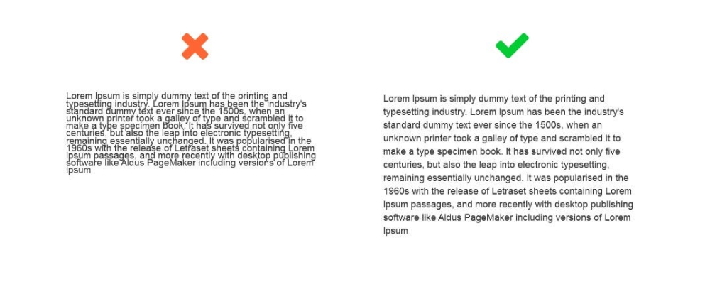
    Let’s look at a few good and bad examples of white space. This photo of some text, for example, shows just how powerful white space can be when reading.

    Source: Medium

    Funnily enough, think about what newspaper (digital or paper) text looks like versus the text in this blog. Newspaper text looks and feels more cluttered, right? “Mirroring paper newspapers, news websites tend to make scarce use of white space. Instead, they show their credibility through this high quantity of content on the page. They reflect how “happening” our world is!” I found this so interesting, because the lack of white space in newspapers, whether intentional or not, actually gives us information about what a newspaper is without even reading it. It tells us that there’s lots going on in the world and they have to fit as much as they can on each page.

    In the example below, both ads have the exact same copy and image, but the use of white space is different. Which one looks better? You guessed it — the one on the right makes much better use of white space. It looks more elegant, cleaner, and luxurious.

    Source: Kathy Lin

    The last and final example I’ll give has to do with trapped negative space. In design, you never want to have chunks or blobs of blank space surrounded by text. You want the white space to almost stretch off the page. It’s encouraged “to push extra negative space toward the outside edges of your layout. Trapped space is a puddle of negative space landlocked inside the layout. It’s like a bubble that can’t escape”.

    Source

    Things to Consider with White Space in Design

    To simplify, here are a few things to consider when it comes to using white space in design:

    • Legibility: make sure you use enough space between letters and words where it’s readable.
    • Tone and branding: what are you designing for? A spa that advertises relaxation and simplicity, would benefit from using lots of white space in their designs.
    • Focus: where do you want the reader’s eyes to go? Use white space to direct them.

    White space is your friend! Remember this the next time you design something.

  • The Psychology of Color

    Source

    Color is more than just a visual experience — it can shape our emotions, perceptions, and even behaviors. The study of this phenomenon, known as color psychology, explores how different hues influence human behavior and responses.

    Color in Marketing and Branding

    Research shows that color can affect human behavior. For example, it can alter the way we experience taste. A drink may seem sweeter in a red cup than in a blue one, and food served on a white plate may appear tastier than if it’s on a dark plate. Marketing professionals have taken the information we have on color psychology and used it to their advantage. Brands use color strategically to evoke specific feelings and drive decisions. For example, blue often conveys trust and dependability, which is why it’s a favorite among banks and tech companies. Red creates urgency and excitement, which is often used in sales in stores. Green can suggest health or Eco-friendliness, making it a go-to for wellness brands.

    Color Across Cultures

    However, the effect of color isn’t universal. Personal experiences, age, gender, and cultural background all influence how we interpret colors. While white may symbolize purity in Western cultures, it can represent mourning in parts of Asia. Similarly, men and women may respond differently to certain hues, and children may associate brighter colors with fun and playfulness.

    Understanding the psychology of color isn’t just useful for marketers or designers — it can impact how we decorate our homes, dress for an interview, or even choose which apps to download. By recognizing the emotional and behavioral effects of color, we can make more intentional choices in how we present ourselves and engage with the world.

    The Influence of Color

    In a world flooded with information, color stands out as a subtle influence. Whether it’s the red “Buy Now” button that nudges you to make a purchase or the calming blue walls of a therapist’s office, color works behind the scenes to shape how we think, feel, and act.

  • Using the System Usability Test to Guide Your Website’s Design

    Have you ever been on a website that has limited usability? Maybe the navigation center is messy, the information is inconsistent, or the website is just plain horrible. With these types of websites in mind, designers had to come up with a standard to hold websites to during the design process. So, they created a test, called the System Usability Test, to achieve more consistency in website design and help others to understand where their websites can improve.

    What is the System Usability Test (SUS)?

    The SUS test was created in 1986 by John Brooke to give a global view on subjective elements of usability. This ten-statement test has become a standard when evaluating usability among websites. Users are given the ten-statement test, and are then asked to rate how much they agree with each statement on a scale from 1-5, exactly like the example shown below.

    At the end, each user will receive a score for each statement, which will then be added up to get one final number. The final score will range from 0-100, depending on the usability of the website. I’ll get back to how the scoring works in a minute—this was just a quick overview.

    The Ten Statements of the SUS Test

    The ten statements of the SUS test can be found online with a simple Google search. The great thing about using this method to gather data is that it’s relatively easy and it’s free. Researchers can tweak the questions if needed, but generally, an SUS test will look like this:

    1. “I think that I would like to use this system frequently.”
    2. “I found the system unnecessarily complex.”
    3. “I thought the system was easy to use.”
    4. “I think that I would need the support of a technical person to be able to use this system.”
    5. “I found the various functions in this system were well integrated.”
    6. “I thought there was too much inconsistency in this system.”
    7. “I would imagine that most people would learn to use this system very quickly.”
    8. “I found the system very cumbersome to use.”
    9. “I felt very confident using the system.”
    10. “I needed to learn a lot of things before I could get going with this system.”

    Each user will go through each statement and rate them on a Likert scale from “Strongly Disagree” to “Strongly Agree”.

    Adding Up Your Score

    This is where it gets a little tricky.

    • For each odd-numbered statement, subtract 1 from the user’s response.
    • For each even-numbered statement, subtract the response from 5.

    Here’s an example:

    1. “I think that I would like to use this system frequently.” User rating: 5

    User rating – 1 = odd-numbered statement score

    5 – 1 = 4

    2. “I found the system unnecessarily complex.” User rating: 3

    5 – user response = even-numbered statement score

    5 – 3 = 2

    Repeat this process for each question, then add up each score. After that, we have to normalize the score by multiplying the sum by 2.5. That is your usability score. If you’re a visual learner, see below.

    The higher the score the better the usability. “Typically, a score above 70 is a good one, while one that’s over 85 is excellent” (Soegaard, 2024). Anything less than around 60, probably needs to revamp their website immediately. The pain points of each website can be highlighted in the results of the test.

    When should I use the SUS test?

    The SUS test works best for recording data related to the usability of a website or app. It should be given to around 50-60 users to get the most reliable result. It’s a cheap, effective, and relatively quick way to see where your website lands with usability. Designers can use it as a first-time test to figure out the baseline usability sore of their website, or use it to compare different versions of the same website for usability. The lower the score, the more urgency!

    References:

    Soegaard, M. (2024, November 19). System Usability Scale for Data-Driven UX. Interaction Design Foundation – IxDF. https://www.interaction-design.org/literature/article/system-usability-scale

  • Where First Impressions Matter: The Five-Second Test in UX Design

    by UXtweak

    There are countless methods and techniques in the UX design process. And no method is right or wrong—it all depends on how you want to refine or change your design to achieve the best result. In my journey of learning more about user-centered design, I decided I wanted to research a method that caught my eye: the Five-Second Test.

    What’s the Five-Second Test?

    Research shows that users make decisions very quickly. The five-second test is a method used in UX design to test people’s first impressions. Five-second testing is used to collect qualitative data about a user’s first reaction (Maze.co, 2024). The design process isn’t linear, so prototypes are often made, tested, then changed, then tested again… and first impressions help refine prototypes based on what the user wants.

    When using the five-second test, users are shown whatever is being designed for just 5 seconds, and then the image or product is taken away. Then, users are asked questions in a survey that relates to their first impressions of the design.

    Some of these survey questions might be:

    • Can you remember the company(s)/product name?
    • What elements of the design stand out?
    • What message did you take away from the design/product?
    • What part of the design/product did you notice first?
    • What don’t you like about the design?

    Then, change your prototype based off of your targeted user’s response.

    by UXtweak

    Why 5 seconds?

    You may have heard that people visit a website for just 10-15 seconds before deciding if they want to continue scrolling. This isn’t surprising, as short-from content began taking over since Youtube and more recently, TikTok and Instagram reels. According to research, 5 seconds is the perfect amount of time to form a first impression, without the impression deviating from the user’s actual genuine impression (Kuric, 2023). Once you’ve passed the 5 second mark, “the participant’s perspective becomes more analytical and less task-driven. The five-second test lets you avoid overtly speculative feedback that nobody would give you under normal circumstances” (Kuric, 2023).

    The five-second method would not be appropriate for instances where you want the user to use your product or try to interact with your design, as it simply doesn’t offer enough time. It’s for first impressions only.

    When should I use this method?

    I thought it might be helpful to use some examples of studies or designs that were done using the five-second method, but I couldn’t find many designers or companies who shared the results of their experience with it. However, it’s best to use the five-second method when you’re testing out pages on a website, advertisements or app interfaces.

    Next time you’re scrolling on your phone or see an advertisement, test out the five-second method with yourself. See what elements of a design or ad you remember after 5 seconds, and research whether or not it was in the brand’s best interest.