For my visual design class this semester, we were tasked with rebranding a local business that we felt needed help. I chose The Courthouse Bar & Grille because after over 20 years in the business, they’re due for an upgrade.
A Bit about The CBG
The Courthouse Bar & Grille is located in downtown Putnam, Connecticut. Putnam is a growing community known for its restaurants, antique shops, and small-town feel. As Putnam continues to modernize itself, The Courthouse remains the same. It would benefit from a rebrand, where it can redefine its importance in the community and stay relevant with up-and-coming competition.
The Courthouse has been a family-owned establishment since 1998. The story and brand are inspired by a traditional courthouse, as the building used to serve as one in the 1800s. More information on it’s history can be found on the “CBG Story” page of the website.
The Courthouse customer demographics consist of both locals and out-of-towners. They offer in-house dining and takeout. They accommodate small parties and offer intimate bar seating, as well as dining room seating to hold large or private parties. It’s rated 4.3/5 stars on Google.
Price range: $$-$$$ | Customers can expect to spend $20-$30 per person.
A few The Courthouse’s competitors are:
- 85 Main | 4.5/5 stars
- Elizabeth’s Farmhouse | 4.7/5 stars
- The Crossings Restaurant & Brew Pub | 4.2/5 stars
- Blackstone Putnam | 4.5/5 stars
- The Hare & the Hound | 4.7/5 stars
- The Black Dog Bar & Grille | 4.6/5 stars
Menu & Atmosphere
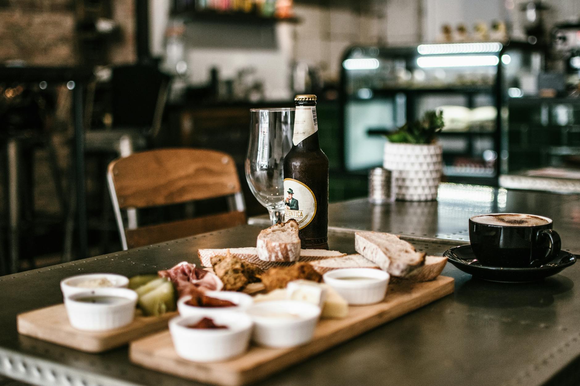
The Courthouse’s menu ranges from pasta to steaks, burgers, seafood, and sandwiches. While the variety is appreciated, it lacks a clear culinary direction. The restaurant prides itself on having a family-friendly atmosphere, so the offerings make sense. Their goal is to accommodate families and offer something for everyone. However, it would still benefit from refining and removing some items. The Courthouse also offers cocktails, 16 rotating beers on tap, and wine.
The Courthouse is in need of a refresh. Its atmosphere and overall presentation feel outdated and lack a modern, inviting touch. With new restaurants and shops constantly emerging, it’s essential for The Courthouse to evolve to remain relevant. While drawing inspiration from its namesake makes sense, there’s an opportunity to reimagine it in a more chic and refined way, blending its signature charm with a contemporary edge. With new decor, some fresh paint, and redefining their target audience, The Courthouse will be on it’s way to becoming the best restaurant in Putnam.
Social Media Presence
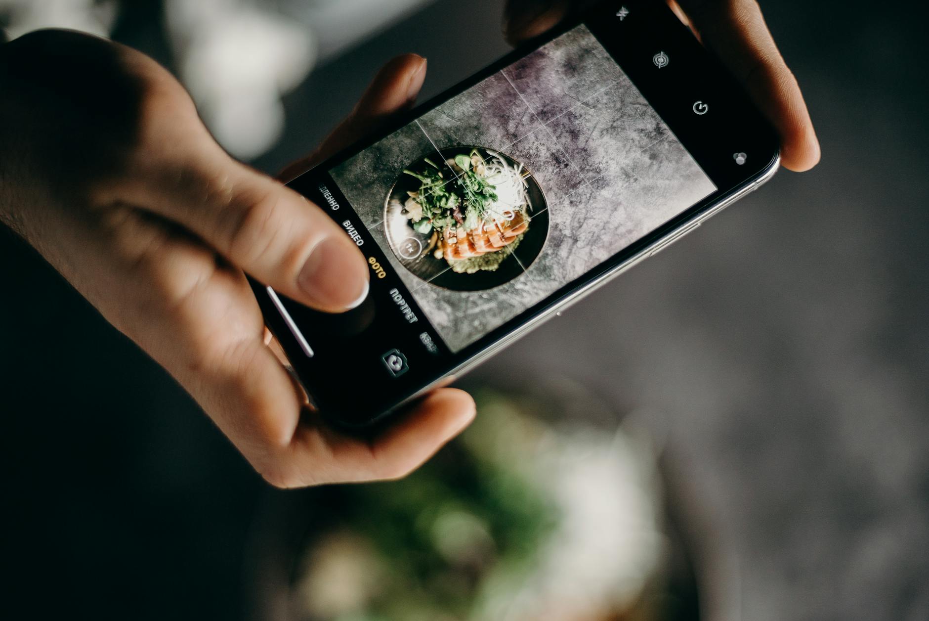
Since social media and online presence are at the forefront of marketing and sharing brands, there will also be an emphasis on rebranding The Courthouse’s website and social media channels.
Their website seems to be the most up-to-date, with high-quality photos and a clean UX. Their social media, on the other hand, doesn’t share any photos of food or cocktails and feels outdated and out of touch. They would also benefit from changing their @ on Instagram. I’m local to this side of Connecticut, and their profile did not pop up with related searches. I had to find their Instagram @ on the website and then search for it on the app. Additionally, their Facebook and Instagram icons on the website don’t work as hyperlinks.
The Redesign
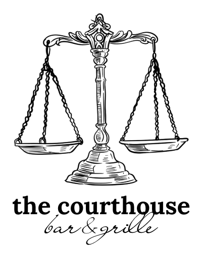
With The Courthouse’s redesign, I wanted to focus on updating the restaurant so that it felt fresh and modern, while still honoring it’s history. This included an update to their verbal brand, values, and tone of voice. I also redesigned their logo, which includes a gavel, an ode to the history of the name and the building.
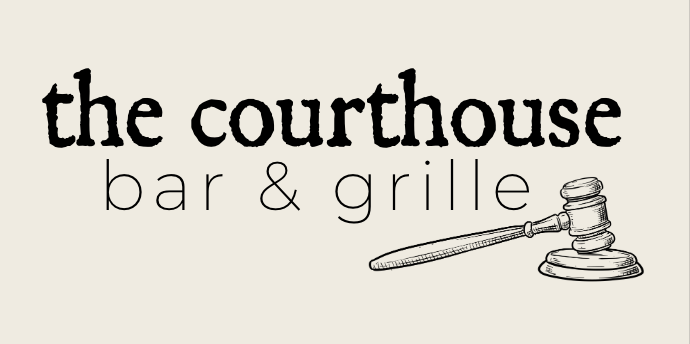
The logo comes in multiple colorways, to be used on light and dark backgrounds. The typefaces and colors were chosen with lots of thought in mind, as I wanted to honor the history of the brand, while incorporating variety for legibility design purposes. The chosen fonts would be used not only in the logo pictured above, but also throughout the website, posters, designs, and even the menu and business cards. The goal is to remain consistent throughout each medium, so that The CBG is easily recognizable and shows it’s character to anyone who comes across the brand.
As far as the colorways, I wanted to use dark but modern colors, like a dark navy, with cream and gold accents. Leaning into the darkness of the navy and using cream for things like curtains, pillows, and backgrounds, while using the gold for hardware, would give the restaurant a classy and updated feel. I wanted to lean into the darkness of the building as well, as the restaurant itself doesn’t have many windows.
Even though the website was the most up-to-date throughout the entire brand, I still redesigned it and incorporated a few different things that might make the landing page more inviting and encourage phone calls and reservations. A fun element to make was also a newsletter, which could be sent out monthly or even quarterly, and inspire community throughout Putnam, CT and beyond.
If you’re interested in taking a look at my re-design, the slide deck is attached below.