Have you ever been on a website that has limited usability? Maybe the navigation center is messy, the information is inconsistent, or the website is just plain horrible. With these types of websites in mind, designers had to come up with a standard to hold websites to during the design process. So, they created a test, called the System Usability Test, to achieve more consistency in website design and help others to understand where their websites can improve.
What is the System Usability Test (SUS)?
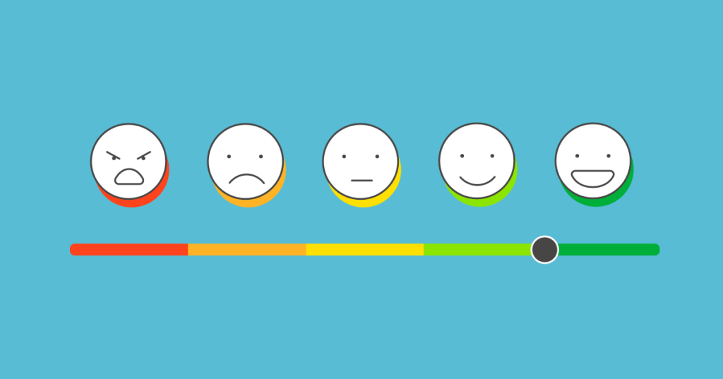
The SUS test was created in 1986 by John Brooke to give a global view on subjective elements of usability. This ten-statement test has become a standard when evaluating usability among websites. Users are given the ten-statement test, and are then asked to rate how much they agree with each statement on a scale from 1-5, exactly like the example shown below.

At the end, each user will receive a score for each statement, which will then be added up to get one final number. The final score will range from 0-100, depending on the usability of the website. I’ll get back to how the scoring works in a minute—this was just a quick overview.
The Ten Statements of the SUS Test
The ten statements of the SUS test can be found online with a simple Google search. The great thing about using this method to gather data is that it’s relatively easy and it’s free. Researchers can tweak the questions if needed, but generally, an SUS test will look like this:
- “I think that I would like to use this system frequently.”
- “I found the system unnecessarily complex.”
- “I thought the system was easy to use.”
- “I think that I would need the support of a technical person to be able to use this system.”
- “I found the various functions in this system were well integrated.”
- “I thought there was too much inconsistency in this system.”
- “I would imagine that most people would learn to use this system very quickly.”
- “I found the system very cumbersome to use.”
- “I felt very confident using the system.”
- “I needed to learn a lot of things before I could get going with this system.”
Each user will go through each statement and rate them on a Likert scale from “Strongly Disagree” to “Strongly Agree”.
Adding Up Your Score
This is where it gets a little tricky.
- For each odd-numbered statement, subtract 1 from the user’s response.
- For each even-numbered statement, subtract the response from 5.
Here’s an example:
- “I think that I would like to use this system frequently.” User rating: 5
User rating – 1 = odd-numbered statement score
5 – 1 = 4
2. “I found the system unnecessarily complex.” User rating: 3
5 – user response = even-numbered statement score
5 – 3 = 2
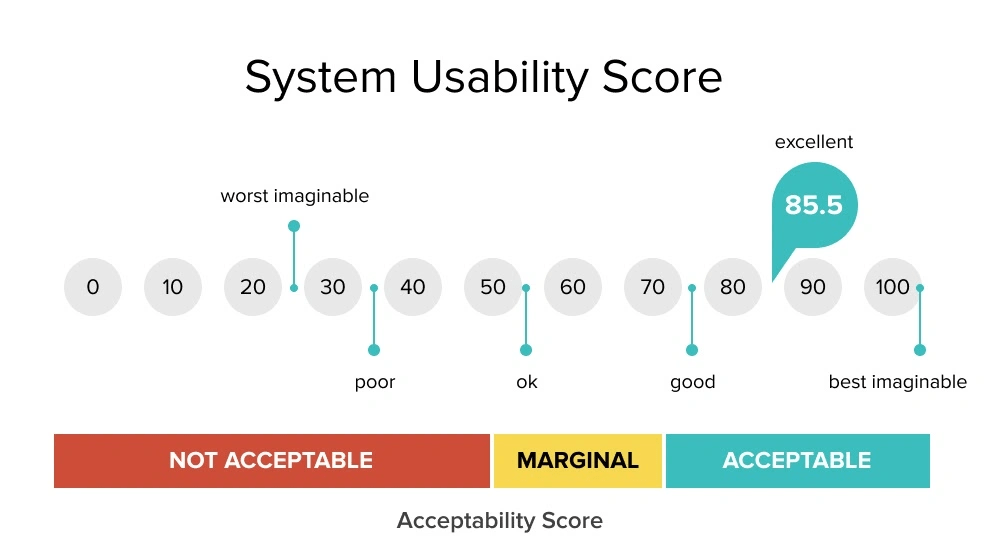
Repeat this process for each question, then add up each score. After that, we have to normalize the score by multiplying the sum by 2.5. That is your usability score. If you’re a visual learner, see below.

The higher the score the better the usability. “Typically, a score above 70 is a good one, while one that’s over 85 is excellent” (Soegaard, 2024). Anything less than around 60, probably needs to revamp their website immediately. The pain points of each website can be highlighted in the results of the test.
When should I use the SUS test?
The SUS test works best for recording data related to the usability of a website or app. It should be given to around 50-60 users to get the most reliable result. It’s a cheap, effective, and relatively quick way to see where your website lands with usability. Designers can use it as a first-time test to figure out the baseline usability sore of their website, or use it to compare different versions of the same website for usability. The lower the score, the more urgency!
References:
Soegaard, M. (2024, November 19). System Usability Scale for Data-Driven UX. Interaction Design Foundation – IxDF. https://www.interaction-design.org/literature/article/system-usability-scale