
A crucial part of the design process involves understanding the user’s point of view. Up until this point, I’ve covered empathy pretty deeply — but wanted to touch on POV and problem statements in design.
What’s a problem statement and why are they important?
A problem statement is sometimes thought of as the most challenging part of the design process. It forces designers to either come up with a problem statement to solve or focus on a problem statement that’s already been brought to their attention. When you have a clear statement that guides you in the direction of brainstorming solutions, it makes the design process more clear and helps you to stay focused. When you have a clear objective, you’re much more likely to stay on track.
Problem statements aren’t just random words strung together. They have to be well thought-out. There are a few qualities that a successful problem statement should have, according to Interaction Design Foundation. These qualities are to be:
- Human-Focused. Have you noticed a theme in design thus far? Hint: the user comes first. 😆
- Broad enough to allow creativity. Don’t get stuck in a box! Your statement needs to be focused with room for flow and creativity.
- Narrow enough to stay organized. I know, it’s a bit of a juxtaposition. Just don’t go overboard. Keep it simple and to the point.
Where does POV come in?
Empathize with the user, know what they need, and why they need it. Take this information and structure it in a sentence like this:
[User . . . (descriptive)] needs [need . . . (verb)] because [insight. . . (compelling)]
There you have it! Your POV. I’ll show you an example.
App POVs: Alive by Whitney Simmons
I decided to take a look at a few workout apps, analyze reviews and collect data, then compare their problems to each other. After I got an idea of what worked/didn’t work for each app and what could be improved, I created a POV statement to reflect the user’s needs. One of the three apps I looked at was Alive by Whitney Simmons. I’m a frequent user of this app, and while I’ve had a great experience, it was interesting to see how other users were interacting with the product.
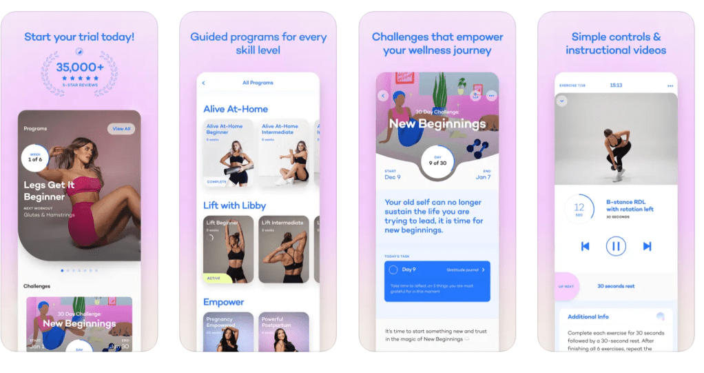
The app is rated 4.9/5 stars on the Apple App Store. It’s a workout app that provides different programs from ones at home to ones at the gym (all for different experience levels). Most users have had a positive experience, but there were also some that hadn’t. There were other users who provided helpful feedback and suggestions to improve the app itself. Here’s some of what they had to say:
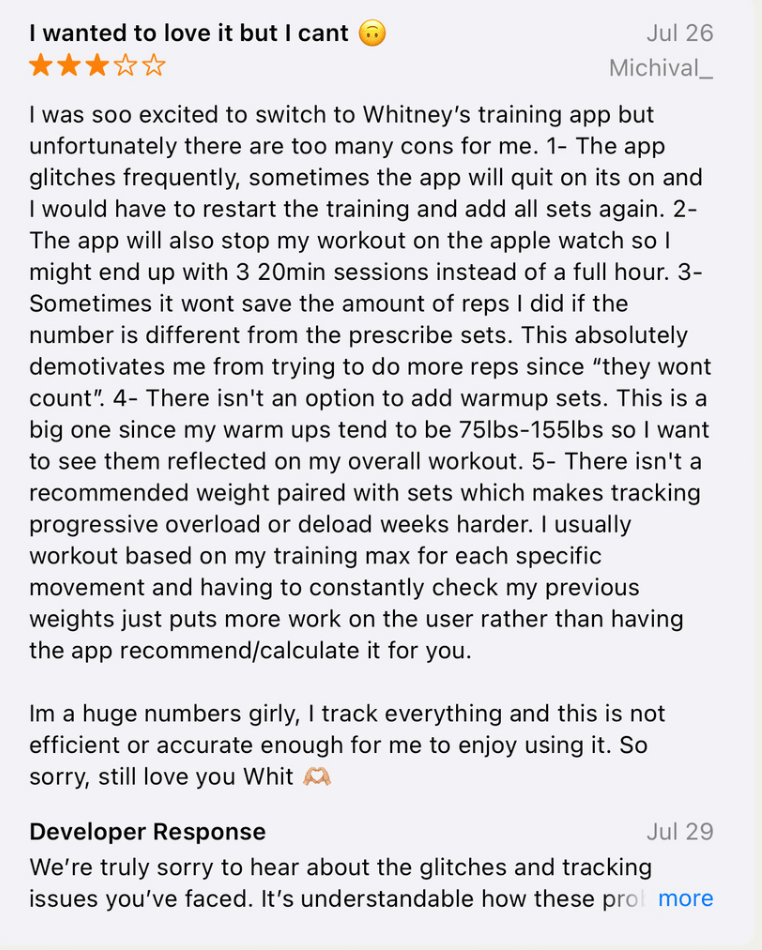
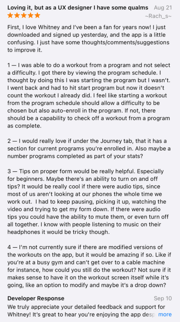

In summary, most users loved the app but had ideas to add a nutrition element, a way to keep track of weights/reps, tips on workout form, and more. I took this information and developed two POV statements using the sentence template I talked about before.
Users who like to track their reps and their weights need a feature that automatically recommends or calculates the last weight used because it’s inconvenient to have to look elsewhere or remember what you may have lifted last.
Users who want to track their calories and/or macros need a nutrition element within the app because it’s frustrating to use other apps to track food. If everything was in one place, it would be easier and more worth the money.
The problem statements above reflect what’s important to the user and provides insight on what could be improved. It’s a clear statement that shows the designer what to work on, but allows creative freedom and room for different ideas that would solve the problem.
I analyzed two other workout apps in comparison to Alive; Nike Training Club and Peloton. If you’d like to dive into POV in the design process a bit more, find my presentation below.

Leave a comment