Tag: marketing

  • Reflecting on Growth: My Final Blog Post in the ICM Program

    Reflecting on Growth: My Final Blog Post in the ICM Program

    Learning Through Women’s Sports

    I’ve learned so much about myself during these last few weeks — and the last year. Over the course of five weeks, I worked on a LinkedIn article series highlighting women’s sports and the inequalities that athletes face. I spent countless hours researching and listening to books, diving deeper into the stories of women who inspire me.

    One of those women is Dawn Staley. While I still haven’t finished her book Uncommon Favor (which I highly recommend), I’ve taken a closer look at her career and leadership style. She’s authentic, vulnerable, and unapologetically real — qualities that have made her a role model to so many. Recently, I even listened to her on Michelle Obama’s podcast, IMO, which I also recommend for anyone who wants to feel empowered.

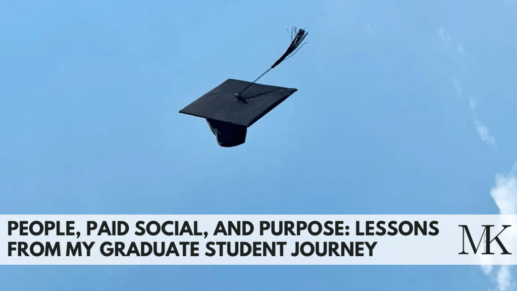
    Closing a Chapter in My Master’s Program

    As I write this, I feel a weight lifted from my shoulders. This is the last blog post I’ll be writing during my time in the ICM program. Over the past year, I pushed myself to take as many courses as possible in order to finish my master’s degree quickly — and now, looking back, I can see how much my life has shifted during that process.

    I truly owe so much to this program. I’ve learned the importance of strategy, developed skills in content creation, and embraced my creativity more fully than ever before.

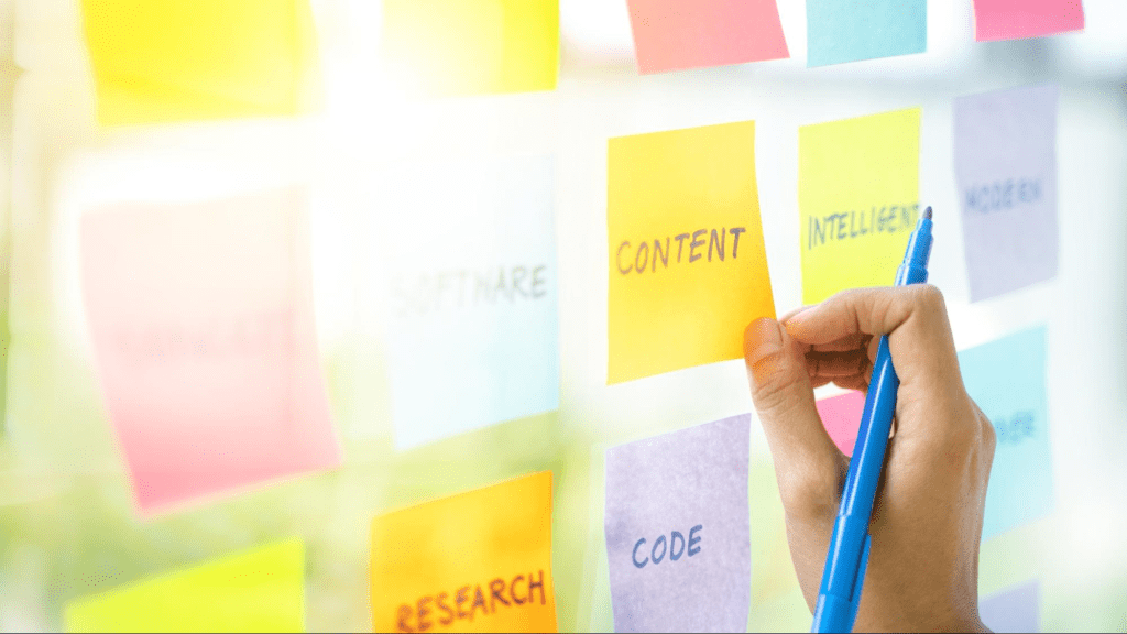
    Lessons from My LinkedIn Series

    When it came to my LinkedIn series, the results weren’t exactly what I envisioned. But what I gained was even more valuable: confidence. I’ve become less intimidated about posting on LinkedIn, more comfortable sharing my voice, and better at managing my time.

    I also learned how to document my work effectively, prioritize tasks, and evaluate what needs to be done first versus what can wait. These are skills that will stick with me long after this project.

    Final Results

    Here’s a snapshot of the total performance of my LinkedIn series:

    2,901 impressions | 54 likes | 6 comments | 8 reposts | 21 new followers

    While the numbers tell one part of the story, the growth I experienced throughout this process tells the rest.

    Moving Forward

    This project marks both an ending and a beginning. It’s the close of my time in the ICM program, but also the start of applying everything I’ve learned to the next chapter of my career.

    More details about my project can be found within my portfolio, or linked here.

  • People, Paid Social, and Purpose: Lessons From My Graduate Student Journey

    People, Paid Social, and Purpose: Lessons From My Graduate Student Journey

    I can’t believe a year has gone by since I started the ICM program. I’ve spent countless hours on blog posts, projects, and what has felt like endless research on how to communicate effectively online. I have so much to thank this program for, and here’s a few things I’ve learned.

    1. People first. Companies seem to forget that empathizing with humans is one of the most important things in marketing. It doesn’t matter how well your product works, or how clean your website is. If you aren’t prioritizing the human side of marketing, your brand will easily get lost among the millions of others online. Take the time to understand your audience and prioritize communication with them.
    2. Don’t forget about paid social. I’ve always been a lover of organic social, but in my internship with the Connecticut Sun, I learned so much about the importance of paid social — and I feel like I almost like it more. With the combination of both, you have the ability to build trust with your audience, stay spontaneous, and target new fans.
    3. Typography matters (and so does white space). Surprisingly, one of the things that has stuck with me most is the importance of typography in brands. After learning about the importance of font families, typefaces, and kerning, I feel like I notice it everywhere. I think about why people have chosen the typefaces they do to represent their brand, and what might they want that typeface to convey. I also learned the importance of white space and how it can help you of more ways than one.
    4. Learning never ends. I’ve always loved being a student. I’d gone back and forth about the pros and cons of going back to school after I got my bachelor’s, and the pros heavily outweighed the cons. Throughout this program, while there are some things I’ve noticed stayed the same, the marketing and digital space is constantly changing. I think being open to the ever-evolving world of social media and digital marketing, while continuing to ask questions, is the best way to grow. A long-term life goal of mine is to be a forever student. Ask questions. Stay curious. Keep an open mind.
    5. I finally found my future in women’s sports. I always struggled to figure out where I fit in the professional world. It wasn’t until I landed my internship at the Connecticut Sun (which was ignited by my love of UConn women’s basketball), that I felt like I found my place. I’ve loved sports since I was a kid, and I find celebrating women athletes to be empowering and motivating. I’ve recently been promoted to Marketing Specialist, and I owe so much to this program — having a master’s degree alone is a good way to make people double-take your job application.

    Looking Ahead

    I’ve accomplished so many things in such a short amount of time, that I’m allowing myself to finally take a deep breath in the completion of my degree. It is one of the things I’m most proud of thus far. I can’t wait to see what the future holds.

  • Notion: The Project Management Tool You Can’t Go Without

    Notion: The Project Management Tool You Can’t Go Without

    No, I’m not sponsored by Notion. I just love it.

    What’s Notion?

    If you’re unfamiliar with Notion or other project management tools, you’re missing out. They can be used for anything and everything — especially when it comes to juggling multiple projects at once, which is exactly what I’m doing right now. With Notion, you can create templates to make to-do lists, calendar appointments, track deadlines, or even do fun things, like cross things off your bucket list. It’s completely customizable, has clean UX/UI, and makes the user feel accomplished when they cross something off their list. I’ve even know people who’ve made templates to track what books they’ve read, how they rated them, and any more information they wanted to include in one sheet. The possibilities are endless.

    Using Notion to Organize my LinkedIn Project

    In this instance, I’m using Notion to organize my LinkedIn project for the next six weeks. Each week, I’ll be writing an article on LinkedIn, discussing different gaps and inequalities in women’s sports vs. men’s sports. Since I want to work in sports media and stay in the WNBA world, it’s important that I become a thought leader in the industry, and this is one of the ways I can do that.

    I organized each week like the photo above, and included due dates, status updates, and tags, so I could keep track of each assignment. In each task, users have the ability to expand and create another template. For mine, I chose to list smaller tasks that I could cross off throughout the week. At the end of each week, my subtasks should look like this:

    I plan on checking into Notion each day to stay on top of my studies. Plus — this is one class, and I’m also completing my master’s capstone at the same time. It’s safe to say that my plate is full.

    This week, I also annotated my bibliography with the current sources I have. I plan on starting to write my first article as well, just because this class happens in such a short period of time, I’d like to get ahead of schedule. I love to write, so this isn’t an issue for me. For this project, I picked something that I genuinely enjoy, but also in an area where I know I have some work to do (my LinkedIn presence), and establishing leadership.

    Updating my Profile

    This past week on LinkedIn, I tried updating my profile to the best of my ability. In one of the videos I cited in my bibliography, Tommy Clark spoke about how important it is to have a clean, concise, and clear presence. In other words, who are you, and what problem are you solving? Why should someone in your target audience follow you on LinkedIn? You don’t have to have a long bio, or try to answer multiple questions at once. Keep it simple. If I’m going to post an article each week on LinkedIn, and I want people to engage with my profile and my posts, my profile has to look top-tier. I updated my profile picture, bio, and headline. I’m starting this experiment with 265 connections, and I’m hoping to reach at least 100 more.

    Stay tuned for my first article next week! Connect with me here.

  • Rebuilding Spalding: A Strategic Blueprint for a Stronger Digital Presence

    Rebuilding Spalding: A Strategic Blueprint for a Stronger Digital Presence

    I spent about 5 weeks researching Spalding’s brand and social media presence. In short: I didn’t find much. I quickly realized that Spalding had a lot of work to do when it came to their digital identity, so I came up with a plan to help them.

    A Brand with Legacy, but Lacking Presence

    Rather than make one single campaign that might help their engagement and success on social media, I analyzed the brand’s voice, what their goals were, the history of the brand, and how they can better portray that on social media. I focused more on longevity than one campaign. Spalding most appeals to young athletes, especially ones that play basketball, softball, or volleyball. They’ve been around for a long time, and are a credible sports brand that many people turn to if they’re putting up a basketball hoop at home or picking up practice equipment. However, they lack that young, fun, and trendy presence on social media, which is crucial when you consider their target audience.

    Their social media presence is almost non-existent, and doesn’t reflect a player-first mentality. It has a cold, impersonal feeling that seems like they’re trying to market to arenas and gyms (which is okay if that was their only target audience, but it’s not). Sports and social media have such a strong relationship in today’s world, and lots of people who watch sports are most likely on social media. It’s crucial that Spalding up their game (pun-intended) if they want to stay relevant in the sports world.

    The Game Plan: How Spalding Can Win Online

    It would help to incorporate things like:

    • More athlete collaborations (college and pro athletes)
    • Social media takeovers
    • Collaborations with landscaping companies (to appeal to young athlete’s parents)
    • More participation in current trends/memes
    • Attempt to reach a larger audience by tapping into golf, softball, tennis, and volleyball worlds (their social media focuses heavily on basketball)
    • Celebrate the history of Spalding, which increases their credibility
    • Incorporate trends unrelated to sports with their sponsored athletes or teams, to reach a different audience

    Measuring Success: SMART Goals for Spalding

    To make sure that Spalding is reaching their goals, I implemented the SMART strategy to accurately measure growth. In short, the main goal would be to increase Spalding’s brand relevance and engagement among Gen Z and Millennial athletes, increase 100k+ followers on combined social platforms, achieve a 15% increase in Instagram and TikTok engagement rates, boost sales of basketballs by 20%, and other equipment by 10%. By leveraging their current partnerships and existing following, Spalding must post on a consistent schedule on Instagram, TikTok, and Youtube to resonate with their target audience — while keeping their brand voice in mind.

    Final Thoughts: A Brand Built for the Future

    It’s crucial that Spalding continues to evolve with the times. They’re legendary, but aren’t acting like it on their socials. With the right strategies implemented, they can increase their brand awareness on social media, appeal to their target audience, and increase sales. If you’d like to take a look at my project, it’s linked below!

  • Why No One’s Clicking Your Link: The Truth About Social Media Engagement

    Why No One’s Clicking Your Link: The Truth About Social Media Engagement

    This week, I’ve been thinking about how I respond when I see a link or a hashtag in a post. Most often, it doesn’t make a difference in whether or not I engage with the post. The only time I find them effective is when I’m interested in the topic of the post (maybe it’s a skincare routine or a recipe I want to make), and then I’m more inclined to click on that link.

    The Research Says: Stop Posting Links

    Interestingly enough, there’s been quite a bit of research done on whether or not links are effective in driving engagement on social media. The short answer: no. Let me tell you why.

    LinkedIn’s Sneaky Thumbnail Shrink

    LinkedIn, a site known for connecting professionals and finding jobs, recently decreased the size of the thumbnail when users share links in their posts. Instead of seeing a large image across your screen, there’s a small box directing you to the linked page. This seems like such a small change, but LinkedIn’s goal with this change is to keep people on their platform longer. The less likely users are to see a thumbnail, the less likely they’ll click on it to leave the platform.

    Meta’s Algorithm Has Other Plans

    Facebook and Instagram, both owned by Meta, want people to stay on their platforms for as long as possible. If you’re sharing links in your Facebook posts, the algorithm is very much against you. “Facebook’s algorithm clearly favors native content like Reels and videos. The staggering statistic that over 95% of posts displayed in user feeds don’t include external links speaks volumes.” Additionally, have you ever noticed that you really only ever see links in user’s Instagram stories, rather than in captions? This ensures that if links are shared, they’re really only seen by the poster’s followers, rather than reach a wider audience through something like a static post or Reel.

    The Solution: Link in Bio

    So, what should you do? You want to share a link or two, but also make sure your posts aren’t being hidden by any algorithms. This is where the “link in bio” trick comes in. Share whatever post you want, and at the end, write “Link in bio.” This will not only direct people to your profile, but allow your post to be seen by anyone — then guide them to the link you’ve attached in your bio. With other platforms and tools such as Linktree, you can also attach as many links as you want! The only downside to this, is that people who don’t want to take the time to go to your profile to then click on a link, probably won’t do that. But in that case, they’re probably not the target audience anyway.

    It’s not surprising that platforms want users to stay scrolling their feeds for as long as possible — it’s how they make money. If you or your business needs to share links from now on, avoid sharing links in your post, because they will most likely be hidden by the algorithm, or at least reach less people. Hop onto the “link in bio” trick, and you’re likely to get more engagement through your posts, while sharing links you want to share.

  • The Rise of AI and the Need for Transparency

    The Rise of AI and the Need for Transparency

    With AI becoming an everyday occurance in many of our lives, it’s becoming more important to be transparent when running a business or a brand. As you’re scrolling through social media, it’s also your responsible to be media literate, so you can differentiate between what’s AI and what’s real.

    What Builds Trust on Social Media?

    We’re entering a time where a product photo might be AI-generated, a caption might be written by a chatbot, and a face in a video may not even belong to a real person. While AI can definitely be used as a tool in businesses, it should not be the end-all-be-all. Now more than ever, being human, honest, and transparent on social media is what sets people and brands apart. Ask yourself — have you ever read a caption that you knew was AI-generated, and it turned you off of that brand completely? Or what if a brand is dealing with a scandal, and they don’t address it online? Does that make you trust the brand more, or less?

    We have to make authenticity the new standard. Show your face. Share the process, not just the product. Talk openly about what tools you use, including AI. People appreciate honesty, and when trust is built, the brand will grow. If there are issues, talk about them. When I worked in the restaurant industry, customers always loved the photos or moments shared in the kitchen or with the staff. The food would of course get lots of attention, but to mix up the social media feeds or encourage engagement, throw in a staff photo here and there!

    Be a Smart Consumer of Content

    On the other hand, as consumers of content, you need to stay sharp. Don’t take everything at face value. If something sounds off, it probably is. Part of being media literate in 2025 is being able to read something or see something, and understand if it’s real or not.

    If You’re Going to Take Away One Thing, Let It Be This

    If you’re a creator or brand, lean into your brand. Show your voice. Share the behind the scenes, and the raw moments because people do enjoy it. As technology and social media continue to evolve, we have to evolve our brands and businesses too. It’s okay to use AI, but use it strategically. Stay honest, transparent, and true to yourself and your brand.

  • Instagram > Everything Else: My Desert Island Social Pick

    Instagram > Everything Else: My Desert Island Social Pick

    Have you ever been asked about your “desert island” picks? Like, if you were stranded on a desert island, what 3 items would you take with you? Ever thought about your “desert island” social media pick? Mine, without a doubt, is Instagram. Here’s why.

    What IG Offers in 2025

    Personally, Instagram is my most-used social media platform. It’s a place to share information, advertise your business, shop, explore, and pretty much post whatever you want, when you want. It’s demographic skews more towards a younger audience, which is crucial in creating change. Instagram is constantly evolving — what started as a simple photo-sharing app, now has features like stories, lives, reels, in-app stores, private messaging, and even broadcast channels, which are a public, one-way messaging feature that allows creators to communicate with their followers in a much more direct and private environment. Also, 90% of the top 100 brands are on IG. What does that tell you?

    “With 2 billion monthly active users, it’s the third biggest social platform globally. Its demographic stats scream opportunity: 72% of U.S. teens and 76% of 18-29-year-olds are on it, making it the go-to spot for Gen Z. If your brand’s chasing younger audiences, this is your playground.” Statistics have shown that Gen Z is the hardest generation to advertise to, because most members of the generation are extremely media-literate, are skeptical, and have grown up in an era where digital advertising began and has evolved. If you’re a business in 2025, you want Gen Z on your side, and Instagram is the way to do that.

    Instagram is Where Young People Actually Pay Attention

    Instagram has an even split as far as gender demographics, which is unique in today’s social media platforms. It’s also one of the best way to create a following organically, and can be used to post and share “behind-the-scenes” content, as well as polished, paid content. Instagram is also riddled with influencers, who can promote your brand by sharing their experiences through images and video.

    As far as sales and shopping goes, Instagram Shop is now a popular way to try to sell to someone and increase profit. I don’t use it often, but can see why it’s beneficial because users don’t have to leave the app to buy something, and it doesn’t feel like products are being pushed on you when you’re scrolling. As an IG user, you can easily scroll past something that doesn’t interest you, or tailor your ad suggestions so that you get content that’s more unique to you.

    Curate Your Feed, Control Your Narrative

    Instagram is a highly visual platform, which gives businesses and brands the opportunity to showcase exactly what they want their users to see. With one look at an Instagram profile, users can decide whether or not they want to interact with that brand. Take the time to craft your Instagram feed and show your audience exactly what you want them to see. It has limitless features that will ultimately aid in brand awareness and reputation.

    Now – what’s your desert island social pick?

  • Why Every Brand Needs a Newsletter (and How to Create One That Works)

    Source

    If you’re not up to date with digital marketing strategies, you might have never thought about the importance of an email newsletter when it comes to marketing your business. Interestingly enough, when a newsletter is thought-out and backed by strategy, it can drive more customers to your website or product.

    I’ve worked on a few newsletters in my lifetime — one being my own, a weekly newsletter that covered fashion, lifestyle, and health and wellness, and another being a monthly newsletter for a professional women’s basketball team, that detailed press releases, team updates, game days, and everything people might need to know about the team.

    If you’d like to learn more about how a newsletter can be beneficial to your business, keep reading. 📖

    What is a newsletter?

    For those of you who don’t know, a newsletter (now, they’re most often sent through email), is something that a brand sends out to its customers or followers to advertise current happenings, sales, or any extra information they feel is useful to include — and that will drive more traffic or sales.

    Newsletters are useful because “email campaigns are easy to measure, which means you can track your progress and make adjustments leading to more wins.”

    Most brands send out a monthly email newsletter, at the beginning to end of each month, to prepare consumers for the upcoming or past months to recap what they might’ve missed, or just keep them up-to-date on the brand itself.

    Design, Content, and Value

    According to Brafton.com, it’s most important to have these three pillars in mind when sending out your newsletter: design, content, and value.

    A few tips to keep in mind:

    • Your newsletter should be easy to navigate. Don’t clutter it with unnecessary details like buttons or designs.
    • Keep your brand logo visible, and design around your logo, brand colors, and guidelines to keep your content consistent and memorable.
    • Use photos in your newsletter to keep the content interesting and catch people’s attention.
    • Personalization goes a long way! With different email software systems, you have the ability to customize the content to each person’s name.
    • Use your newsletter to convert subscribers to social media followers. Attach them as icons to make them easy to click on.
    • Keep the name of your newsletter focused and associated with your brand, so people know exactly what to expect.
    • Don’t have lots of text in your newsletter. You want to keep it short, brief, and drive traffic back to your website.

    Newsletters for Fun

    Below is an example of the newsletter that I used to write, where I created collages with what I was going to discuss. I talked about current trends in beauty, fashion, and health and wellness — but while I’m focusing on my degree, that was put on the back burner. Nonetheless, it was fun and something I enjoyed doing.

    October ins & outs. by mia

    Read on Substack

    Overall, newsletters are a great way to connect with an audience and, like we said, drive traffic to your website! Remember to guide people to the pages you want to see, while keeping the newsletter clean, easy to read, and consistent with your brand guidelines.

    Happy newslettering!

  • When Going Viral Means Going Vegetarian: The Good and Bad of Sticky Content

    Source

    In this day and age, stickiness is what makes content stand out. It’s not just about views — it’s about content that gets people’s attention, encourages emotion, and lingers in people’s minds. Content that makes people emotional (good or bad), makes it more likely to be shared and remembered, which is incredibly useful when it comes to social media.

    The Stickiness of Food, Inc.

    The first thing that comes to my mind when I think about “sticky” content, is the documentary Food, Inc. It’s a documentary about factory farming and shares information about how horrible the animals in factory farms are treated. I’ve watched it a total of two times in my life, and both times, I went vegetarian for probably a month. The documentary shared information that while disturbing and sad — was true — which made me remember it more, hence “sticky” content. I can almost guarantee that if you decide to watch it, you’ll remember it forever.

    Using Stickiness for Good

    Sticky content, when used correctly, can help create a better world. It can go viral and drive change. When creators use emotional storytelling and bold visuals, they can raise awareness about social issues or inspire people to take action with the causes they care about — in other words, me going vegetarian after I watched Food, Inc. Think about something that you saw on social media that you’ve always remembered. What are some features of that message, post, or content that made it stick in your brain? It probably elicited emotion and/or was bold. Websites can also be made “sticky” by encouraging engagement and return visits. According to TMDesign, this means designing platforms that make it easy to learn more, get involved, or take action.

    Another way to use “stickiness” in social media, is to post “sticky posts“. These are images or posts that can be pinned to stay at the top of feeds, keeping important messages visible longer — which makes people remember them more. In the sense of using social media for public good, accounts and organizations can keep things up on their pages for a long period of time if they want users to remember a specific detail.

    Concerns with Sticky Content

    It’s important to remember that just because something goes viral, doesn’t necessarily mean it’s good or accurate content. Sticky content, even if it contains false information, can spread just as quickly as something that is telling the truth. Creators of content must be thoughtful and intentional with the things that they’re posting. And users must be thoughtful about the content they’re sharing. If you see a TikTok video spreading information about something that sounds crazy, research it before you share it.

    When used correctly, stickiness can help turn something that’s forgetful into something that encourages lasting impact — and that’s exactly what we need for a brighter future.

  • The Psychology of Color

    Source

    Color is more than just a visual experience — it can shape our emotions, perceptions, and even behaviors. The study of this phenomenon, known as color psychology, explores how different hues influence human behavior and responses.

    Color in Marketing and Branding

    Research shows that color can affect human behavior. For example, it can alter the way we experience taste. A drink may seem sweeter in a red cup than in a blue one, and food served on a white plate may appear tastier than if it’s on a dark plate. Marketing professionals have taken the information we have on color psychology and used it to their advantage. Brands use color strategically to evoke specific feelings and drive decisions. For example, blue often conveys trust and dependability, which is why it’s a favorite among banks and tech companies. Red creates urgency and excitement, which is often used in sales in stores. Green can suggest health or Eco-friendliness, making it a go-to for wellness brands.

    Color Across Cultures

    However, the effect of color isn’t universal. Personal experiences, age, gender, and cultural background all influence how we interpret colors. While white may symbolize purity in Western cultures, it can represent mourning in parts of Asia. Similarly, men and women may respond differently to certain hues, and children may associate brighter colors with fun and playfulness.

    Understanding the psychology of color isn’t just useful for marketers or designers — it can impact how we decorate our homes, dress for an interview, or even choose which apps to download. By recognizing the emotional and behavioral effects of color, we can make more intentional choices in how we present ourselves and engage with the world.

    The Influence of Color

    In a world flooded with information, color stands out as a subtle influence. Whether it’s the red “Buy Now” button that nudges you to make a purchase or the calming blue walls of a therapist’s office, color works behind the scenes to shape how we think, feel, and act.

  • Remember Kony 2012? Me either.

    Source: NY Times

    Kony 2012, as you probably remember, was a video created in 2012 to shed light on the horrible things happening in Africa — Joseph Kony, a cult leader and war criminal, was head of the Lord’s Resistance Army, who abducted children and forced them to become soldiers. The video showed graphic and disturbing content, and followed Jacob, an African child who lived his life in fear of being abducted by the LRA. It was heavy, emotional, and garnered millions of views in a short period of time.

    The Viral Video That Shook the World

    In 2012, I was in 6th or 7th grade, and watched Kony 2012 for the first time with a few classmates. I felt sad for the children in Africa, who were the same age as me, but living completely different lives than my classmates and I. They woke up every day and lived in fear of becoming child soldiers, while my biggest problem every day was probably what I was going to wear to school. Kony 2012 ignited something in my classmates and I where we felt like we had to participate to spread awareness, and we headed down to the computer lab to print posters of Joseph Kony to hang around the school. One of the main goals of the video was to make Kony a household name, so everyone would know who he was, which would hopefully incite more change.

    That’s all I can remember about my participation in raising awareness for Kony 2012. And I think many other people felt the same way. Besides sharing the video, purchasing kits that contained bracelets (among other things), and hanging posters, there really wasn’t anything tangible to do that would guarantee change. I quickly forgot about Kony 2012, and had not thought about it again until this week.

    Lessons in Virality and Digital Activism

    Watching it over this week, I still felt sad for the children in Africa. But I thought, “they had to have captured Joseph Kony by now, right?” Wrong. Joseph Kony is still hiding out somewhere in Africa. While Kony 2012 captured the attention of millions of people, it didn’t create the long-lasting change they’d hoped for. Nonetheless, it taught us how powerful social media can be in creating change.

    Kony 2012 “taught others how to harness the power of the web for good—and how to do it responsibly.” It showed how powerful the internet can be, and that it is possible to create a campaign that goes viral. But you have to do it correctly. In 2025, we have the opportunity to learn from Kony 2012, and do something different.

  • The Subtle Influence of Typefaces on Memory and Branding

    via PicMonkey

    I had never really given much thought to typefaces until this week. It wasn’t something I paid much attention to. But after being introduced to the world of typefaces, fonts, and everything in between, I realized how much they play a role in brand identity.

    Discovering the Power of Typefaces

    Some typefaces are instantly recognizable. While scrolling through typefaces online, I came across one that felt extremely nostalgic. If you grew up in the early 2000s, you are probably familiar with the children’s book, Don’t Let the Pigeon Drive the Bus! by Mo Willems. The cover’s iconic typeface is seared into my memory. The moment I saw it, I felt 5 years old again. I hadn’t thought about that book in years, but with just one glance at the typeface, I could picture the cover perfectly. That’s when I realized how powerful typefaces really are.

    The Cover of Don’t Let the Pigeon Drive the Bus! | Source: Mo Willems

    Typefaces have a unique way of shaping how we interpret content or a brand. For example, think about the Harry Potter series, which is another nostalgic brand for me. The recognizable lightning-bolt-inspired typeface used for the book titles and movies is now synonymous with the franchise. Without even seeing what something says, most people would immediately associate the typeface with the franchise. It’s a perfect example of how typefaces become deeply tied to a brand or cultural phenomenon.

    Typefaces vs. Fonts

    Up until this week, I had always used the word font to describe what I now know is a typeface. Turns out, there’s actually a difference. A typeface refers to a font or font family with various widths and weights, but same overall style. A font, on the other hand, is the style of the typeface within that family. In the image below, the typeface is Helvetica Neue, while the fonts are all of the variations —like Helvetica Neue 25 Ultra Light is a font, the same way Helvetica Neue 85 Black is a font. Make sense?

    Source: Wix

    It’s interesting how something as subtle as typeface can evoke such strong emotion and memories, all while playing a role in shaping how we perceive brands. “Well-chosen typography can enhance the brand’s image, making it more memorable in the minds of its target consumers.” When you think about some of the most memorable typefaces, you might think of the Nike typeface, Futura Bold Condensed. It’s bold, energetic, and strong. Or, you might think of writing a paper in APA format and making sure the typeface is Times New Roman, which is slightly decorative and easy to read. Different fonts convey different meanings, and each one is unique.

    Typefaces = Brand Identity

    I never thought I’d care much about typefaces, but now I can’t stop noticing them. They’re everywhere — on book covers, logos, websites — and they’re important to a brand’s identity. Whether they spark nostalgia or make a brand instantly recognizable, typefaces have a subtle yet powerful influence. They’re a reminder that even the smallest details make a difference in brand story and identity.

  • When Hashtags Aren’t Enough: The Fine Line Between Advocacy and Slacktivism

    Photo by Ehimetalor Akhere Unuabona

    Social media is used by many to learn, share information, and connect with others. It’s also a place that can be used to create good in the world, given its many capabilities. Have you ever cared about a movement or a project that you wanted to advocate for but didn’t know where to start? Or what about simply sharing an opinion you think could benefit others? Let me explain.

    Social Media Activism 101

    Social media, in addition to ways you’re probably already using it, can be used to participate in movements you care about. It can be used to call on communities, spread awareness, and inspire action throughout society. Social media creates a sense of a “digital village,” where someone can post something that others might agree with and support, thus mimicking a sense of closeness with community. If you can reach millions of people just by posting one TikTok of you eating your lunch, think about the impact that might have when using it to advocate.

    Nicole Reiley, a writer for University Times, explained how we most often use social media to advocate: “Every day on social media, it is not uncommon to see various forms of advocacy at work—whether raising awareness about the war in Gaza, educating people about reproductive rights, or promoting sustainability measures. Viral hashtags can now educate communities about human rights, underrepresented groups, and address pressing political issues. This can be done from anywhere in the world, without the barrier of geographical distance.”

    The Dangers of Slacktivism

    While social media can most definitely be used for good, we also must address that there’s a fine line between activism and “slacktivism.” Slacktivism is a term used by some to explain how when people choose to participate in some sort of movement (especially on social media) they might repost a hashtag or an Instagram photo, and believe they’ve done all they can. done. Posting a black square on #BlackoutTuesday, then never speaking on the issues of racism again, is an example of slacktivism.

    Make Your Posts Count

    As we continue to learn and evolve as a society, we must learn how to effectively communicate and advocate for causes we care about. If there’s some sort of movement or topic you feel compelled to support, but may not fully understand, I challenge you to take the time to do some extra research. Understand how to best support each movement. Ponder on information and form your own opinions. Advocate with care.

  • Rebranding The Courthouse: A Fresh Look for a Local Favorite

    Photo by cottonbro studio on Pexels.com

    When you take the time to think about it, there are probably lots of brands you can think of that would benefit from a re-brand, or update to their brand identity. Some brands are timeless, which of course is the goal, but there are other brands and companies that weren’t necessarily thinking about longevity in the infancy of their companies.

    This week, I was taking some time to think about brands that I come into contact with often. I’m a frequent restaurant-goer, and live in a very small part of Connecticut. It’s full of locals, and some of the brands and companies that I see or visit often, have probably never thought about branding to a wider audience. Until now, there wasn’t ever a need. With social media at the forefront of just about everything, it’s important that companies and brands are continuing to stay up-to-date with trends, while also having an active social media presence. When it came down to it, after thinking about all of the small and medium local businesses near me, I thought the one that would most benefit from a re-brand is a restaurant called The Courthouse.

    The Courthouse has been around for 20+ years, and it shows. While the food is pretty good, the menu is extremely large and lacks direction. The building is a beautiful historic “block” (it used to be referred to as the courthouse block, because it actually was a courthouse in the 1800s), built with bricks and large storefront windows. The restaurant itself doesn’t get a lot of light inside, but I think they could use this to their advantage (more on that later). The ceilings are high and there’s lots of wood, but it’s stained orange, and the decor is extremely lacking. Even the TVs inside look like they’re from 2010.

    I’m not here to shame The Courthouse, but instead propose how it could be rebranded to feel a bit more upscale, remain a local favorite with families, and stay relevant in the ongoing restaurant competition in downtown Putnam, Connecticut.

    Logos and Why They’re Relevant

    Logos are everything. They’re the face of a brand. They should encompass details of the brand and be recognizable. One of my favorite logo designs is one that everyone knows.

    Source: FedEx

    “The much-lauded logo is not only extremely simple in appearance but has a very nifty design trick under its belt: using negative space to form an arrow between the “E” and “x.” This arrow conveys speed, a firm sense of direction and a delivery service so smooth and fuss-free that you barely notice it’s happened.”

    Genius, if you ask me.

    The Courthouse’s Logo Refresh

    Let’s start with The Courthouse’s current logo. It’s clear and bold, which makes it feel traditional. The black, while also bold, feels a bit heavy. The justice scales are great for a courthouse theme, but even those feel outdated and “blocky”.

    With a new logo, I wanted to convey the same courthouse theme, but make it feel a little more chic and upscale. If the restaurant is going to be updated, the logo should feel that way too. The justice scale has a more vintage feel, with lots of detail. I kept “The Courthouse” in all lowercase, to make the restaurant still feel casual, but mixed with the calligraphy typeface, feels a little fancier at the same time. I stuck with black and white for the first logo mock-up, but also think dark navy, which is included in the color palette rebrand, could be the primary color used for the logo.

    Moving Forward

    I’m extremely excited to continue documenting this restaurant rebrand, especially because it’s a local business. With an updated brand and more refined feel, the Courthouse is on it’s way to becoming the best restaurant in Putnam.

  • Redesigning Goodreads: A UX Research Case Study

    Photo by Startup Stock Photos on Pexels.com

    Goodreads is a well-known book-tracking platform for book lovers. It’s the most popular platform of its kind and serves as a place for organizing, book reviews, recommendations, and more. Despite its popularity, many users find it cluttered, unorganized, and hard to navigate. This case study explores the research conducted in evaluating Goodreads’ strengths and weaknesses to suggest a more user-friendly design. 

    At First Glance 

    The first step in the site evaluation process was simply to evaluate. It was important to take note of common issues and research the problems that users were having on a day-to-day basis. Upon immediate inspection, the website felt cluttered and disorganized and had an overwhelming navigation center. There were irrelevant pop-up ads and glitches with the reading challenge, a popular feature that many users like to participate in. Goodreads and its competitors were also researched in this step. Even though Goodreads is the most popular, it lacks up-to-date features that platforms like StoryGraph use: the ability to make ½ star ratings and book recommendations based on your mood, to name a few. 

    From the User’s Perspective

    Next, personas were created to imagine the different kinds of users that use Goodreads. Also, interviews and surveys were made to learn what users liked and disliked about Goodreads. Most often, users liked the book-tracking and organizational features but disliked its outdated design and lack of personalized recommendations. 

    Along with the interviews and surveys, a card-sorting test was conducted to help re-work the navigation center. Many of the pages listed in the Goodreads navigation center were repetitive, unclear, and just didn’t make sense. Users were given the freedom to sort the pages in categories where they saw fit, and patterns were recorded to then come up with a navigation center that would make sense to most people. 

    Photo by Pavel Danilyuk on Pexels.com

    Goodreads’ Usability 

    While the website seems like it’d be easy to navigate, a heuristic evaluation showed the opposite. The site is over-complicated, and the navigation center continues to disappoint. A usability test was also conducted, and results showed that users who were familiar with Goodreads had learned to navigate around the flaws, whereas users who weren’t so familiar with the platform struggled altogether. 

    Suggestions for Goodreads 

    After this 6-week evaluation, some suggestions are definitely in order. 

    • Goodreads needs a dedicated “Trending Now” section, instead of plopping new books on all kinds of pages, with no theme or organization 
    • Incorporate AI into their recommendations like other platforms to give a more personalized feel
    • Reduce ads (or completely get rid of them!) as they’re messy and distracting 
    • Put more time and effort into the back-end of the platform to reduce issues that users are experiencing with website glitches and their devices not syncing 
    • Review filtering should be improved so users can filter through the kinds of reviews they want to see and add a ½ star option for more accurate ratings 
    • Market less towards authors and more towards readers 
    • Combine pages where seen fit. There are too many pages that repeat the same information in a different way 
    • Friend activity tracking should be more accessible and designed less like a social media feed 
    • Updated design for a modern, cleaner feel 
    via Goodreads

    Conclusion 

    This project combined various UX research methods to suggest a complete website redesign of Goodreads. In the end, what matters most is that Goodreads prioritizes its readers. Users want to feel seen, heard, and listened to, and Goodreads is not doing that. With a better design, condensed navigation, and more updated and personalized features, it could become a platform that readers truly enjoy. 

    Below is the final report.

  • Using the System Usability Test to Guide Your Website’s Design

    Have you ever been on a website that has limited usability? Maybe the navigation center is messy, the information is inconsistent, or the website is just plain horrible. With these types of websites in mind, designers had to come up with a standard to hold websites to during the design process. So, they created a test, called the System Usability Test, to achieve more consistency in website design and help others to understand where their websites can improve.

    What is the System Usability Test (SUS)?

    The SUS test was created in 1986 by John Brooke to give a global view on subjective elements of usability. This ten-statement test has become a standard when evaluating usability among websites. Users are given the ten-statement test, and are then asked to rate how much they agree with each statement on a scale from 1-5, exactly like the example shown below.

    At the end, each user will receive a score for each statement, which will then be added up to get one final number. The final score will range from 0-100, depending on the usability of the website. I’ll get back to how the scoring works in a minute—this was just a quick overview.

    The Ten Statements of the SUS Test

    The ten statements of the SUS test can be found online with a simple Google search. The great thing about using this method to gather data is that it’s relatively easy and it’s free. Researchers can tweak the questions if needed, but generally, an SUS test will look like this:

    1. “I think that I would like to use this system frequently.”
    2. “I found the system unnecessarily complex.”
    3. “I thought the system was easy to use.”
    4. “I think that I would need the support of a technical person to be able to use this system.”
    5. “I found the various functions in this system were well integrated.”
    6. “I thought there was too much inconsistency in this system.”
    7. “I would imagine that most people would learn to use this system very quickly.”
    8. “I found the system very cumbersome to use.”
    9. “I felt very confident using the system.”
    10. “I needed to learn a lot of things before I could get going with this system.”

    Each user will go through each statement and rate them on a Likert scale from “Strongly Disagree” to “Strongly Agree”.

    Adding Up Your Score

    This is where it gets a little tricky.

    • For each odd-numbered statement, subtract 1 from the user’s response.
    • For each even-numbered statement, subtract the response from 5.

    Here’s an example:

    1. “I think that I would like to use this system frequently.” User rating: 5

    User rating – 1 = odd-numbered statement score

    5 – 1 = 4

    2. “I found the system unnecessarily complex.” User rating: 3

    5 – user response = even-numbered statement score

    5 – 3 = 2

    Repeat this process for each question, then add up each score. After that, we have to normalize the score by multiplying the sum by 2.5. That is your usability score. If you’re a visual learner, see below.

    The higher the score the better the usability. “Typically, a score above 70 is a good one, while one that’s over 85 is excellent” (Soegaard, 2024). Anything less than around 60, probably needs to revamp their website immediately. The pain points of each website can be highlighted in the results of the test.

    When should I use the SUS test?

    The SUS test works best for recording data related to the usability of a website or app. It should be given to around 50-60 users to get the most reliable result. It’s a cheap, effective, and relatively quick way to see where your website lands with usability. Designers can use it as a first-time test to figure out the baseline usability sore of their website, or use it to compare different versions of the same website for usability. The lower the score, the more urgency!

    References:

    Soegaard, M. (2024, November 19). System Usability Scale for Data-Driven UX. Interaction Design Foundation – IxDF. https://www.interaction-design.org/literature/article/system-usability-scale

  • Balancing User vs. Business Requirements in Design

    Photo by Photo By: Kaboompics.com on Pexels.com

    User Requirements

    User requirements are the features a product should have to ensure satisfaction from the user (Baxter et al., 2015). In design, it’s important that the products being created are properly serving the targeted users, because that’s what deems a product useful. For example, when I log onto a website to shop for clothes, it’s crucial that the website functions properly. I don’t want a cluttered landing page with flashing headlines. I want the navigation center to be clear and organized. I want the checkout process to go seamlessly. It may even be nice to browse a section where the website puts together outfits for me. I want to order a new outfit (or two!) and leave as a satisfied customer.

    In order to find out what’s important to users in the design process, we must conduct user experience research. Different methods can be used to collect data–– such as surveys, focus groups, field studies, card sorts, and more. Once we collect and analyze the data, we can create a user-centered design.

    Business Requirements

    When designing a useful product, we need to make sure that it also makes sense in business. Believe it or not, business requirements are often confused with user requirements, but these requirements apply to two different groups involved in the design process. “You cannot assume that what the salesperson wants to see in the sales product is the same as what the user wants to see in the product” (Baxter et al., 2015).

    Business requirements may be things like features that the marketing or sales team wants to add to a product to help it sell… even if those features aren’t what the actual user wants. A salesperson or marketer might want the product to be #1 on the market, or a tool to give the fastest results, but that isn’t always what’s most important to the user.

    Often times, business requirements revolve around money. Think about it this way: you’ve designed a product, with user requirements in mind, but you also want to make sure it sells, right?

    Does one come before the other?

    I decided to do some of my own research on the relationship between user requirements and business requirements, because I found myself wondering which should be prioritized. They’re both important, but how do you decide which requirements to favor if they differ?

    I found a YouTube short that summed it up perfectly. The key is to favor the user requirements. Since business requirements often revolve around money, the product or service needs to sell. So, in order to sell, the product needs to appeal to the user first. Think of the user requirements as augmenting the business requirements.

    Knowing this allows the designer to focus on satisfying the user requirements first, thus fulfilling the business requirements of the product or service. But remember—they aren’t one in the same!

    References: Baxter, K., Courage, C., & Caine, K. (2015). Understanding your users : a practical guide to user research methods. Elsevier, Morgan Kaufmann.
  • Promoting on Social Media: Instagram, Facebook, and LinkedIn

    Photo by Tracy Le Blanc on Pexels.com

    I’m currently writing an article on the WNBA and the rise of women’s sports. It’s something I’ve always had an interest in—but lately, the industry has been booming. In order to promote my article, I’ve made 3 posts that will go up on social media to encourage sharing, but each post has a different technique as far as copy and graphics.

    Instagram

    For Instagram, I wanted to keep it short and sweet. I chose to use one black and white image (no carousels, because I find that not everyone scrolls through them. I want to catch their attention right away). Everyone knows Caitlin Clark, So I thought the black and white, plus Clark, and the bright orange text might make someone stop. I took inspiration from some of the magazine accounts I follow who post on Instagram with links in their bios leading to the articles. I wanted to give some detail, but keep it “mysterious” to encourage them to click on the link to read.

    Facebook

    I associate Facebook with the older population. It’s not that young people don’t use Facebook, but it seems to be the most-used among older adults. I wanted to create a short post, with a video to capture their attention. The link to the article is located within the post, so the audience doesn’t have to navigate anywhere else to find the article. I thought a video might encourage Facebook users to stop and look. I want the focus to be more on the video and not on the copy. Keep in mind that if this was actually posted on Facebook, the arrow would not be there and the video would automatically start playing should the user hover over this post. (The actual video sample is here, on here, on Canva).

    LinkedIn

    While we associate LinkedIn with professionalism and business, I wanted to mix in a casual tone with my post. I kept the voice mostly sophisticated, but wanted to add a personal touch in saying that I was proud of the work I did on the article. Similar to Facebook, my LinkedIn post had a link to the article directly within the post (Instagram—when are we adding this feature?). The copy in this post was also longer than on Facebook and Instagram, as I’ve found that when users are scrolling through LinkedIn, they’re prepared to read a bit more!

    I’m prepared to actually share my LinkedIn post when my article is completed. Different social media calls for different techniques, and it’s important to lean into each a little differently.

  • Creating Customer Journey Maps

    Photo by Tiana on Pexels.com

    Customer journey maps are a tool used by many designers to learn more about their users and understand what may influence their decisions, and their journeys with specific products. With a customer journey map, the story is supposed to be told from the user’s perspective in a way that will inform designers. They’re useful to display information found when research is gathered.

    Elements of a Customer Journey Map

    According to UX Mastery, a customer journey map must have the following components:

    1. Personas: Remember when we talked about personas? They’re the main characters in the customer journey map.
    2. Timeline: How long is the process?
    3. Emotions: What emotions does the user (or persona) run into during different moments in the process? What feelings do they feel when they cross paths with your product?
    4. Touchpoints: Anything that the customer is doing.
    5. Channels: Where does the customer come into contact with your product? In person? Online? And in what context?

    Honorable mentions also include moments of truth and any supporting characters. Moments of truth can be any “eureka moment” that the customer will likely remember. It’s something that causes frustration or anxiety. Any supporting characters are exactly how it sounds— it’s anyone else involved in the decision-making process.

    The customer journey map should help work out all of the “kinks” that may be evident when a customer is interacting with your product. A Forbes article stated that “the map helps you see which touchpoints your customers love, so you can emphasize those, and where there are common pain points you want to improve. You can use the map to create standard operating procedures in your business, train your staff, help all team members better understand your customers, and improve your product or service for a better user experience.”

    Starbucks Customer Journey Map

    When creating my customer journey map, I wanted to walk through a routine that I go through often. For me, that’s getting coffee in the morning. I often make coffee at home, but when I do decide to buy one, there’s a lot of thought and context that goes into my decision making.

    Where do I want to go? What kind of coffee do I want? Do I have any coupons? Am I hungry too, or do I just want coffee? How much time do I have? Should I order ahead of time or when I get there? Do I want to go inside or through the drive-through?

    In my map, I included my entire routine, as well as a persona, moment of truth, touchpoints, and emotions I often feel while waiting for my coffee. The journey map helped me identify where I come in contact with Starbucks most, and issues that I often run into when I go to order coffee. I realized that the best way to go is to always order ahead of time. But, I’m always happy with my cold brew. If you’d like to see my journey map in full swing, look below! ☕️

  • Understanding User Personas for Effective Design

    Photo by Ivan Samkov on Pexels.com

    When designing a new item, product, or service, it’s helpful to know who you’re designing for. Not only must you empathize with your target audience, but you should also know their demographics, hobbies, who they’re influenced by, and what their day-to-day looks like. These details are crucial because they keep the important part of design (humans!) at the forefront of the conversation. Now, picture this information neatly wrapped in a little box with a bow. These little boxes are called personas.

    Here’s the fancy definition of personas according to UX Magazine:

    A persona represents a cluster of users who exhibit similar behavioral patterns in their purchasing decisions, use of technology or products, customer service preferences, lifestyle choices, and the like. Behaviors, attitudes, and motivations are common to a “type” regardless of age, gender, education, and other typical demographics. In fact, personas vastly span demographics.

    Companies use personas to help them design for groups of people, rather than make a product for one person with one individual problem. Personas are either made up, or created based on patterns found after conducting research. There’s no “right or wrong” when it comes to personas, and there are a few different versions of them.

    1. Goal-directed personas. These kinds of personas are developed to focus on one thing: what does the user want to achieve with my product? What are some issues that the user might run into? How do we move through these issues? Basically, how can they achieve the goal we want them to achieve, with our product or service?
    2. Role-based personas. Role-based personas are a perfect mix of goal-directed personas and human behavior. They include lots of data and focus on the user’s role in the process.
    3. Engaging personas. Engaging personas take into consideration the emotions of the user, as well as their psychology and behavior. Designers use engaging personas to make them seem more “real” to inspire more ideas.
    4. Fictional personas. Fictional personas are exactly how they sound – fictional. They come from experience, assumptions, and sometimes stereotypes of the people creating them. Many argue that these personas can be flawed because they’re not based on data. Although this may be true, I think fictional personas are the most fun to create and work with.

    This week, after creating a few personas based on my A&F website analysis, I realized how much more difficult I found it to create one around myself, rather than make one up. It took me a while to pinpoint what I thought was worth including and what might be better left out. For some reason, this was probably the most difficult exercise for me in the graduate program thus far, and I’m not exactly sure why. While I appreciate the use of personas, I do know that there are designers who feel that they’re sometimes unnecessary.

    Whatever your opinion is on personas, I believe that they’re useful to get your creative juices flowing. Next time you’re engaged in the design thinking process, give them a try.

    And, if you’d like to take a look at my personas I created for A&F, they’re embedded below.