Tag: technology

  • From the Arab Spring to Today: How Social Media Fuels Social Change

    Photo by Ahmed akacha on Pexels.com

    Social media is used by billions of people every day. When it comes to social media’s role in major social justice movements, there’s definitely something to talk about. In the same way we’ve seen social media play a role in #BlackLivesMatter and in the ALS Ice Bucket Challenge (which, has resurged this month to raise awareness for mental health), social media has helped empower people to speak their minds and influence or even topple governments.

    The Arab Spring

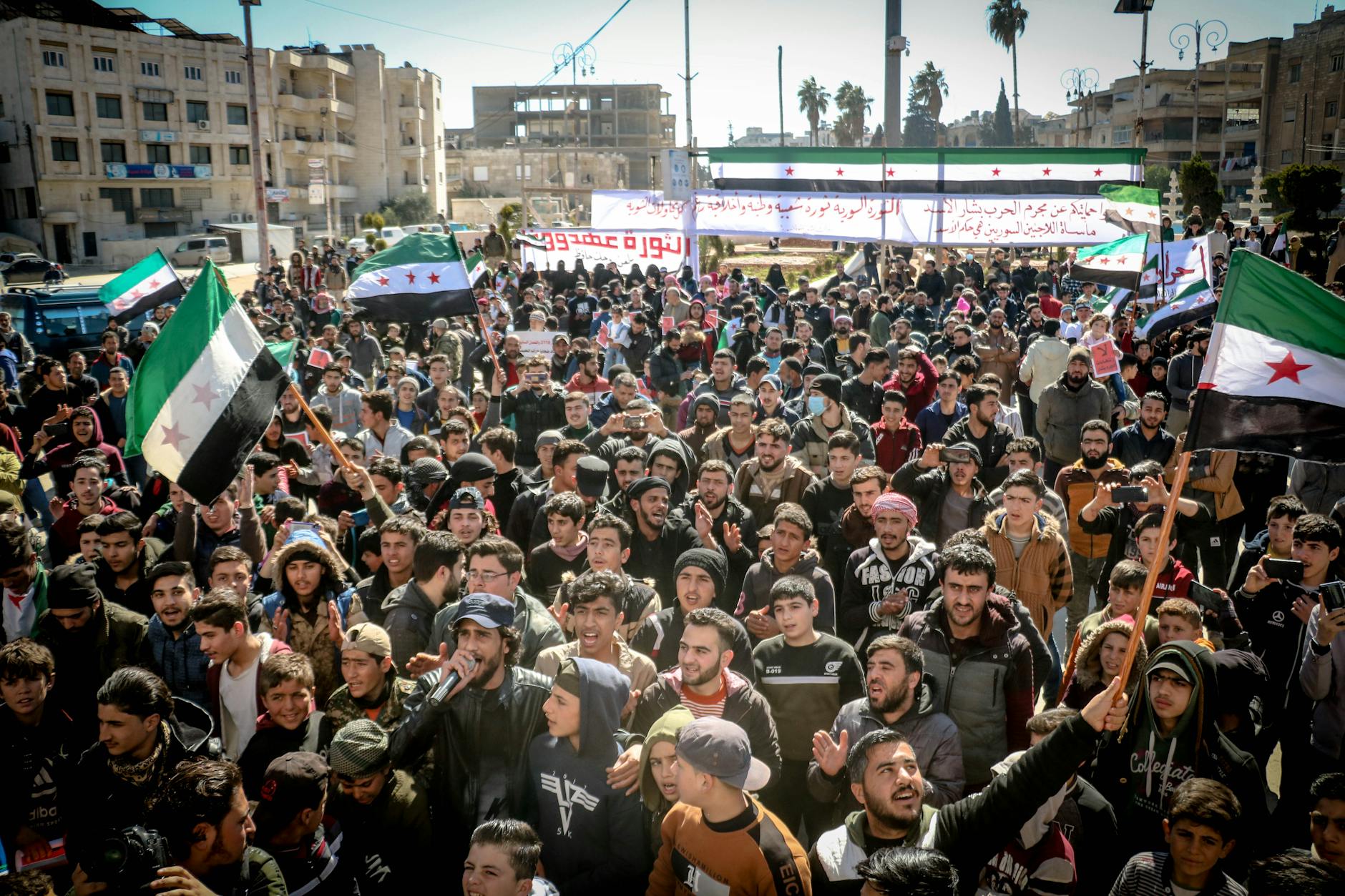
    In 2010, a produce vendor in Tunisia stood in front of a government building and lit himself on fire in response to how he’d been treated by local officials. This horrible event, which is now known as The Arab Spring, sparked protests and brought attention to many countries in the Middle East and their corrupt governments. After these events, social media played a role in sharing information and bringing people together to protest and suggest changes of power in their governments. Unfortunately, many of these protests weren’t friendly, and resulted in civilian casualties and bloodshed.

    The Arab Spring was one of the first events where social media and political activism worked together to force change. An article by Lipum Kumar on Geostrata writes: “Protests were organized using such platforms as Facebook or Twitter while real time information was given out through YouTube among others. An example of how the Egyptian revolt became a case in point of the manner in which the techie young group made use of social networks to oust a regime that had been in power for the long term. The parameters of digital activism expanded and became more sophisticated ahead from then.”

    People began realizing the powers that social media had, and that they could actually, overthrow their governments. While it’s great that social media can give voices to those who would otherwise be oppressed, there are also some dangers to using it to organize protests. “In Bangladesh, social media has evolved into a platform through which protests are organized, and at the same time, turned into a target for government crackdowns.”

    The Good vs. the Bad

    As with many things in this world, there are pros and cons to using social media to topple corrupt governments. Social media will undoubtedly continue to be intertwined in all parts of our day-to-day lives as humans, so it’s important that we remember it’s strengths and weaknesses. Social media is a powerful tool that can be used to spread information, but ideas should move beyond social media to create lasting political change.

  • Remember Kony 2012? Me either.

    Source: NY Times

    Kony 2012, as you probably remember, was a video created in 2012 to shed light on the horrible things happening in Africa — Joseph Kony, a cult leader and war criminal, was head of the Lord’s Resistance Army, who abducted children and forced them to become soldiers. The video showed graphic and disturbing content, and followed Jacob, an African child who lived his life in fear of being abducted by the LRA. It was heavy, emotional, and garnered millions of views in a short period of time.

    The Viral Video That Shook the World

    In 2012, I was in 6th or 7th grade, and watched Kony 2012 for the first time with a few classmates. I felt sad for the children in Africa, who were the same age as me, but living completely different lives than my classmates and I. They woke up every day and lived in fear of becoming child soldiers, while my biggest problem every day was probably what I was going to wear to school. Kony 2012 ignited something in my classmates and I where we felt like we had to participate to spread awareness, and we headed down to the computer lab to print posters of Joseph Kony to hang around the school. One of the main goals of the video was to make Kony a household name, so everyone would know who he was, which would hopefully incite more change.

    That’s all I can remember about my participation in raising awareness for Kony 2012. And I think many other people felt the same way. Besides sharing the video, purchasing kits that contained bracelets (among other things), and hanging posters, there really wasn’t anything tangible to do that would guarantee change. I quickly forgot about Kony 2012, and had not thought about it again until this week.

    Lessons in Virality and Digital Activism

    Watching it over this week, I still felt sad for the children in Africa. But I thought, “they had to have captured Joseph Kony by now, right?” Wrong. Joseph Kony is still hiding out somewhere in Africa. While Kony 2012 captured the attention of millions of people, it didn’t create the long-lasting change they’d hoped for. Nonetheless, it taught us how powerful social media can be in creating change.

    Kony 2012 “taught others how to harness the power of the web for good—and how to do it responsibly.” It showed how powerful the internet can be, and that it is possible to create a campaign that goes viral. But you have to do it correctly. In 2025, we have the opportunity to learn from Kony 2012, and do something different.

  • Where First Impressions Matter: The Five-Second Test in UX Design

    by UXtweak

    There are countless methods and techniques in the UX design process. And no method is right or wrong—it all depends on how you want to refine or change your design to achieve the best result. In my journey of learning more about user-centered design, I decided I wanted to research a method that caught my eye: the Five-Second Test.

    What’s the Five-Second Test?

    Research shows that users make decisions very quickly. The five-second test is a method used in UX design to test people’s first impressions. Five-second testing is used to collect qualitative data about a user’s first reaction (Maze.co, 2024). The design process isn’t linear, so prototypes are often made, tested, then changed, then tested again… and first impressions help refine prototypes based on what the user wants.

    When using the five-second test, users are shown whatever is being designed for just 5 seconds, and then the image or product is taken away. Then, users are asked questions in a survey that relates to their first impressions of the design.

    Some of these survey questions might be:

    • Can you remember the company(s)/product name?
    • What elements of the design stand out?
    • What message did you take away from the design/product?
    • What part of the design/product did you notice first?
    • What don’t you like about the design?

    Then, change your prototype based off of your targeted user’s response.

    by UXtweak

    Why 5 seconds?

    You may have heard that people visit a website for just 10-15 seconds before deciding if they want to continue scrolling. This isn’t surprising, as short-from content began taking over since Youtube and more recently, TikTok and Instagram reels. According to research, 5 seconds is the perfect amount of time to form a first impression, without the impression deviating from the user’s actual genuine impression (Kuric, 2023). Once you’ve passed the 5 second mark, “the participant’s perspective becomes more analytical and less task-driven. The five-second test lets you avoid overtly speculative feedback that nobody would give you under normal circumstances” (Kuric, 2023).

    The five-second method would not be appropriate for instances where you want the user to use your product or try to interact with your design, as it simply doesn’t offer enough time. It’s for first impressions only.

    When should I use this method?

    I thought it might be helpful to use some examples of studies or designs that were done using the five-second method, but I couldn’t find many designers or companies who shared the results of their experience with it. However, it’s best to use the five-second method when you’re testing out pages on a website, advertisements or app interfaces.

    Next time you’re scrolling on your phone or see an advertisement, test out the five-second method with yourself. See what elements of a design or ad you remember after 5 seconds, and research whether or not it was in the brand’s best interest.

  • Balancing User vs. Business Requirements in Design

    Photo by Photo By: Kaboompics.com on Pexels.com

    User Requirements

    User requirements are the features a product should have to ensure satisfaction from the user (Baxter et al., 2015). In design, it’s important that the products being created are properly serving the targeted users, because that’s what deems a product useful. For example, when I log onto a website to shop for clothes, it’s crucial that the website functions properly. I don’t want a cluttered landing page with flashing headlines. I want the navigation center to be clear and organized. I want the checkout process to go seamlessly. It may even be nice to browse a section where the website puts together outfits for me. I want to order a new outfit (or two!) and leave as a satisfied customer.

    In order to find out what’s important to users in the design process, we must conduct user experience research. Different methods can be used to collect data–– such as surveys, focus groups, field studies, card sorts, and more. Once we collect and analyze the data, we can create a user-centered design.

    Business Requirements

    When designing a useful product, we need to make sure that it also makes sense in business. Believe it or not, business requirements are often confused with user requirements, but these requirements apply to two different groups involved in the design process. “You cannot assume that what the salesperson wants to see in the sales product is the same as what the user wants to see in the product” (Baxter et al., 2015).

    Business requirements may be things like features that the marketing or sales team wants to add to a product to help it sell… even if those features aren’t what the actual user wants. A salesperson or marketer might want the product to be #1 on the market, or a tool to give the fastest results, but that isn’t always what’s most important to the user.

    Often times, business requirements revolve around money. Think about it this way: you’ve designed a product, with user requirements in mind, but you also want to make sure it sells, right?

    Does one come before the other?

    I decided to do some of my own research on the relationship between user requirements and business requirements, because I found myself wondering which should be prioritized. They’re both important, but how do you decide which requirements to favor if they differ?

    I found a YouTube short that summed it up perfectly. The key is to favor the user requirements. Since business requirements often revolve around money, the product or service needs to sell. So, in order to sell, the product needs to appeal to the user first. Think of the user requirements as augmenting the business requirements.

    Knowing this allows the designer to focus on satisfying the user requirements first, thus fulfilling the business requirements of the product or service. But remember—they aren’t one in the same!

    References: Baxter, K., Courage, C., & Caine, K. (2015). Understanding your users : a practical guide to user research methods. Elsevier, Morgan Kaufmann.
  • The Double-Edged Sword of Advanced Technology

    Photo by Pavel Danilyuk on Pexels.com

    Even though we’ve witnessed some of technology’s amazing benefits in today’s society, it often comes at a price.

    Tech is so much smarter than we are. The Center of Humane Technology explained it perfectly: Technology is extremely profitable, so it often develops faster than our ability to regulate it or understand its long-term effects.” Isn’t that crazy? Our brains can’t even comprehend information at the same rate as the technology being used today.

    Over these last few weeks, I’ve done a lot of thinking about tech, society, and how it’s changed how we behave. And right now, we only know its short-term effects, as the more advanced technology hasn’t come about until recent years. The rise of artificial intelligence is something that I, personally, have troubling comprehending.

    AI can do everything that humans can — but faster, and maybe in some situations, better. It can create images, and stories, gather information, answer questions, and more. There seems to be no limit to what it can do.

    Because technology is becoming so advanced, “it means we are rapidly disseminating technology with dangerous, exponentially advancing applications.” For example, the genetically modified babies. Let me explain.

    I didn’t even know this was an actual thing until I read this journal. He Jiankui (a scientist) and his team, used CRISPR technology to disable the CCR5 gene in two babies, which enables HIV infection. While I think his intentions were fair, it’s up for debate on whether this practice is ethical. The babies couldn’t consent in embryo, and we don’t know the long-term effects of disabling this gene. What if it causes other problems in different areas? What’s even crazier to me is that “CRISPR-Cas9 has made it possible to add, delete or replace genes, thereby opening the door to new types of genetic interventions.” Our technology has become so advanced to the point where we can change, edit, or delete genes. Whoever thought this would be possible?

    It’s overwhelming to think about the types of advancements we’ve had in technology lately. I can’t imagine a world where we have thousands upon thousands of genetically modified babies walking the planet. On the bright side, technology is so advanced that as a society, we can learn to use it for good. He Jiankui ended up serving 3 years in jail for performing “illegal medical practices,” but so far, the two babies are still healthy. Do you think that’s a fair punishment? Or that genes should be allowed to be modified? Do the benefits of technology outweigh the risks? I’m not so sure.

  • The Importance of POV the in Design Process

    Photo by Maksim Goncharenok on Pexels.com

    A crucial part of the design process involves understanding the user’s point of view. Up until this point, I’ve covered empathy pretty deeply — but wanted to touch on POV and problem statements in design.

    What’s a problem statement and why are they important?

    A problem statement is sometimes thought of as the most challenging part of the design process. It forces designers to either come up with a problem statement to solve or focus on a problem statement that’s already been brought to their attention. When you have a clear statement that guides you in the direction of brainstorming solutions, it makes the design process more clear and helps you to stay focused. When you have a clear objective, you’re much more likely to stay on track.

    Problem statements aren’t just random words strung together. They have to be well thought-out. There are a few qualities that a successful problem statement should have, according to Interaction Design Foundation. These qualities are to be:

    1. Human-Focused. Have you noticed a theme in design thus far? Hint: the user comes first. 😆
    2. Broad enough to allow creativity. Don’t get stuck in a box! Your statement needs to be focused with room for flow and creativity.
    3. Narrow enough to stay organized. I know, it’s a bit of a juxtaposition. Just don’t go overboard. Keep it simple and to the point.

    Where does POV come in?

    A point of view (POV) is a meaningful and actionable problem statement which will allow you to ideate in a goal-oriented manner.

    Empathize with the user, know what they need, and why they need it. Take this information and structure it in a sentence like this:

    [User . . . (descriptive)] needs [need . . . (verb)] because [insight. . . (compelling)]

    There you have it! Your POV. I’ll show you an example.

    App POVs: Alive by Whitney Simmons

    I decided to take a look at a few workout apps, analyze reviews and collect data, then compare their problems to each other. After I got an idea of what worked/didn’t work for each app and what could be improved, I created a POV statement to reflect the user’s needs. One of the three apps I looked at was Alive by Whitney Simmons. I’m a frequent user of this app, and while I’ve had a great experience, it was interesting to see how other users were interacting with the product.

    The app is rated 4.9/5 stars on the Apple App Store. It’s a workout app that provides different programs from ones at home to ones at the gym (all for different experience levels). Most users have had a positive experience, but there were also some that hadn’t. There were other users who provided helpful feedback and suggestions to improve the app itself. Here’s some of what they had to say:

    In summary, most users loved the app but had ideas to add a nutrition element, a way to keep track of weights/reps, tips on workout form, and more. I took this information and developed two POV statements using the sentence template I talked about before.

    Users who like to track their reps and their weights need a feature that automatically recommends or calculates the last weight used because it’s inconvenient to have to look elsewhere or remember what you may have lifted last.

    Users who want to track their calories and/or macros need a nutrition element within the app because it’s frustrating to use other apps to track food. If everything was in one place, it would be easier and more worth the money.

    The problem statements above reflect what’s important to the user and provides insight on what could be improved. It’s a clear statement that shows the designer what to work on, but allows creative freedom and room for different ideas that would solve the problem.

    I analyzed two other workout apps in comparison to Alive; Nike Training Club and Peloton. If you’d like to dive into POV in the design process a bit more, find my presentation below.

  • Maximize Productivity with Asana: A Personal Review

    I love lists. Grocery lists. To-do lists. Packing lists. Affirmation lists. Homework lists.

    I’ve used an agenda for school since fourth grade and I don’t think I could have gotten through my middle and high school years without one. To this day, I appreciate my teachers who would require us to write everything in our agenda as part of the homework assignment. For me, it never felt like work. There’s something about seeing everything taken out of your brain and written on a sheet of paper that makes it seem more accomplishable. At the end of the day when it came time to fill my backpack with books, I’d know exactly what I’d be taking home and what could be saved for later. And the best feeling is when you get to cross something off your list of scribbles (and never think of it again!).

    This week, I decided to use an online version of a to-do list/task management system called Asana. I’ve had experience using Asana in previous internships and loved it. I enjoy how you can organize everything. It reminds me a bit of Notion, which is another website you can use for organization and to-do lists. Asana, however, feels much more work- and project-related.

    I decided to set up my Asana so that it’s strictly project-focused and separated my schoolwork and business into different folders. I run a small business on Etsy and create digital artwork. It’s something I genuinely enjoy doing because it allows me to be as creative as I please. This week, I had a few custom pieces to create for customers. I used Asana to input each order, the steps I had to take to complete the orders, and the days I needed them completed by. For my custom pieces, I allow for a 3-5 day turn-around time. The due date feature on Asana is great for this!

    My favorite overview is the list overview. I love the fact that you can also create subtasks within each task, so you don’t have an extremely long to-do list that instantly creates anxiety. You can hide the subtasks and cross them off as you complete them. Here’s an example of what a list looked like for one of my to-dos:

    If you don’t like the list overview, you can choose to switch it to a board view, timeline view, and dashboard view, among many others.

    As far as course organization, I created a new folder specifically for the white paper which is going to take a lot of time and focus. Then, I created a separate project folder just for this week but used the calendar option to organize it. Here’s what it ended up looking like:

    Overall, I can see myself using Asana week-to-week. The little unicorn explosion that happens each time you complete a task is enough motivation for me to keep checking things off of my to-do list! I’m hoping that as my time as a graduate student continues, I become better and better at managing my time and projects.