I’ve learned so much about myself during these last few weeks — and the last year. Over the course of five weeks, I worked on a LinkedIn article series highlighting women’s sports and the inequalities that athletes face. I spent countless hours researching and listening to books, diving deeper into the stories of women who inspire me.
One of those women is Dawn Staley. While I still haven’t finished her book Uncommon Favor (which I highly recommend), I’ve taken a closer look at her career and leadership style. She’s authentic, vulnerable, and unapologetically real — qualities that have made her a role model to so many. Recently, I even listened to her on Michelle Obama’s podcast, IMO, which I also recommend for anyone who wants to feel empowered.
Closing a Chapter in My Master’s Program
As I write this, I feel a weight lifted from my shoulders. This is the last blog post I’ll be writing during my time in the ICM program. Over the past year, I pushed myself to take as many courses as possible in order to finish my master’s degree quickly — and now, looking back, I can see how much my life has shifted during that process.
I truly owe so much to this program. I’ve learned the importance of strategy, developed skills in content creation, and embraced my creativity more fully than ever before.
Lessons from My LinkedIn Series
When it came to my LinkedIn series, the results weren’t exactly what I envisioned. But what I gained was even more valuable: confidence. I’ve become less intimidated about posting on LinkedIn, more comfortable sharing my voice, and better at managing my time.
I also learned how to document my work effectively, prioritize tasks, and evaluate what needs to be done first versus what can wait. These are skills that will stick with me long after this project.
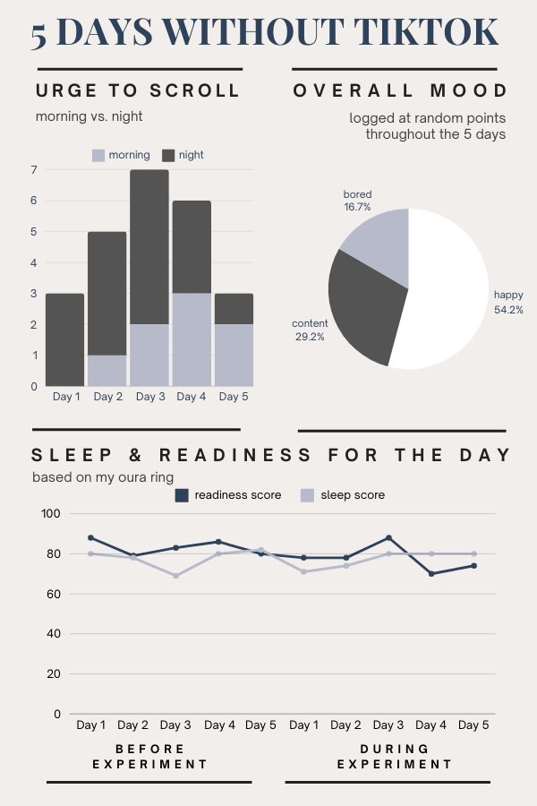
Final Results
Here’s a snapshot of the total performance of my LinkedIn series:
While the numbers tell one part of the story, the growth I experienced throughout this process tells the rest.
Moving Forward
This project marks both an ending and a beginning. It’s the close of my time in the ICM program, but also the start of applying everything I’ve learned to the next chapter of my career.
More details about my project can be found within my portfolio, or linked here.
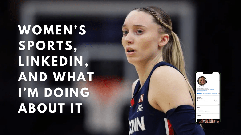
For the past five weeks, I’ve written about the gaps in equity between men and women’s sports, and posted articles on LinkedIn. I’ve done tons of research, spent hours on assignments, and written hundreds of words. As a sports marketer for the Connecticut Sun, I spend almost every day working for athletes. I send out emails, work in the team app, write copy for paid social posts, curate the newsletter, write for the podcast, and more.
While working for a professional women’s team, I think a lot about the importance of equal pay, equal representation, equal media coverage, and the safety of women athletes. While these are important issues, there’s another forgotten equity gap — the medical research gap.
As a women’s basketball fan, I’ve heard tons of stories and even seen ACL tears on the court. And actually, women are six times more likely to tear their ACL’s than men. This is due to a few different reasons.
In my LinkedIn article (which is scheduled for tomorrow morning), I wrote a bit more in depth about ACL tears and how we can try to move forward as a society in performing more research. And prioritizing women in this research. We need more investment in research that centers women athletes, more training and recovery programs built specifically for women’s bodies, and more women leading the conversations in sports science. If we want women’s sports to thrive, protecting athletes’ health is just as important as paying them fairly or broadcasting their games on national television.
Looking Ahead
Through proper research, and the right advocates, I really believe that women’s sports has the chance to become as popular as men’s sports. The more women continue to work in sports, uplift other women, the more women play sports, and the more people invest in women’s sports — it’ll all add up over time and make a difference.
I can’t believe a year has gone by since I started the ICM program. I’ve spent countless hours on blog posts, projects, and what has felt like endless research on how to communicate effectively online. I have so much to thank this program for, and here’s a few things I’ve learned.
People first. Companies seem to forget that empathizing with humans is one of the most important things in marketing. It doesn’t matter how well your product works, or how clean your website is. If you aren’t prioritizing the human side of marketing, your brand will easily get lost among the millions of others online. Take the time to understand your audience and prioritize communication with them.
Don’t forget about paid social. I’ve always been a lover of organic social, but in my internship with the Connecticut Sun, I learned so much about the importance of paid social — and I feel like I almost like it more. With the combination of both, you have the ability to build trust with your audience, stay spontaneous, and target new fans.
Typography matters (and so does white space). Surprisingly, one of the things that has stuck with me most is the importance of typography in brands. After learning about the importance of font families, typefaces, and kerning, I feel like I notice it everywhere. I think about why people have chosen the typefaces they do to represent their brand, and what might they want that typeface to convey. I also learned the importance of white space and how it can help you of more ways than one.
Learning never ends. I’ve always loved being a student. I’d gone back and forth about the pros and cons of going back to school after I got my bachelor’s, and the pros heavily outweighed the cons. Throughout this program, while there are some things I’ve noticed stayed the same, the marketing and digital space is constantly changing. I think being open to the ever-evolving world of social media and digital marketing, while continuing to ask questions, is the best way to grow. A long-term life goal of mine is to be a forever student. Ask questions. Stay curious. Keep an open mind.
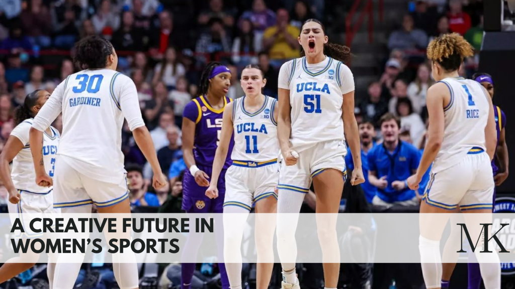
I finally found my future in women’s sports. I always struggled to figure out where I fit in the professional world. It wasn’t until I landed my internship at the Connecticut Sun (which was ignited by my love of UConn women’s basketball), that I felt like I found my place. I’ve loved sports since I was a kid, and I find celebrating women athletes to be empowering and motivating. I’ve recently been promoted to Marketing Specialist, and I owe so much to this program — having a master’s degree alone is a good way to make people double-take your job application.
Looking Ahead
I’ve accomplished so many things in such a short amount of time, that I’m allowing myself to finally take a deep breath in the completion of my degree. It is one of the things I’m most proud of thus far. I can’t wait to see what the future holds.
This week, I wrote about the issues in safety and abuse among women athletes. In short, the reality is scary. A few months ago, during a Connecticut Sun vs. Indiana Fever game, Jacy Sheldon found herself in a scuffle with Caitlin Clark. The confrontation got heated pretty quickly, and many Caitlin Clark fans went after Jacy Sheldon on social media. I was scrolling through her Instagram comments the next day, and was appalled at the hate and cruelty on her page.
Social Media’s Role in Amplifying Hate
I wondered why Instagram wasn’t doing more to regulate the clear hate speech and comments on her profile. At the end of the day, even though she got in an altercation that many people disagreed with, lots of the comments were unrelated, horrible, and just scary. In 2019, Instagram was supposed to role out an AI feature that flagged hate comments before they’re posted. However, I’m unsure if this was ever rolled out, and still — this doesn’t do much to stop the comments from being left.
At the end of the day, this is bigger than one player, one game, or one moment that fans don’t like. It’s about creating a world where women athletes can compete without worrying about their safety every time they step on the court or open their phones. The reality is that the job shouldn’t come with harassment, stalking, or abuse.
On LinkedIn
I tried to touch on this deeper in my LinkedIn article, and am hoping that my professional network will appreciate the insight. I wrote about suggested solutions too, and changes that need to be had to make the world a better place for women. Connect with me here, and stay tuned for the last two articles of my series!
This week was an exceptionally busier week than the last — and I already thought it couldn’t get any busier. It was my birthday, I got a promotion at work, and have really tried to pace myself with my homework. In the past, I’ve found myself saving all of my homework for the weekend or for a Sunday, and am miserable trying to complete everything by the due dates. At work, and through weekly production journals for my class, I’ve found myself become better at pacing my work, and am much less stressed
A Reminder from my Boss
The other day, my boss was explaining to me that even though I like to cross everything off my to-do list, I need to get out of that mindset. Likely, my to-do list will never end. It’s more about prioritizing what needs to get done first. And then ask yourself, what could wait until next week?
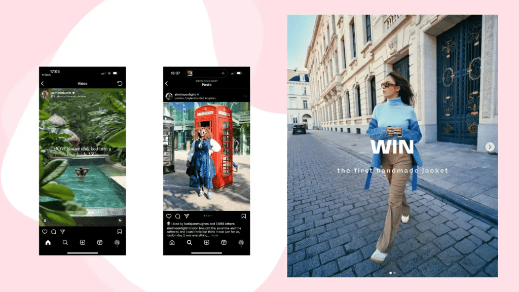
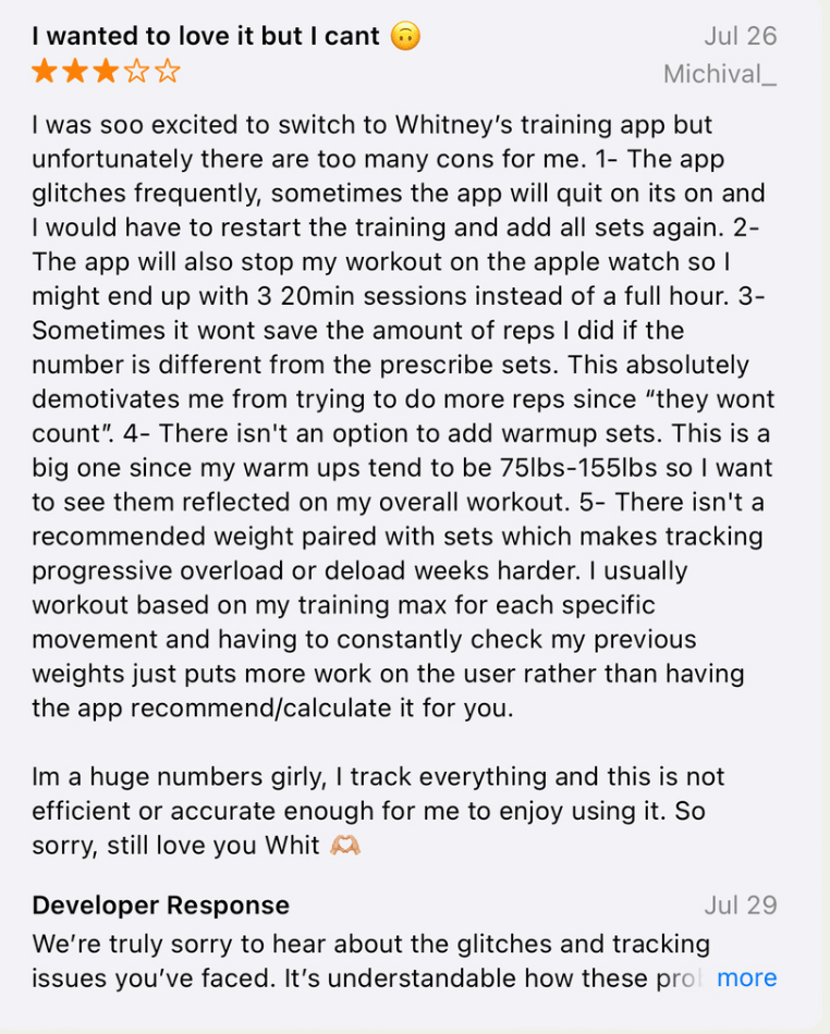
Diving Into a New Topic: Gender Pay Gap in Sports
This week, I wrote about the gender pay gap in sports. This issue has been a well known issue in the world in general for so long, that I feel like maybe it’s just not interesting. For my first article, I wrote a brief history on women’s sports, and below are the metrics:
Article #1 Post Date: Jul 28, 2025 Post Publish Time 1:00 PM
Impressions: 1,005 Members reached: 588 Profile viewers from this post: 12 Followers gained from this post: 0 Reactions: 16 Comments: 6 Reposts: 2
Article #2 Post Date: Aug 1, 2025 Post Publish Time: 3:00 PM
Impressions:171 Members reached: 88 Profile viewers from this post: 1 Followers gained from this post: 0 Reactions: 3
Timing is Everything
After seeing these metrics, it’s safe to say that I will not be posting on a Friday again. Hootsuite published an article that had recommended times for each days of the week, if you wanted to post every day. What’s most important about that article though, is that even if you post at a good time for that day, it might not be the best time in the week. Comparing the metrics from a Monday LinkedIn post to a Friday LinkedIn post showed a drastic change, and I can definitely learn something from my audiences’ behavior. On Monday, people are scrolling LinkedIn more, ready to take on the work week. By Friday, people might not be as active on LinkedIn because they’re ready for the weekend.
Do I blame them? No. Do I wish my second article performed better? Yes. Admittedly, I don’t know why I would’ve posted at 3:00PM either. That was probably an error on my part, because no article that I have read suggests posting at 3PM on a Friday.
Knowing Your Audience — and Reaching the Right One
Another thought I had, was that maybe my article just wasn’t appealing to the followers that I currently have. Women are probably more interested in the topic at hand. The women’s pay gap doesn’t really appeal to men. Over half of my followers/connections are men… so maybe that’s the problem. This week, I’m going to continue working on expanding my followers and connections to women leaders, marketers, and women in the sports industry. I think this will help in appealing to the right audience.
Lessons I’m Taking Into Next Week
Don’t post on Friday afternoons.
Keep building a network that reflects the audience I want to reach.
Your to-do list will never be empty — so stop treating it like it should be.
Here’s to another week of growing, learning, and maybe (just maybe) choosing a better time to post.
This week felt like one of the busiest weeks I’ve had in a while. I worked every day, and three of those days were game days, which often take up extra time and energy. No complaints though, I love what I do and am so blessed to work in an industry that I truly love.
The project management system that I wrote about last week really came in handy. I had an outline and broke down what I needed to get done throughout the week, which it made it much easier to accomplish. It’s hard to even attempt to work on a project that you know will take a lot of thought, when you don’t even know where to start.
Habit Stacking, Not Multitasking
Often times, I try to implement habit stacking into my routine, so I can get as much done as possible in the shortest amount of time. I wouldn’t say it’s like multitasking though, because I’m not trying to do too many things at once… just combining tasks I need to get done in a way that makes sense. This week, during my commutes to and from work, I listened to Dawn Staley’s Uncommon Favor: Basketball, North Philly, My Mother, and the Life Lessons I Learned from All Three, which I’m using for research for my LinkedIn project.
Listening, Learning, and Coach Staley
I’d always known that Coach Staley was one of a kind — she was the National POY in high school, played on an Olympian team, in the ABL, and the WNBA, and is a pillar in women’s basketball. But, learning about her upbringing has truly been eye-opening. She talks a lot about where she grew up — in the projects in North Philly — and how she had to prove herself to the boys in the neighborhood that she could keep up with them. They’d just ignore her, until she showed them what she could do on the court, and then they started picking her to play the first 10 rounds, which was a big deal.
While getting quite a bit of research and reading time in, I started to write my first article. I wanted to approach the first article and start out as broad as possible, but still throw in tidbits of information that might make people think. I thought about structuring my paragraphs, how to write an effective post to go along with the article, and researched best times to post on LinkedIn. I ended up finishing the article on Friday, but by the time I created the banner for the article, it was Sunday night.
According to Sprout Social, the best time to post on LinkedIn varies depending on the day of the week. I had thought about posting my article on Sunday night, but I want to give this project the best chance at succeeding. So, my first article is scheduled for 9am on Monday, July 28th.
By the time you’re reading this, it’s already been posted — and you can find it here. I’d love to hear your thoughts.
When I think about my future in the sports world, there’s one thing I’m sure of. As a woman, I want to be an ally for other women and advocate for women athletes in one way or another. Right now, I work as a marketing intern for the Connecticut Sun, and it’s truly my dream internship. My boss trusts in my ideas and in my content, which I think has made me a more confident employee. I love writing, creating graphics, working with paid social (something I never thought I’d say!) and just being creative. Any chance I get to do anything player forward — whether that’s running a meet and greet, crafting a newsletter about what the team has been up to, or helping out a player during media day, I’ll take.
In my personal life, I love creating content. I love reading, writing, posting on Instagram, traveling, and making TikToks. I’ve always been more creative-minded than anything, so I think working in a position that combines my strengths in creativity and my passion for the WNBA is the perfect role for me.
Curious About What’s Next
I’d love to stick with marketing, but I’ve also thought about creating content (player facing). With the Connecticut Sun though, I don’t think that creating content is strategic enough for me. Lately, I’ve been thinking more and more about PR, which I don’t have much experience in, but I have a knack for writing. It’s something I’m hoping to explore before my internship ends.
I love the days where we travel and have to work games. Being in an environment where I’m seeing an audience cheering for women is inspiring, and I hope it never ends. I feel that I’ve entered the league at the perfect time — it’s exploding and it’s only just the beginning.
Looking Toward the Bigger Picture
One day, I could see myself transitioning to a position that spans league-wide, not just for a specific team. Working for the league seems like such a great opportunity to experience athletes, sports media, and sports marketing as a whole. I’ve learned so much from the Sun, and have come to love the team and it’s players, but content always remains focused to one team.
I’m sitting in front of the TV, watching the 2025 WNBA All-Star game in Indiana, and can’t help but think, “what a wonderful thing to be part of.” No matter what specialty I end up in, whether it’s marketing, content creation, or PR, I know I’ll thrive in a role where I can be creative. I’m blessed to have this opportunity with the Sun, and I can’t wait to see what the future holds for the team.
If you’re unfamiliar with Notion or other project management tools, you’re missing out. They can be used for anything and everything — especially when it comes to juggling multiple projects at once, which is exactly what I’m doing right now. With Notion, you can create templates to make to-do lists, calendar appointments, track deadlines, or even do fun things, like cross things off your bucket list. It’s completely customizable, has clean UX/UI, and makes the user feel accomplished when they cross something off their list. I’ve even know people who’ve made templates to track what books they’ve read, how they rated them, and any more information they wanted to include in one sheet. The possibilities are endless.
Using Notion to Organize my LinkedIn Project
In this instance, I’m using Notion to organize my LinkedIn project for the next six weeks. Each week, I’ll be writing an article on LinkedIn, discussing different gaps and inequalities in women’s sports vs. men’s sports. Since I want to work in sports media and stay in the WNBA world, it’s important that I become a thought leader in the industry, and this is one of the ways I can do that.
I organized each week like the photo above, and included due dates, status updates, and tags, so I could keep track of each assignment. In each task, users have the ability to expand and create another template. For mine, I chose to list smaller tasks that I could cross off throughout the week. At the end of each week, my subtasks should look like this:
I plan on checking into Notion each day to stay on top of my studies. Plus — this is one class, and I’m also completing my master’s capstone at the same time. It’s safe to say that my plate is full.
This week, I also annotated my bibliography with the current sources I have. I plan on starting to write my first article as well, just because this class happens in such a short period of time, I’d like to get ahead of schedule. I love to write, so this isn’t an issue for me. For this project, I picked something that I genuinely enjoy, but also in an area where I know I have some work to do (my LinkedIn presence), and establishing leadership.
Updating my Profile
This past week on LinkedIn, I tried updating my profile to the best of my ability. In one of the videos I cited in my bibliography, Tommy Clark spoke about how important it is to have a clean, concise, and clear presence. In other words, who are you, and what problem are you solving? Why should someone in your target audience follow you on LinkedIn? You don’t have to have a long bio, or try to answer multiple questions at once. Keep it simple. If I’m going to post an article each week on LinkedIn, and I want people to engage with my profile and my posts, my profile has to look top-tier. I updated my profile picture, bio, and headline. I’m starting this experiment with 265 connections, and I’m hoping to reach at least 100 more.
Stay tuned for my first article next week! Connect with me here.
In the culmination of my graduate degree, I’ve been thinking about what career I want to pursue and where I think I can do better as far as my online presence. I know one thing without a doubt — I want to work in women’s sports. In February, I accepted an internship with the Connecticut Sun, and it’s been such an amazing learning experience for me. Not only did I finally figure out where I fit in the professional world, but also what I’m genuinely passionate about. As a woman, I love seeing other women succeed, and as a life-long lover of most sports, I love seeing women succeed as athletes. I’ve learned so much in my internship and continue to learn more every day, about things like paid social, email marketing, app management, writing copy, creating promotional graphics, working with brand partners, ticket sales, and more.
Personally, I struggle with LinkedIn. I don’t know if it just feels too formal to me, or if I’m not connecting and following with the right people. I think I’ve always felt some sort of imposter syndrome, which is when someone thinks they’re “undeserving of their achievements and the high esteem in which they are, in fact, generally held.” I’m familiar with this feeling, especially because it’s easy to compare yourself to other people in your 20s. I’m in a place right now where I feel like I could be farther in my career, but I’m really just starting, and I struggle with that sometimes.
Because of my imposter syndrome, I’m not as confident with posting on LinkedIn as I should be. But I’m here to change that. Combining my professional interests, and my lack of presence on LinkedIn, plus my passion for protecting and recognizing women in sports — I’ll be releasing a 6-week LinkedIn series, educating others on the history of women’s sports, the gaps between women and men in multiple areas, and how we can move forward.
A Game Plan for Change
Look out for my LinkedIn articles! I’ll post one article and one post per week, focusing on a different aspect of women’s sports. They’ll be about 600-1,000 words long, and backed by thoughtful research from articles, journals, podcasts, books, and videos. The goal is to not only educate others on historic and societal barriers that women athletes face, but to establish myself as a thought-leader on LinkedIn. This series will aim to reach audiences who want to create change — from athletic directors to sports executives and everyone in between.
I spent about 5 weeks researching Spalding’s brand and social media presence. In short: I didn’t find much. I quickly realized that Spalding had a lot of work to do when it came to their digital identity, so I came up with a plan to help them.
A Brand with Legacy, but Lacking Presence
Rather than make one single campaign that might help their engagement and success on social media, I analyzed the brand’s voice, what their goals were, the history of the brand, and how they can better portray that on social media. I focused more on longevity than one campaign. Spalding most appeals to young athletes, especially ones that play basketball, softball, or volleyball. They’ve been around for a long time, and are a credible sports brand that many people turn to if they’re putting up a basketball hoop at home or picking up practice equipment. However, they lack that young, fun, and trendy presence on social media, which is crucial when you consider their target audience.
Their social media presence is almost non-existent, and doesn’t reflect a player-first mentality. It has a cold, impersonal feeling that seems like they’re trying to market to arenas and gyms (which is okay if that was their only target audience, but it’s not). Sports and social media have such a strong relationship in today’s world, and lots of people who watch sports are most likely on social media. It’s crucial that Spalding up their game (pun-intended) if they want to stay relevant in the sports world.
The Game Plan: How Spalding Can Win Online
It would help to incorporate things like:
More athlete collaborations (college and pro athletes)
Social media takeovers
Collaborations with landscaping companies (to appeal to young athlete’s parents)
More participation in current trends/memes
Attempt to reach a larger audience by tapping into golf, softball, tennis, and volleyball worlds (their social media focuses heavily on basketball)
Celebrate the history of Spalding, which increases their credibility
Incorporate trends unrelated to sports with their sponsored athletes or teams, to reach a different audience
Measuring Success: SMART Goals for Spalding
To make sure that Spalding is reaching their goals, I implemented the SMART strategy to accurately measure growth. In short, the main goal would be to increase Spalding’s brand relevance and engagement among Gen Z and Millennial athletes, increase 100k+ followers on combined social platforms, achieve a 15% increase in Instagram and TikTok engagement rates, boost sales of basketballs by 20%, and other equipment by 10%. By leveraging their current partnerships and existing following, Spalding must post on a consistent schedule on Instagram, TikTok, and Youtube to resonate with their target audience — while keeping their brand voice in mind.
Final Thoughts: A Brand Built for the Future
It’s crucial that Spalding continues to evolve with the times. They’re legendary, but aren’t acting like it on their socials. With the right strategies implemented, they can increase their brand awareness on social media, appeal to their target audience, and increase sales. If you’d like to take a look at my project, it’s linked below!
This week, I’ve been thinking about how I respond when I see a link or a hashtag in a post. Most often, it doesn’t make a difference in whether or not I engage with the post. The only time I find them effective is when I’m interested in the topic of the post (maybe it’s a skincare routine or a recipe I want to make), and then I’m more inclined to click on that link.
The Research Says: Stop Posting Links
Interestingly enough, there’s been quite a bit of research done on whether or not links are effective in driving engagement on social media. The short answer: no. Let me tell you why.
LinkedIn’s Sneaky Thumbnail Shrink
LinkedIn, a site known for connecting professionals and finding jobs, recently decreased the size of the thumbnail when users share links in their posts. Instead of seeing a large image across your screen, there’s a small box directing you to the linked page. This seems like such a small change, but LinkedIn’s goal with this change is to keep people on their platform longer. The less likely users are to see a thumbnail, the less likely they’ll click on it to leave the platform.
So, what should you do? You want to share a link or two, but also make sure your posts aren’t being hidden by any algorithms. This is where the “link in bio” trick comes in. Share whatever post you want, and at the end, write “Link in bio.” This will not only direct people to your profile, but allow your post to be seen by anyone — then guide them to the link you’ve attached in your bio. With other platforms and tools such as Linktree, you can also attach as many links as you want! The only downside to this, is that people who don’t want to take the time to go to your profile to then click on a link, probably won’t do that. But in that case, they’re probably not the target audience anyway.
It’s not surprising that platforms want users to stay scrolling their feeds for as long as possible — it’s how they make money. If you or your business needs to share links from now on, avoid sharing links in your post, because they will most likely be hidden by the algorithm, or at least reach less people. Hop onto the “link in bio” trick, and you’re likely to get more engagement through your posts, while sharing links you want to share.
With AI becoming an everyday occurance in many of our lives, it’s becoming more important to be transparent when running a business or a brand. As you’re scrolling through social media, it’s also your responsible to be media literate, so you can differentiate between what’s AI and what’s real.
What Builds Trust on Social Media?
We’re entering a time where a product photo might be AI-generated, a caption might be written by a chatbot, and a face in a video may not even belong to a real person. While AI can definitely be used as a tool in businesses, it should not be the end-all-be-all. Now more than ever, being human, honest, and transparent on social media is what sets people and brands apart. Ask yourself — have you ever read a caption that you knew was AI-generated, and it turned you off of that brand completely? Or what if a brand is dealing with a scandal, and they don’t address it online? Does that make you trust the brand more, or less?
We have to make authenticity the new standard. Show your face. Share the process, not just the product. Talk openly about what tools you use, including AI. People appreciate honesty, and when trust is built, the brand will grow. If there are issues, talk about them. When I worked in the restaurant industry, customers always loved the photos or moments shared in the kitchen or with the staff. The food would of course get lots of attention, but to mix up the social media feeds or encourage engagement, throw in a staff photo here and there!
Be a Smart Consumer of Content
On the other hand, as consumers of content, you need to stay sharp. Don’t take everything at face value. If something sounds off, it probably is. Part of being media literate in 2025 is being able to read something or see something, and understand if it’s real or not.
If You’re Going to Take Away One Thing, Let It Be This
If you’re a creator or brand, lean into your brand. Show your voice. Share the behind the scenes, and the raw moments because people do enjoy it. As technology and social media continue to evolve, we have to evolve our brands and businesses too. It’s okay to use AI, but use it strategically. Stay honest, transparent, and true to yourself and your brand.
Have you ever been asked about your “desert island” picks? Like, if you were stranded on a desert island, what 3 items would you take with you? Ever thought about your “desert island” social media pick? Mine, without a doubt, is Instagram. Here’s why.
Instagram is Where Young People Actually Pay Attention
Instagram has an even split as far as gender demographics, which is unique in today’s social media platforms. It’s also one of the best way to create a following organically, and can be used to post and share “behind-the-scenes” content, as well as polished, paid content. Instagram is also riddled with influencers, who can promote your brand by sharing their experiences through images and video.
As far as sales and shopping goes, Instagram Shop is now a popular way to try to sell to someone and increase profit. I don’t use it often, but can see why it’s beneficial because users don’t have to leave the app to buy something, and it doesn’t feel like products are being pushed on you when you’re scrolling. As an IG user, you can easily scroll past something that doesn’t interest you, or tailor your ad suggestions so that you get content that’s more unique to you.
Curate Your Feed, Control Your Narrative
Instagram is a highly visual platform, which gives businesses and brands the opportunity to showcase exactly what they want their users to see. With one look at an Instagram profile, users can decide whether or not they want to interact with that brand. Take the time to craft your Instagram feed and show your audience exactly what you want them to see. It has limitless features that will ultimately aid in brand awareness and reputation.
When I think about the way that social media has changed over the years, it baffles me. I was born in 1999, the same year of the Internet. I grew up without much social media, and iPhones didn’t come out until I was 8 years old. Back then, I remember iPhones being considered some kind of luxury.
I remember social media really becoming popular around 2013, when I was in 8th grade. At this time, I was obsessed with the boy band One Direction. I’d spend my days on Twitter and YouTube, watching music videos of the band, following their journey, and tweeting about them with other young girls who had the same interests. At that time, many people said that One Direction surpassed the popularity of the Beatles, which sounded like a crazy statement at the time. Looking back, they were exactly right, and that was because of social media.
One Direction and their Online Community
“One Direction had a recruitment and promotional technique that no boy band before had ever utilized properly: the internet” (Greenwood, 2020). CDs turned into Spotify. Newspapers turned into Twitter threads. Traditional publicists turned into fan accounts with thousands of followers. Social media connected the distance between celebrities and fans in a way that was never possible before. One Direction’s popularity wasn’t just about their music — it was about how easily their music could be shared. Fans from all around the world could tune in. It also felt like they had a personal stake in the band’s success because they were part of the online community that kept the hype alive.
In 2013, there were no algorithms manipulating our feeds, no influencer marketing, no brands trying to sneak into our conversations. Social media felt new, simple, and much less commercialized. As I’ve gotten older, and continue to use social media daily, I’ve noticed a shift. Social media platforms today feel more like digital malls than gathering spaces. Content is now designed for virality rather than authenticity. The same tools that helped build global communities around a band like One Direction are now used to sell products and even used to spread misinformation. Instead of social media being a fun place to go, it can sometimes feel overwhelming and saturated.
Nostalgia for the old Social Media
Still, I can’t help but feel nostalgic. Social media introduced me to people I would’ve never met in real life. It gave me a voice at a young age, and put me in touch with other girls who had the same interests. I often wonder if today’s teens feel the same way. The Internet has grown up and so have I, but I’ll always reminisce on the times I used it to support a boyband from the UK.
Social media is used by billions of people every day. When it comes to social media’s role in major social justice movements, there’s definitely something to talk about. In the same way we’ve seen social media play a role in #BlackLivesMatter and in the ALS Ice Bucket Challenge (which, has resurged this month to raise awareness for mental health), social media has helped empower people to speak their minds and influence or even topple governments.
The Arab Spring
In 2010, a produce vendor in Tunisia stood in front of a government building and lit himself on fire in response to how he’d been treated by local officials. This horrible event, which is now known as The Arab Spring, sparked protests and brought attention to many countries in the Middle East and their corrupt governments. After these events, social media played a role in sharing information and bringing people together to protest and suggest changes of power in their governments. Unfortunately, many of these protests weren’t friendly, and resulted in civilian casualties and bloodshed.
The Arab Spring was one of the first events where social media and political activism worked together to force change. An article by Lipum Kumar on Geostrata writes: “Protests were organized using such platforms as Facebook or Twitter while real time information was given out through YouTube among others. An example of how the Egyptian revolt became a case in point of the manner in which the techie young group made use of social networks to oust a regime that had been in power for the long term. The parameters of digital activism expanded and became more sophisticated ahead from then.”
As with many things in this world, there are pros and cons to using social media to topple corrupt governments. Social media will undoubtedly continue to be intertwined in all parts of our day-to-day lives as humans, so it’s important that we remember it’s strengths and weaknesses. Social media is a powerful tool that can be used to spread information, but ideas should move beyond social media to create lasting political change.
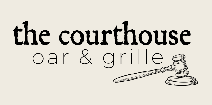
For my visual design class this semester, we were tasked with rebranding a local business that we felt needed help. I chose The Courthouse Bar & Grille because after over 20 years in the business, they’re due for an upgrade.
A Bit about The CBG
The Courthouse Bar & Grille is located in downtown Putnam, Connecticut. Putnam is a growing community known for its restaurants, antique shops, and small-town feel. As Putnam continues to modernize itself, The Courthouse remains the same. It would benefit from a rebrand, where it can redefine its importance in the community and stay relevant with up-and-coming competition.
The Courthouse has been a family-owned establishment since 1998. The story and brand are inspired by a traditional courthouse, as the building used to serve as one in the 1800s. More information on it’s history can be found on the “CBG Story” page of the website.
The Courthouse customer demographics consist of both locals and out-of-towners. They offer in-house dining and takeout. They accommodate small parties and offer intimate bar seating, as well as dining room seating to hold large or private parties. It’s rated 4.3/5 stars on Google.
Price range: $$-$$$ | Customers can expect to spend $20-$30 per person.
The Courthouse’s menu ranges from pasta to steaks, burgers, seafood, and sandwiches. While the variety is appreciated, it lacks a clear culinary direction. The restaurant prides itself on having a family-friendly atmosphere, so the offerings make sense. Their goal is to accommodate families and offer something for everyone. However, it would still benefit from refining and removing some items. The Courthouse also offers cocktails, 16 rotating beers on tap, and wine.
The Courthouse is in need of a refresh. Its atmosphere and overall presentation feel outdated and lack a modern, inviting touch. With new restaurants and shops constantly emerging, it’s essential for The Courthouse to evolve to remain relevant. While drawing inspiration from its namesake makes sense, there’s an opportunity to reimagine it in a more chic and refined way, blending its signature charm with a contemporary edge. With new decor, some fresh paint, and redefining their target audience, The Courthouse will be on it’s way to becoming the best restaurant in Putnam.
Social Media Presence
Since social media and online presence are at the forefront of marketing and sharing brands, there will also be an emphasis on rebranding The Courthouse’s website and social media channels.
Their website seems to be the most up-to-date, with high-quality photos and a clean UX. Their social media, on the other hand, doesn’t share any photos of food or cocktails and feels outdated and out of touch. They would also benefit from changing their @ on Instagram. I’m local to this side of Connecticut, and their profile did not pop up with related searches. I had to find their Instagram @ on the website and then search for it on the app. Additionally, their Facebook and Instagram icons on the website don’t work as hyperlinks.
The Redesign
With The Courthouse’s redesign, I wanted to focus on updating the restaurant so that it felt fresh and modern, while still honoring it’s history. This included an update to their verbal brand, values, and tone of voice. I also redesigned their logo, which includes a gavel, an ode to the history of the name and the building.
New Logo Design
The logo comes in multiple colorways, to be used on light and dark backgrounds. The typefaces and colors were chosen with lots of thought in mind, as I wanted to honor the history of the brand, while incorporating variety for legibility design purposes. The chosen fonts would be used not only in the logo pictured above, but also throughout the website, posters, designs, and even the menu and business cards. The goal is to remain consistent throughout each medium, so that The CBG is easily recognizable and shows it’s character to anyone who comes across the brand.
As far as the colorways, I wanted to use dark but modern colors, like a dark navy, with cream and gold accents. Leaning into the darkness of the navy and using cream for things like curtains, pillows, and backgrounds, while using the gold for hardware, would give the restaurant a classy and updated feel. I wanted to lean into the darkness of the building as well, as the restaurant itself doesn’t have many windows.
Even though the website was the most up-to-date throughout the entire brand, I still redesigned it and incorporated a few different things that might make the landing page more inviting and encourage phone calls and reservations. A fun element to make was also a newsletter, which could be sent out monthly or even quarterly, and inspire community throughout Putnam, CT and beyond.
If you’re interested in taking a look at my re-design, the slide deck is attached below.
If you’re not up to date with digital marketing strategies, you might have never thought about the importance of an email newsletter when it comes to marketing your business. Interestingly enough, when a newsletter is thought-out and backed by strategy, it can drive more customers to your website or product.
I’ve worked on a few newsletters in my lifetime — one being my own, a weekly newsletter that covered fashion, lifestyle, and health and wellness, and another being a monthly newsletter for a professional women’s basketball team, that detailed press releases, team updates, game days, and everything people might need to know about the team.
If you’d like to learn more about how a newsletter can be beneficial to your business, keep reading. 📖
What is a newsletter?
For those of you who don’t know, a newsletter (now, they’re most often sent through email), is something that a brand sends out to its customers or followers to advertise current happenings, sales, or any extra information they feel is useful to include — and that will drive more traffic or sales.
Most brands send out a monthly email newsletter, at the beginning to end of each month, to prepare consumers for the upcoming or past months to recap what they might’ve missed, or just keep them up-to-date on the brand itself.
Design, Content, and Value
According to Brafton.com, it’s most important to have these three pillars in mind when sending out your newsletter: design, content, and value.
A few tips to keep in mind:
Your newsletter should be easy to navigate. Don’t clutter it with unnecessary details like buttons or designs.
Keep your brand logo visible, and design around your logo, brand colors, and guidelines to keep your content consistent and memorable.
Use photos in your newsletter to keep the content interesting and catch people’s attention.
Personalization goes a long way! With different email software systems, you have the ability to customize the content to each person’s name.
Use your newsletter to convert subscribers to social media followers. Attach them as icons to make them easy to click on.
Keep the name of your newsletter focused and associated with your brand, so people know exactly what to expect.
Don’t have lots of text in your newsletter. You want to keep it short, brief, and drive traffic back to your website.
Newsletters for Fun
Below is an example of the newsletter that I used to write, where I created collages with what I was going to discuss. I talked about current trends in beauty, fashion, and health and wellness — but while I’m focusing on my degree, that was put on the back burner. Nonetheless, it was fun and something I enjoyed doing.
Overall, newsletters are a great way to connect with an audience and, like we said, drive traffic to your website! Remember to guide people to the pages you want to see, while keeping the newsletter clean, easy to read, and consistent with your brand guidelines.
In this day and age, stickiness is what makes content stand out. It’s not just about views — it’s about content that gets people’s attention, encourages emotion, and lingers in people’s minds. Content that makes people emotional (good or bad), makes it more likely to be shared and remembered, which is incredibly useful when it comes to social media.
The Stickiness of Food, Inc.
The first thing that comes to my mind when I think about “sticky” content, is the documentary Food, Inc.It’s a documentary about factory farming and shares information about how horrible the animals in factory farms are treated. I’ve watched it a total of two times in my life, and both times, I went vegetarian for probably a month. The documentary shared information that while disturbing and sad — was true — which made me remember it more, hence “sticky” content. I can almost guarantee that if you decide to watch it, you’ll remember it forever.
Using Stickiness for Good
Sticky content, when used correctly, can help create a better world. It can go viral and drive change. When creators use emotional storytelling and bold visuals, they can raise awareness about social issues or inspire people to take action with the causes they care about — in other words, me going vegetarian after I watched Food, Inc. Think about something that you saw on social media that you’ve always remembered. What are some features of that message, post, or content that made it stick in your brain? It probably elicited emotion and/or was bold. Websites can also be made “sticky” by encouraging engagement and return visits. According to TMDesign, this means designing platforms that make it easy to learn more, get involved, or take action.
Another way to use “stickiness” in social media, is to post “sticky posts“. These are images or posts that can be pinned to stay at the top of feeds, keeping important messages visible longer — which makes people remember them more. In the sense of using social media for public good, accounts and organizations can keep things up on their pages for a long period of time if they want users to remember a specific detail.
Concerns with Sticky Content
It’s important to remember that just because something goes viral, doesn’t necessarily mean it’s good or accurate content. Sticky content, even if it contains false information, can spread just as quickly as something that is telling the truth. Creators of content must be thoughtful and intentional with the things that they’re posting. And users must be thoughtful about the content they’re sharing. If you see a TikTok video spreading information about something that sounds crazy, research it before you share it.
When used correctly, stickiness can help turn something that’s forgetful into something that encourages lasting impact — and that’s exactly what we need for a brighter future.
When thinking about layouts in design, you might think of how photos and typography are arranged in a magazine. Or, you might think of a landing page on a website that perfectly aligns text, images, buttons, and calls to action.
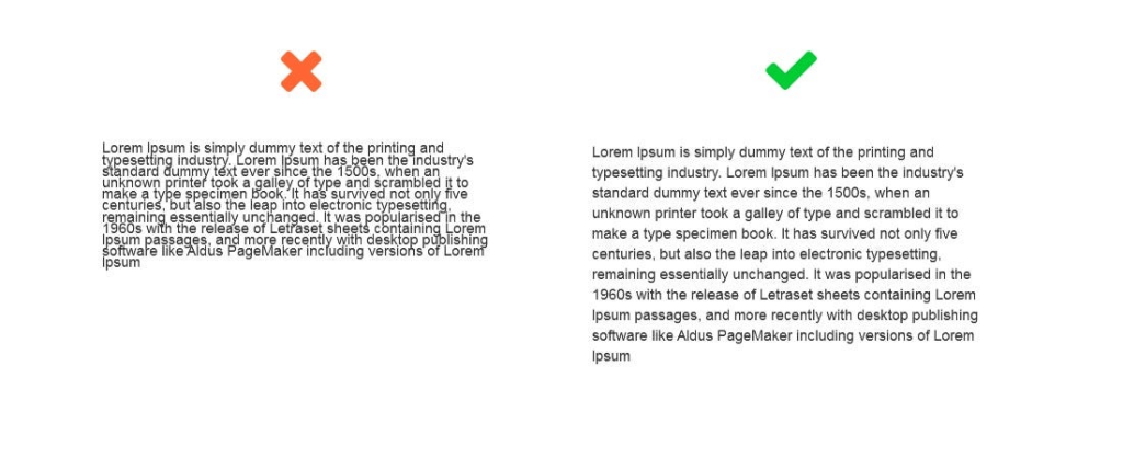
One of the more interesting elements about layouts in design (to me), is the use (or not) of white space. Until now, I didn’t realize how controversial white space can be in the design world. Some love it, some hate it. To me — it works. You know when people say less is more? That’s the vibe white space gives. Let’s talk about it.
White Space 101
White space is “the area between design elements”. The space between the lines of this blog, for example. Or the space between the title and headers, and the other words, throughout this post. While “white space” sounds like it should always be white, white space can actually be any color, as long as it’s void of any text or design.
Let’s look at a few good and bad examples of white space. This photo of some text, for example, shows just how powerful white space can be when reading.
In the example below, both ads have the exact same copy and image, but the use of white space is different. Which one looks better? You guessed it — the one on the right makes much better use of white space. It looks more elegant, cleaner, and luxurious.
To simplify, here are a few things to consider when it comes to using white space in design:
Legibility: make sure you use enough space between letters and words where it’s readable.
Tone and branding: what are you designing for? A spa that advertises relaxation and simplicity, would benefit from using lots of white space in their designs.
Focus: where do you want the reader’s eyes to go? Use white space to direct them.
White space is your friend! Remember this the next time you design something.
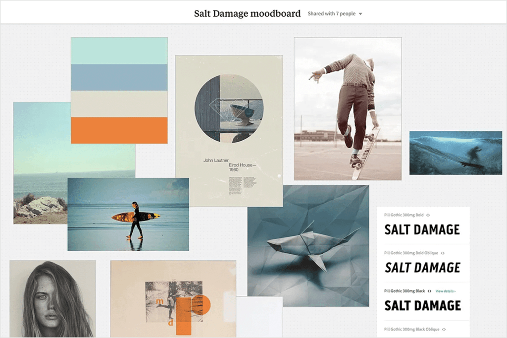
I’m a much more creative person than analytical, and making mood boards has always been one of the most fun and expressive ways to explore different colors, textures, and “vibes.” Mood boards are like modern scrapbooks (which I also love)—they help tell a story or communicate a feeling without needing any words. Pinterest is basically a giant mood board in itself and one of my favorite platforms for curating visual inspiration.
In UX, mood boards help visually align the team on the emotional tone or aesthetic direction of a digital product. For example, if you’re designing a travel website, you might use images of sandy beaches, cozy mountain cabins, airplane windows, friendly typography, and warm, inviting colors. Each element contributes to a collective feeling—adventure, comfort, escape, excitement.
As you’re adding items to your mood board, try to strive for unity. You want everything to convey that specific feeling your searching for, and to compliment each other in different ways. You’ll also want to prioritize a hierarchy of items when making your mood board. Make the more important elements larger, and less important elements smaller.
Mood Boards in Marketing
Mood boards are huge in marketing. They’re often used early in a campaign to help define the brand tone, messaging, and visual style. Before a single social media post is written or a video is filmed, creative teams will often build out mood boards to make sure everyone is on the same page.
Think of a campaign for a sustainable clothing brand. The mood board might include earthy tones, soft textures like linen or cotton, serene nature scenes, and clean, minimal typography. That mood board then informs everything from the website layout to the social ads to the packaging.
I’m an avid mood board creator (as you may have picked up on at the beginning). I use Pinterest to make different mood boards—also known as Boards on the platform—to envision the exact vibe or goal I want to manifest. At the beginning of every year, I usually create a new board and start pinning photos, quotes, colors, and visuals that align with what I want that year to look like.
I’ve also created mood boards for more specific events—party planning, trips, home decor, you name it. They’re not just for professionals or designers—they’re for anyone who wants to create with intention. Whether you’re visualizing your dream apartment or brainstorming a brand identity, mood boards are a great way to bring an idea to fruition.
Color is more than just a visual experience — it can shape our emotions, perceptions, and even behaviors. The study of this phenomenon, known as color psychology, explores how different hues influence human behavior and responses.
Color in Marketing and Branding
Research shows that color can affect human behavior. For example, it can alter the way we experience taste. A drink may seem sweeter in a red cup than in a blue one, and food served on a white plate may appear tastier than if it’s on a dark plate. Marketing professionals have taken the information we have on color psychology and used it to their advantage. Brands use color strategically to evoke specific feelings and drive decisions. For example, blue often conveys trust and dependability, which is why it’s a favorite among banks and tech companies. Red creates urgency and excitement, which is often used in sales in stores. Green can suggest health or Eco-friendliness, making it a go-to for wellness brands.
Color Across Cultures
However, the effect of color isn’t universal. Personal experiences, age, gender, and cultural background all influence how we interpret colors. While white may symbolize purity in Western cultures, it can represent mourning in parts of Asia. Similarly, men and women may respond differently to certain hues, and children may associate brighter colors with fun and playfulness.
Understanding the psychology of color isn’t just useful for marketers or designers — it can impact how we decorate our homes, dress for an interview, or even choose which apps to download. By recognizing the emotional and behavioral effects of color, we can make more intentional choices in how we present ourselves and engage with the world.
The Influence of Color
In a world flooded with information, color stands out as a subtle influence. Whether it’s the red “Buy Now” button that nudges you to make a purchase or the calming blue walls of a therapist’s office, color works behind the scenes to shape how we think, feel, and act.
Kony 2012, as you probably remember, was a video created in 2012 to shed light on the horrible things happening in Africa — Joseph Kony, a cult leader and war criminal, was head of the Lord’s Resistance Army, who abducted children and forced them to become soldiers. The video showed graphic and disturbing content, and followed Jacob, an African child who lived his life in fear of being abducted by the LRA. It was heavy, emotional, and garnered millions of views in a short period of time.
The Viral Video That Shook the World
In 2012, I was in 6th or 7th grade, and watched Kony 2012 for the first time with a few classmates. I felt sad for the children in Africa, who were the same age as me, but living completely different lives than my classmates and I. They woke up every day and lived in fear of becoming child soldiers, while my biggest problem every day was probably what I was going to wear to school. Kony 2012 ignited something in my classmates and I where we felt like we had to participate to spread awareness, and we headed down to the computer lab to print posters of Joseph Kony to hang around the school. One of the main goals of the video was to make Kony a household name, so everyone would know who he was, which would hopefully incite more change.
That’s all I can remember about my participation in raising awareness for Kony 2012. And I think many other people felt the same way. Besides sharing the video, purchasing kits that contained bracelets (among other things), and hanging posters, there really wasn’t anything tangible to do that would guarantee change. I quickly forgot about Kony 2012, and had not thought about it again until this week.
Lessons in Virality and Digital Activism
Watching it over this week, I still felt sad for the children in Africa. But I thought, “they had to have captured Joseph Kony by now, right?” Wrong. Joseph Kony is still hiding out somewhere in Africa. While Kony 2012 captured the attention of millions of people, it didn’t create the long-lasting change they’d hoped for. Nonetheless, it taught us how powerful social media can be in creating change.
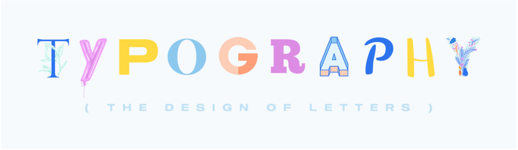
I had never really given much thought to typefaces until this week. It wasn’t something I paid much attention to. But after being introduced to the world of typefaces, fonts, and everything in between, I realized how much they play a role in brand identity.
Discovering the Power of Typefaces
Some typefaces are instantly recognizable. While scrolling through typefaces online, I came across one that felt extremely nostalgic. If you grew up in the early 2000s, you are probably familiar with the children’s book,Don’t Let the Pigeon Drive the Bus! by Mo Willems. The cover’s iconic typeface is seared into my memory. The moment I saw it, I felt 5 years old again. I hadn’t thought about that book in years, but with just one glance at the typeface, I could picture the cover perfectly. That’s when I realized how powerful typefaces really are.
The Cover of Don’t Let the Pigeon Drive the Bus! | Source: Mo Willems
Typefaces have a unique way of shaping how we interpret content or a brand. For example, think about the Harry Potter series, which is another nostalgic brand for me. The recognizable lightning-bolt-inspired typeface used for the book titles and movies is now synonymous with the franchise. Without even seeing what something says, most people would immediately associate the typeface with the franchise. It’s a perfect example of how typefaces become deeply tied to a brand or cultural phenomenon.
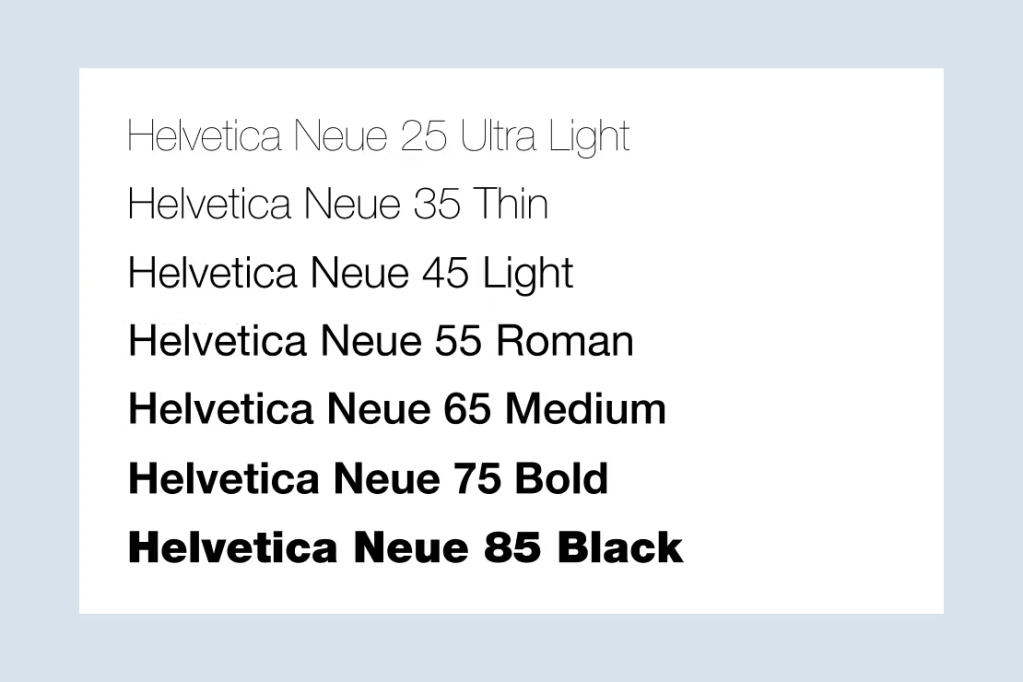
Typefaces vs. Fonts
Up until this week, I had always used the word font to describe what I now know is a typeface. Turns out, there’s actually a difference. A typeface refers to a font or font family with various widths and weights, but same overall style. A font, on the other hand, is the style of the typeface within that family. In the image below, the typeface is Helvetica Neue, while the fontsare all of the variations —like Helvetica Neue 25 Ultra Light is a font, the same way Helvetica Neue 85 Black is a font. Make sense?
It’s interesting how something as subtle as typeface can evoke such strong emotion and memories, all while playing a role in shaping how we perceive brands. “Well-chosen typography can enhance the brand’s image, making it more memorable in the minds of its target consumers.” When you think about some of the most memorable typefaces, you might think of the Nike typeface, Futura Bold Condensed. It’s bold, energetic, and strong. Or, you might think of writing a paper in APA format and making sure the typeface is Times New Roman, which is slightly decorative and easy to read. Different fonts convey different meanings, and each one is unique.
Typefaces = Brand Identity
I never thought I’d care much about typefaces, but now I can’t stop noticing them. They’re everywhere — on book covers, logos, websites — and they’re important to a brand’s identity. Whether they spark nostalgia or make a brand instantly recognizable, typefaces have a subtle yet powerful influence. They’re a reminder that even the smallest details make a difference in brand story and identity.
Social media is used by many to learn, share information, and connect with others. It’s also a place that can be used to create good in the world, given its many capabilities. Have you ever cared about a movement or a project that you wanted to advocate for but didn’t know where to start? Or what about simply sharing an opinion you think could benefit others? Let me explain.
Social Media Activism 101
Social media, in addition to ways you’re probably already using it, can be used to participate in movements you care about. It can be used to call on communities, spread awareness, and inspire action throughout society. Social media creates a sense of a “digital village,” where someone can post something that others might agree with and support, thus mimicking a sense of closeness with community. If you can reach millions of people just by posting one TikTok of you eating your lunch, think about the impact that might have when using it to advocate.
Nicole Reiley, a writer for University Times, explained how we most often use social media to advocate: “Every day on social media, it is not uncommon to see various forms of advocacy at work—whether raising awareness about the war in Gaza, educating people about reproductive rights, or promoting sustainability measures. Viral hashtags can now educate communities about human rights, underrepresented groups, and address pressing political issues. This can be done from anywhere in the world, without the barrier of geographical distance.”
The Dangers of Slacktivism
While social media can most definitely be used for good, we also must address that there’s a fine line between activism and “slacktivism.” Slacktivism is a term used by some to explain how when people choose to participate in some sort of movement (especially on social media) they might repost a hashtag or an Instagram photo, and believe they’ve done all they can. done. Posting a black square on #BlackoutTuesday, then never speaking on the issues of racism again, is an example of slacktivism.
Make Your Posts Count
As we continue to learn and evolve as a society, we must learn how to effectively communicate and advocate for causes we care about. If there’s some sort of movement or topic you feel compelled to support, but may not fully understand, I challenge you to take the time to do some extra research. Understand how to best support each movement. Ponder on information and form your own opinions. Advocate with care.
When you take the time to think about it, there are probably lots of brands you can think of that would benefit from a re-brand, or update to their brand identity. Some brands are timeless, which of course is the goal, but there are other brands and companies that weren’t necessarily thinking about longevity in the infancy of their companies.
This week, I was taking some time to think about brands that I come into contact with often. I’m a frequent restaurant-goer, and live in a very small part of Connecticut. It’s full of locals, and some of the brands and companies that I see or visit often, have probably never thought about branding to a wider audience. Until now, there wasn’t ever a need. With social media at the forefront of just about everything, it’s important that companies and brands are continuing to stay up-to-date with trends, while also having an active social media presence. When it came down to it, after thinking about all of the small and medium local businesses near me, I thought the one that would most benefit from a re-brand is a restaurant called The Courthouse.
The Courthouse has been around for 20+ years, and it shows. While the food is pretty good, the menu is extremely large and lacks direction. The building is a beautiful historic “block” (it used to be referred to as the courthouse block, because it actually was a courthouse in the 1800s), built with bricks and large storefront windows. The restaurant itself doesn’t get a lot of light inside, but I think they could use this to their advantage (more on that later). The ceilings are high and there’s lots of wood, but it’s stained orange, and the decor is extremely lacking. Even the TVs inside look like they’re from 2010.
I’m not here to shame The Courthouse, but instead propose how it could be rebranded to feel a bit more upscale, remain a local favorite with families, and stay relevant in the ongoing restaurant competition in downtown Putnam, Connecticut.
Logos and Why They’re Relevant
Logos are everything. They’re the face of a brand. They should encompass details of the brand and be recognizable. One of my favorite logo designs is one that everyone knows.
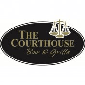
Let’s start with The Courthouse’s current logo. It’s clear and bold, which makes it feel traditional. The black, while also bold, feels a bit heavy. The justice scales are great for a courthouse theme, but even those feel outdated and “blocky”.
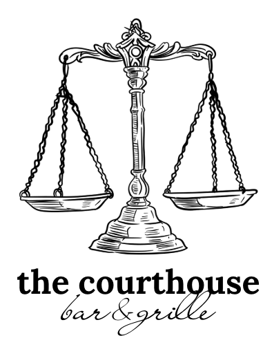
With a new logo, I wanted to convey the same courthouse theme, but make it feel a little more chic and upscale. If the restaurant is going to be updated, the logo should feel that way too. The justice scale has a more vintage feel, with lots of detail. I kept “The Courthouse” in all lowercase, to make the restaurant still feel casual, but mixed with the calligraphy typeface, feels a little fancier at the same time. I stuck with black and white for the first logo mock-up, but also think dark navy, which is included in the color palette rebrand, could be the primary color used for the logo.
Moving Forward
I’m extremely excited to continue documenting this restaurant rebrand, especially because it’s a local business. With an updated brand and more refined feel, the Courthouse is on it’s way to becoming the best restaurant in Putnam.
There’s good and bad in every situation. Social media, for example, has both strengths and weaknesses that add or take away from society in different ways. In this post, I’d like to focus on the goodside of social media.
Activism in the Digital Age
Where there’s social media, there’s activism. After the pandemic in 2020, many people took to social media to participate in movements like Black Lives Matter and #BlackoutTuesday. On #BlackoutTuesday, millions of people posted black squares in solidarity of ending police brutality and racism, and also added #BLM hashtags. While the intent behind the trend was meant to show support, it backfired and ended up doing the opposite. Many people felt like all they had to do to show their support was post a black square and their participation ended there. It also inundated hashtags and social media with so many black squares, that people couldn’t find real, useful information on how to support black people and ending racism.
Social media is powerful, and almost everyone in the world has access to the Internet. It allows us to share information and ideas, learn, and connect with people that we may have never crossed paths with. I’m hopeful that in situations similar to the #BlackoutTuesday movement, that we can continue to learn to do better as a society. Whether good or bad, the movement sparked conversation and encouraged people who wouldn’t ever speak about race to speak about race. It encouraged uncomfortable but necessary conversations, questions, and ideas.
I posted a black square during the BLM movement, thinking that it was enough. I soon realized though that there was so much more to being an ally than making a single post, and that is how social media can be used for public good. As a white person, I can continue to learn, ask questions, and support the black community, beyond an Instagram post. If others adopt this mindset and realize there is so much more work to do in many areas of social justice, we can use social media for good in ways that would benefit everyone.
Goodreads is a well-known book-tracking platform for book lovers. It’s the most popular platform of its kind and serves as a place for organizing, book reviews, recommendations, and more. Despite its popularity, many users find it cluttered, unorganized, and hard to navigate. This case study explores the research conducted in evaluating Goodreads’ strengths and weaknesses to suggest a more user-friendly design.
At First Glance
The first step in the site evaluation process was simply to evaluate. It was important to take note of common issues and research the problems that users were having on a day-to-day basis. Upon immediate inspection, the website felt cluttered and disorganized and had an overwhelming navigation center. There were irrelevant pop-up ads and glitches with the reading challenge, a popular feature that many users like to participate in. Goodreads and its competitors were also researched in this step. Even though Goodreads is the most popular, it lacks up-to-date features that platforms like StoryGraph use: the ability to make ½ star ratings and book recommendations based on your mood, to name a few.
Next, personas were created to imagine the different kinds of users that use Goodreads. Also, interviews and surveys were made to learn what users liked and disliked about Goodreads. Most often, users liked the book-tracking and organizational features but disliked its outdated design and lack of personalized recommendations.
Along with the interviews and surveys, a card-sorting test was conducted to help re-work the navigation center. Many of the pages listed in the Goodreads navigation center were repetitive, unclear, and just didn’t make sense. Users were given the freedom to sort the pages in categories where they saw fit, and patterns were recorded to then come up with a navigation center that would make sense to most people.
While the website seems like it’d be easy to navigate, a heuristic evaluation showed the opposite. The site is over-complicated, and the navigation center continues to disappoint. A usability test was also conducted, and results showed that users who were familiar with Goodreads had learned to navigate around the flaws, whereas users who weren’t so familiar with the platform struggled altogether.
Suggestions for Goodreads
After this 6-week evaluation, some suggestions are definitely in order.
Goodreads needs a dedicated “Trending Now” section, instead of plopping new books on all kinds of pages, with no theme or organization
Incorporate AI into their recommendations like other platforms to give a more personalized feel
Reduce ads (or completely get rid of them!) as they’re messy and distracting
Put more time and effort into the back-end of the platform to reduce issues that users are experiencing with website glitches and their devices not syncing
Review filtering should be improved so users can filter through the kinds of reviews they want to see and add a ½ star option for more accurate ratings
Market less towards authors and more towards readers
Combine pages where seen fit. There are too many pages that repeat the same information in a different way
Friend activity tracking should be more accessible and designed less like a social media feed
This project combined various UX research methods to suggest a complete website redesign of Goodreads. In the end, what matters most is that Goodreads prioritizes its readers. Users want to feel seen, heard, and listened to, and Goodreads is not doing that. With a better design, condensed navigation, and more updated and personalized features, it could become a platform that readers truly enjoy.
Have you ever been on a website that has limited usability? Maybe the navigation center is messy, the information is inconsistent, or the website is just plain horrible. With these types of websites in mind, designers had to come up with a standard to hold websites to during the design process. So, they created a test, called the System Usability Test, to achieve more consistency in website design and help others to understand where their websites can improve.
What is the System Usability Test (SUS)?
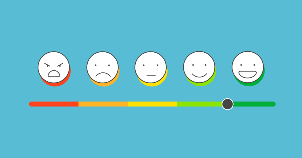
The SUS test was created in 1986 by John Brooke to give a global view on subjective elements of usability. This ten-statement test has become a standard when evaluating usability among websites. Users are given the ten-statement test, and are then asked to rate how much they agree with each statement on a scale from 1-5, exactly like the example shown below.
At the end, each user will receive a score for each statement, which will then be added up to get one final number. The final score will range from 0-100, depending on the usability of the website. I’ll get back to how the scoring works in a minute—this was just a quick overview.
The Ten Statements of the SUS Test
The ten statements of the SUS test can be found online with a simple Google search. The great thing about using this method to gather data is that it’s relatively easy and it’s free. Researchers can tweak the questions if needed, but generally, an SUS test will look like this:
“I think that I would like to use this system frequently.”
“I found the system unnecessarily complex.”
“I thought the system was easy to use.”
“I think that I would need the support of a technical person to be able to use this system.”
“I found the various functions in this system were well integrated.”
“I thought there was too much inconsistency in this system.”
“I would imagine that most people would learn to use this system very quickly.”
“I found the system very cumbersome to use.”
“I felt very confident using the system.”
“I needed to learn a lot of things before I could get going with this system.”
Each user will go through each statement and rate them on a Likert scale from “Strongly Disagree” to “Strongly Agree”.
Adding Up Your Score
This is where it gets a little tricky.
For each odd-numbered statement, subtract 1 from the user’s response.
For each even-numbered statement, subtract the response from 5.
Here’s an example:
“I think that I would like to use this system frequently.” User rating: 5
User rating – 1 = odd-numbered statement score
5 – 1 = 4
2. “I found the system unnecessarily complex.” User rating: 3
5 – user response = even-numbered statement score
5 – 3 = 2
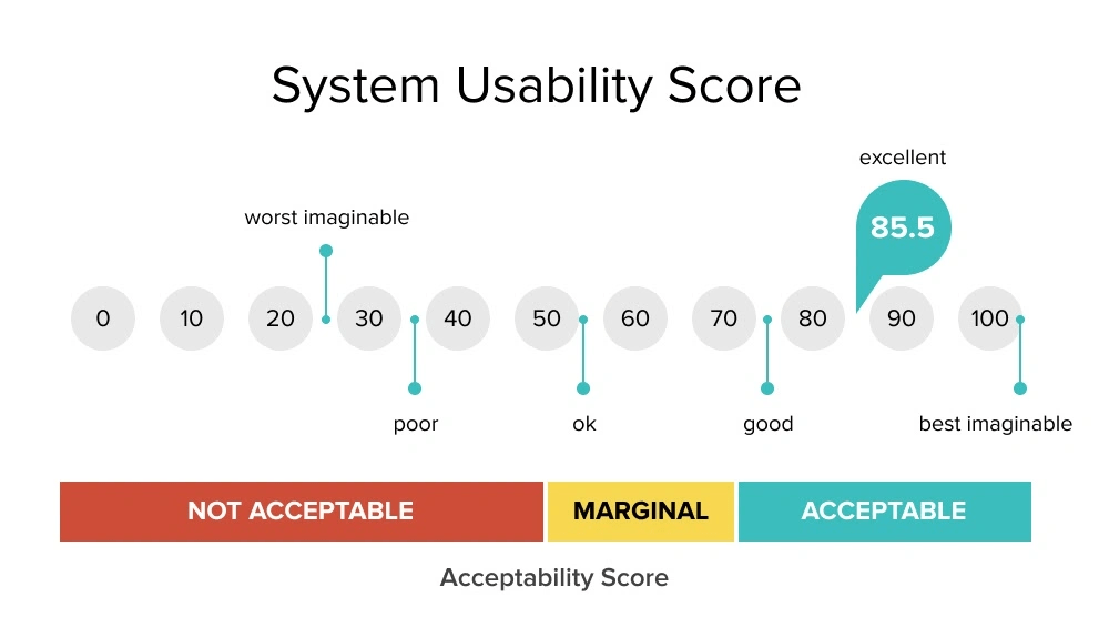
Repeat this process for each question, then add up each score. After that, we have to normalize the score by multiplying the sum by 2.5. That is your usability score. If you’re a visual learner, see below.
The higher the score the better the usability. “Typically, a score above 70 is a good one, while one that’s over 85 is excellent” (Soegaard, 2024). Anything less than around 60, probably needs to revamp their website immediately. The pain points of each website can be highlighted in the results of the test.
When should I use the SUS test?
The SUS test works best for recording data related to the usability of a website or app. It should be given to around 50-60 users to get the most reliable result. It’s a cheap, effective, and relatively quick way to see where your website lands with usability. Designers can use it as a first-time test to figure out the baseline usability sore of their website, or use it to compare different versions of the same website for usability. The lower the score, the more urgency!
There are countless methods and techniques in the UX design process. And no method is right or wrong—it all depends on how you want to refine or change your design to achieve the best result. In my journey of learning more about user-centered design, I decided I wanted to research a method that caught my eye: the Five-Second Test.
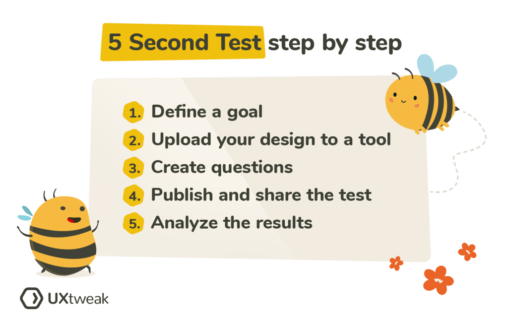
What’s the Five-Second Test?
Research shows that users make decisions very quickly. The five-second test is a method used in UX design to test people’s first impressions. Five-second testing is used to collect qualitative data about a user’s first reaction (Maze.co, 2024). The design process isn’t linear, so prototypes are often made, tested, then changed, then tested again… and first impressions help refine prototypes based on what the user wants.
When using the five-second test, users are shown whatever is being designed for just 5 seconds, and then the image or product is taken away. Then, users are asked questions in a survey that relates to their first impressions of the design.
Some of these survey questions might be:
Can you remember the company(s)/product name?
What elements of the design stand out?
What message did you take away from the design/product?
What part of the design/product did you notice first?
What don’t you like about the design?
Then, change your prototype based off of your targeted user’s response.
The five-second method would not be appropriate for instances where you want the user to use your product or try to interact with your design, as it simply doesn’t offer enough time. It’s for first impressions only.
When should I use this method?
I thought it might be helpful to use some examples of studies or designs that were done using the five-second method, but I couldn’t find many designers or companies who shared the results of their experience with it. However, it’s best to use the five-second method when you’re testing out pages on a website, advertisements or app interfaces.
Next time you’re scrolling on your phone or see an advertisement, test out the five-second method with yourself. See what elements of a design or ad you remember after 5 seconds, and research whether or not it was in the brand’s best interest.
User requirements are the features a product should have to ensure satisfaction from the user (Baxter et al., 2015). In design, it’s important that the products being created are properly serving the targeted users, because that’s what deems a product useful. For example, when I log onto a website to shop for clothes, it’s crucial that the website functions properly. I don’t want a cluttered landing page with flashing headlines. I want the navigation center to be clear and organized. I want the checkout process to go seamlessly. It may even be nice to browse a section where the website puts together outfits for me. I want to order a new outfit (or two!) and leave as a satisfied customer.
In order to find out what’s important to users in the design process, we must conduct user experience research. Different methods can be used to collect data–– such as surveys, focus groups, field studies, card sorts, and more. Once we collect and analyze the data, we can create a user-centered design.
Business Requirements
When designing a useful product, we need to make sure that it also makes sense in business. Believe it or not, business requirements are often confused with user requirements, but these requirements apply to two different groups involved in the design process. “You cannot assume that what the salesperson wants to see in the sales product is the same as what the user wants to see in the product” (Baxter et al., 2015).
Business requirements may be things like features that the marketing or sales team wants to add to a product to help it sell… even if those features aren’t what the actual user wants. A salesperson or marketer might want the product to be #1 on the market, or a tool to give the fastest results, but that isn’t always what’s most important to the user.
Often times, business requirements revolve around money. Think about it this way: you’ve designed a product, with user requirements in mind, but you also want to make sure it sells, right?
Does one come before the other?
I decided to do some of my own research on the relationship between user requirements and business requirements, because I found myself wondering which should be prioritized. They’re both important, but how do you decide which requirements to favor if they differ?
I found a YouTube short that summed it up perfectly. The key is to favor the user requirements. Since business requirements often revolve around money, the product or service needs to sell. So, in order to sell, the product needs to appeal to the user first. Think of the user requirements as augmenting the business requirements.
Knowing this allows the designer to focus on satisfying the user requirements first, thus fulfilling the business requirements of the product or service. But remember—they aren’t one in the same!
References: Baxter, K., Courage, C., & Caine, K. (2015). Understanding your users : a practical guide to user research methods. Elsevier, Morgan Kaufmann.
I’m currently writing an article on the WNBA and the rise of women’s sports. It’s something I’ve always had an interest in—but lately, the industry has been booming. In order to promote my article, I’ve made 3 posts that will go up on social media to encourage sharing, but each post has a different technique as far as copy and graphics.
Instagram
For Instagram, I wanted to keep it short and sweet. I chose to use one black and white image (no carousels, because I find that not everyone scrolls through them. I want to catch their attention right away). Everyone knows Caitlin Clark, So I thought the black and white, plus Clark, and the bright orange text might make someone stop. I took inspiration from some of the magazine accounts I follow who post on Instagram with links in their bios leading to the articles. I wanted to give some detail, but keep it “mysterious” to encourage them to click on the link to read.
Facebook
I associate Facebook with the older population. It’s not that young people don’t use Facebook, but it seems to be the most-used among older adults. I wanted to create a short post, with a video to capture their attention. The link to the article is located within the post, so the audience doesn’t have to navigate anywhere else to find the article. I thought a video might encourage Facebook users to stop and look. I want the focus to be more on the video and not on the copy. Keep in mind that if this was actually posted on Facebook, the arrow would not be there and the video would automatically start playing should the user hover over this post. (The actual video sample is here, on here, on Canva).
LinkedIn
While we associate LinkedIn with professionalism and business, I wanted to mix in a casual tone with my post. I kept the voice mostly sophisticated, but wanted to add a personal touch in saying that I was proud of the work I did on the article. Similar to Facebook, my LinkedIn post had a link to the article directly within the post (Instagram—when are we adding this feature?). The copy in this post was also longer than on Facebook and Instagram, as I’ve found that when users are scrolling through LinkedIn, they’re prepared to read a bit more!
I’m prepared to actually share my LinkedIn post when my article is completed. Different social media calls for different techniques, and it’s important to lean into each a little differently.
I set a reading goal for the beginning of 2024 to read 52 books. I underestimated how hard it was going to be for me to stick to my goal. I’m ashamed to say that I’m now at about 9 books completed for this year. I’m so disappointed and have found myself scrambling to finish as many books as possible before the new year in attempt to make myself feel better.
The problem is that I’ve found it hard to find books that hold my attention. I’ll start a book and make it a quarter of the way through (sometimes even half!) and I just get bored, and won’t finish it. After contemplating why I tend to do this, I think another reason was probably that I don’t have enough time. And I hate that excuse. But here’s what I’ve done to overcome that.
Habit-Stacking to my advantage
I came across this new thing called habit-stacking. It’s where you stack a few things you need to get done—and do them at the same time— to be as efficient as possible. In my case, I started listening to audiobooks while I was driving, cleaning, cooking, showering — you name it. I thought I could try to finish as many books as possible, while doing the things I’d already be doing.
Writing for the ear
I came across an article about writing for the ear. “When you are writing for print, ideas and stories are communicated in a visual-linear mode which engages logic and thought. The kind of writing you do for a listener is quite different than when writing for readers. When writing for the ear, follow the ABCs. Accurate. Brief. Clear.” (Swenson, 2017).
This got me thinking if I was even absorbing any of the information I was listening to, rather than if I’d actually read it. Audiobooks aren’t necessarily written for the ear. Books are written to be psychically read, while cozied up on the couch. While I feel like I’m doing the right thing by listening to as many books as I can to read my goal, is it worth it if I don’t even retain the information?
I wonder if at one point in the future, books will be written to be listened to. Podcasts are formatted to be listened to, as well as radio shows and news broadcasts. Will authors ever decide to write book in an audiobook format? Will it change the way we read? With AI on the rise, I’m curious to know what the future of books will look like.
After beginning On Writing Well, by William Zinsser, I started reflecting on my life as someone who’s always considered herself a writer. My earliest memories involve me having some kind of journal, where I’d write about my days at school and talk about memorable moments that I wanted to remember. As time passed, these moments ranged from concerts, holidays, vacations, the birth of my sister (my favorite—I was 12, and it was on Easter that year), graduations, breakups, and everything in between.
Over the years, I began adding pictures into my journals. I’d print them from my phone, take Polaroids, and kept receipts or other memorabilia to glue into the pages. Some of my favorite pages to look back on are where I kept to-do lists. I’m able to look back on not only what I was thinking about that day, but what I had to do. My to-do lists from high school are vastly different from my to-do lists now. I love being able to see the natural progression of my own life.
In high school, I enjoyed writing essays and English assignments. My school was very small, with not many teachers, so I had the same English teacher my freshman and senior year—Ms. Williams. She was always serious and came off a bit cold at times, but you could tell that there was warmth beneath the surface. I think I’d only seen her laugh a handful of times. She cared about what she taught and it showed.
Ms. Williams ingrained a few rules about writing in my brain that I will probably never forget. We could never use first person in our writing. It felt so freeing anytime I’d had an assignment where first person was allowed. She taught us how to structure a thesis at the end of an introduction, and we had to follow this format no matter what:
“One can see why/how this argument is true (for example) by analyzing xyz.”
That used to frustrate me. One? Who is that? In On Writing Well, Zinsser, he states, “I don’t want to meet “one”—he’s a boring guy.” She also hated when we used the word “it” as she felt it was unclear. For example:
Ms. Williams was also the only teacher to give me a detention for going to the beach on senior skip day. On Writing Well has me questioning rules about writing that I believed to be true. I’ve never read a book about writing, so maybe his opinions aren’t necessarily unique, but they’re new to me. I’m excited to continue reading this book and learning more about writing to become a better writer. So far, I’ve learned that it doesn’t have to be that serious. Write for you, not an imaginary audience. I’m thankful I have years of journals to look back on and know I’ve improved as a writer since my middle school journals, maybe thanks to Ms. Williams.
Mia is probably one of the most indecisive people you’ll ever meet. As early as she could remember, she never knew what she wanted to do when she “grew up” and struggled to figure out which college to attend. Looking back now, she can see how everything fell into place to make her who she is today.
Where It All Began
Mia grew up in rural Connecticut, played soccer, and had a great group of friends. She was always interested in content creation and liked to create things independently—whether that was writing, scrapbooking, making birthday cards, cooking, or redecorating her room.
On a weekend trip to Cleveland, Ohio
A Husky for Life
By the time high school was over, Mia decided to attend the University of Connecticut. She liked the idea of being close enough to home but far enough at the same time. She was drawn to the love of sports that the UCONN culture carried with them. Long story short—she loved UCONN. Unfortunately, her time at the university was cut short by COVID-19, and she was forced to finish her undergraduate degree at home. Mia graduated with a BA in Communication in 2022 and quickly jumped into the professional workforce.
Driven by her love for creativity and writing, Mia scored an internship at a marketing agency in Cheshire, Connecticut, where she wrote copy for the content team. While this internship gave her great experience, she found that once it was over, she struggled to stand out in the job market. She completed another short internship editing for a digital magazine but still felt she needed more experience to prepare her for the workforce.
Grad School It Is
Mia began researching for the perfect fit for grad school. After months of research and lots of deliberation, Mia settled on Quinnipiac University’s Interactive Media and Communications program. She is now almost done with her first semester of grad school and is enjoying every moment of it. She plans to eventually enter the world of sports journalism or into the world of editorial work (she can’t decide on that either, so whatever falls into place). Mia is so excited to see what opportunities come her way during and after this program and plans to make the best of it post-pandemic. She’s currently waitressing full-time while in the program. In her free time, Mia enjoys reading, writing, being outside, hanging out with her friends, family, and dogs, and listening to Taylor Swift. She also loves traveling, going out to dinner, and trying new foods.
Writing has always been something I enjoyed. And I always felt like it came easy to me. I was never intimidated by essays or assignments where lots of writing was expected. The assignments I dreaded most were ones that involved math or science.
I’ve never thought about how I write or why I write. I just write. And to ponder all of the logistics that come with writing online is a new feeling for me. I was thinking about “readability” and what makes one thing easier to read than others. It’s not just about the text– it’s about how the text looks on the screen and other elements, like photos, that draw in the reader.
What makes online text easier to read?
Anyone can write. But writing well is what makes you stand out. This day in age, everyone is moving fast. We all have things to do and places to be, and we rarely stop to read anymore. Less and less people can focus long enough to get through an article or read a chapter of a book. More of us are prone to scanning, where we scroll quickly and try to pick out the important pieces. It’s gotten to a point where we have to tailor the way we write to make the content more digestible.
The Basics of Writing Well Online
A few things I learned to keep in mind are below:
Spacing between paragraphs is helpful to not overwhelm the reader.
Bullets, lists, or numbers are great for skimming.
Minimize the amount of words you use to keep readers engaged.
Subheaders!
Make sure your font is large enough.
Use pictures throughout.
The larger and cleaner the margin, the better (for the most part).
Moving Forward
As someone who writes for fun, and posts her work online, these are all important things that I never really considered in my own work. It’s an aspiration of mine to be someone who writes well. One day, I hope to write a book (maybe a memoir?), but for now, I think it’s important to know how to write online. When society is chronically online, it’s a crucial skill to have.
Customer journey maps are a tool used by many designers to learn more about their users and understand what may influence their decisions, and their journeys with specific products. With a customer journey map, the story is supposed to be told from the user’s perspective in a way that will inform designers. They’re useful to display information found when research is gathered.
Elements of a Customer Journey Map
According to UX Mastery, a customer journey map must have the following components:
Personas: Remember when we talked about personas? They’re the main characters in the customer journey map.
Timeline: How long is the process?
Emotions: What emotions does the user (or persona) run into during different moments in the process? What feelings do they feel when they cross paths with your product?
Touchpoints: Anything that the customer is doing.
Channels: Where does the customer come into contact with your product? In person? Online? And in what context?
Honorable mentions also include moments of truth and any supporting characters. Moments of truth can be any “eureka moment” that the customer will likely remember. It’s something that causes frustration or anxiety. Any supporting characters are exactly how it sounds— it’s anyone else involved in the decision-making process.
When creating my customer journey map, I wanted to walk through a routine that I go through often. For me, that’s getting coffee in the morning. I often make coffee at home, but when I do decide to buy one, there’s a lot of thought and context that goes into my decision making.
Where do I want to go? What kind of coffee do I want? Do I have any coupons? Am I hungry too, or do I just want coffee? How much time do I have? Should I order ahead of time or when I get there? Do I want to go inside or through the drive-through?
In my map, I included my entire routine, as well as a persona, moment of truth, touchpoints, and emotions I often feel while waiting for my coffee. The journey map helped me identify where I come in contact with Starbucks most, and issues that I often run into when I go to order coffee. I realized that the best way to go is to always order ahead of time. But, I’m always happy with my cold brew. If you’d like to see my journey map in full swing, look below! ☕️
Have you ever tried to come up with something new— an idea, design, or opportunity— to feel like you keep drawing blanks? Like your brain simply isn’t doing what it needs to do? No matter how hard you try, you just feel stuck? It’s not just you. Most of us have faced this situation once or twice. Here are some ideation techniques to help spark new ideas, or at the least, get some wheels turning so you can start making progress.
What is Ideation?
According to Interactive Design Foundation, ideation isat the heart of the design thinking process. There are literally hundreds of ideation techniques, such as brainstorming, brain-dumping, sketching, SCAMPER, and prototyping. Ideation involves taking ideas from your conscious and subconscious mind, to come up with the best solution. In other words, let your mind run wild! Let’s discuss a few techniques in detail.
Brainstorming
Brainstorming is probably the most common ideation technique. I can think back to my early school years and remember my teachers introducing this concept. In my eyes, I’ve always just thought of it as a fancy term for bouncing ideas around (by yourself or with others), to come up with a solution. During a brainstorm, you should be able to share ideas without fear of judgement.
Sketching
Sketching is a great way to bring ideas to life. Visuals sometimes help come up with new ideas a bit better than words do. Your sketches don’t have to be pretty, or well-thought out. It’s actually better if they’re messier and rough, as it leaves room for further development and improvement. Sketches are also great for sharing ideas with others.
Analogies
Using analogies to spark new ideas is exactly what it sounds like. The idea is to come up with similar situations or concepts, and build off of ideas that pop up. To me, using analogies sounded a bit weird and like it could be considered copying, but some designers believe that “all design is re-design.”
Ideation on Nike Training Club App
I wanted to see the above techniques in action, and decided to use them to come up with new ideas for a few different workout apps. I analyzed and compared three different workout apps and created two POV statements for each, after I collected enough data on user experiences. Then, I brainstormed, sketched, and analyzed each POV statement to try to come up with an idea to solve each statement.
The Nike Training app for example, had some issues with users feeling like it wasn’t beginner friendly. Users also wanted a way to track their previous workouts in a calendar form to stay organized and even plan future workouts.
POV Statement: Users who like to plan their workouts need a calendar feature to view their history and future workouts because there’s no way to see what they’ve completed, or the ability to track progress.
And here were my 3 different ideation techniques in action:
Notice how they differ? And how each technique comes up with different ideas? Off of one POV statement, I was able to build 5+ new ideas using just three techniques.
Try some of these new techniques if you’re feeling stuck, and I can almost guarantee that you’ll come up with something new. If you’d like to look more into my presentation on ideation techniques on my POV statements from last week, see below.
Over these last few weeks, I’ve done a lot of thinking about tech, society, and how it’s changed how we behave. And right now, we only know its short-term effects, as the more advanced technology hasn’t come about until recent years. The rise of artificial intelligence is something that I, personally, have troubling comprehending.
AI can do everything that humans can — but faster, and maybe in some situations, better. It can create images, and stories, gather information, answer questions, and more. There seems to be no limit to what it can do.
I didn’t even know this was an actual thing until I read this journal. He Jiankui (a scientist) and his team, used CRISPR technology to disable the CCR5 gene in two babies, which enables HIV infection. While I think his intentions were fair, it’s up for debate on whether this practice is ethical. The babies couldn’t consent in embryo, and we don’t know the long-term effects of disabling this gene. What if it causes other problems in different areas? What’s even crazier to me is that “CRISPR-Cas9 has made it possible to add, delete or replace genes, thereby opening the door to new types of genetic interventions.” Our technology has become so advanced to the point where we can change, edit, or delete genes. Whoever thought this would be possible?
It’s overwhelming to think about the types of advancements we’ve had in technology lately. I can’t imagine a world where we have thousands upon thousands of genetically modified babies walking the planet. On the bright side, technology is so advanced that as a society, we can learn to use it for good. He Jiankui ended up serving 3 years in jail for performing “illegal medical practices,” but so far, the two babies are still healthy. Do you think that’s a fair punishment? Or that genes should be allowed to be modified? Do the benefits of technology outweigh the risks? I’m not so sure.
A crucial part of the design process involves understanding the user’s point of view. Up until this point, I’ve covered empathy pretty deeply — but wanted to touch on POV and problem statements in design.
What’s a problem statement and why are they important?
A problem statement is sometimes thought of as the most challenging part of the design process. It forces designers to either come up with a problem statement to solve or focus on a problem statement that’s already been brought to their attention. When you have a clear statement that guides you in the direction of brainstorming solutions, it makes the design process more clear and helps you to stay focused. When you have a clear objective, you’re much more likely to stay on track.
Problem statements aren’t just random words strung together. They have to be well thought-out. There are a few qualities that a successful problem statement should have, according to Interaction Design Foundation. These qualities are to be:
Human-Focused. Have you noticed a theme in design thus far? Hint: the user comes first. 😆
Broad enough to allow creativity. Don’t get stuck in a box! Your statement needs to be focused with room for flow and creativity.
Narrow enough to stay organized. I know, it’s a bit of a juxtaposition. Just don’t go overboard. Keep it simple and to the point.
There you have it! Your POV. I’ll show you an example.
App POVs: Alive by Whitney Simmons
I decided to take a look at a few workout apps, analyze reviews and collect data, then compare their problems to each other. After I got an idea of what worked/didn’t work for each app and what could be improved, I created a POV statement to reflect the user’s needs. One of the three apps I looked at was Alive by Whitney Simmons. I’m a frequent user of this app, and while I’ve had a great experience, it was interesting to see how other users were interacting with the product.
The app is rated 4.9/5 stars on the Apple App Store. It’s a workout app that provides different programs from ones at home to ones at the gym (all for different experience levels). Most users have had a positive experience, but there were also some that hadn’t. There were other users who provided helpful feedback and suggestions to improve the app itself. Here’s some of what they had to say:
In summary, most users loved the app but had ideas to add a nutrition element, a way to keep track of weights/reps, tips on workout form, and more. I took this information and developed two POV statements using the sentence template I talked about before.
Users who like to track their reps and their weights need a feature that automatically recommends or calculates the last weight used because it’s inconvenient to have to look elsewhere or remember what you may have lifted last.
Users who want to track their calories and/or macros need a nutrition element within the app because it’s frustrating to use other apps to track food. If everything was in one place, it would be easier and more worth the money.
The problem statements above reflect what’s important to the user and provides insight on what could be improved. It’s a clear statement that shows the designer what to work on, but allows creative freedom and room for different ideas that would solve the problem.
I analyzed two other workout apps in comparison to Alive; Nike Training Club and Peloton. If you’d like to dive into POV in the design process a bit more, find my presentation below.
As I’ve continued reading Stolen Focus, I’ve begun to think more about ADHD, anxiety, stress, and the internet. Quite a handful, I know. Hari, the author of Stolen Focus, talked about an interview he’d had with Dr. Nadine Burke Harris. Dr. Harris explained how so many children and people are struggling to focus because their brains are focusing on surviving. Not only are we being overstimulated by things like social media and the news, but for some people, traumatic events cause them to constantly be on the lookout for the next shoe to drop.
One heartbreaking story Dr. Harris told was about a boy named Robert who had been abused by his mother’s boyfriend. This happened around age 10, which is when his attention problems started happening. Think about the stress that this causes a child, and then picture that child trying to learn long division in school. Robert’s brain was using all of its energy to detect danger — his mother’s boyfriend — instead of learning new things. It wasn’t his fault he couldn’t pay attention.
Robert was prescribed medication to help him focus in school, but his problems at home were being ignored. Why, as a society, are we ignoring things like this? Why are we ignoring the problems that are happening at home? The real-life issues? It seems like everything now is covered up with medicine or by ignorance.
As a society, we’re given antidepressants instead of meditation and therapy. Drinking coffee instead of sleeping more. Watching TikTok when we could be outside. Not speaking to each other during meals. All of this comes back to the problem that I wrote about in my first blog post — is this really the true human experience? I don’t think it is.
I’ve been traveling a lot these past few weeks. I was in Cleveland last weekend and am in Atlanta writing this post. And I notice the same behavior everywhere. As I look around the airport, everyone was on their phones. On the plane, there are TVs behind every seat. What happened to resting, sitting, and talking to each other? It sometimes feels impossible to escape media and just take a break when it’s all around you, all the time. I’m slowly learning that a slow, simple life seems to be the healthiest way to live. The challenge is, how do we live this way when society doesn’t let us? As a population, we are so used to being inundated with information that it’s hard to catch a break.
I don’t know how we change society as a whole. But, the best thing we can do, is change our behavior for ourselves and those close to us. If enough people realize the true meaning of human connection and life itself, we might be on our way to healing.
I love lists. Grocery lists. To-do lists. Packing lists. Affirmation lists. Homework lists.
I’ve used an agenda for school since fourth grade and I don’t think I could have gotten through my middle and high school years without one. To this day, I appreciate my teachers who would require us to write everything in our agenda as part of the homework assignment. For me, it never felt like work. There’s something about seeing everything taken out of your brain and written on a sheet of paper that makes it seem more accomplishable. At the end of the day when it came time to fill my backpack with books, I’d know exactly what I’d be taking home and what could be saved for later. And the best feeling is when you get to cross something off your list of scribbles (and never think of it again!).
This week, I decided to use an online version of a to-do list/task management system called Asana. I’ve had experience using Asana in previous internships and loved it. I enjoy how you can organize everything. It reminds me a bit of Notion, which is another website you can use for organization and to-do lists. Asana, however, feels much more work- and project-related.
I decided to set up my Asana so that it’s strictly project-focused and separated my schoolwork and business into different folders. I run a small business on Etsy and create digital artwork. It’s something I genuinely enjoy doing because it allows me to be as creative as I please. This week, I had a few custom pieces to create for customers. I used Asana to input each order, the steps I had to take to complete the orders, and the days I needed them completed by. For my custom pieces, I allow for a 3-5 day turn-around time. The due date feature on Asana is great for this!
My favorite overview is the list overview. I love the fact that you can also create subtasks within each task, so you don’t have an extremely long to-do list that instantly creates anxiety. You can hide the subtasks and cross them off as you complete them. Here’s an example of what a list looked like for one of my to-dos:
If you don’t like the list overview, you can choose to switch it to a board view, timeline view, and dashboard view, among many others.
As far as course organization, I created a new folder specifically for the white paper which is going to take a lot of time and focus. Then, I created a separate project folder just for this week but used the calendar option to organize it. Here’s what it ended up looking like:
Overall, I can see myself using Asana week-to-week. The little unicorn explosion that happens each time you complete a task is enough motivation for me to keep checking things off of my to-do list! I’m hoping that as my time as a graduate student continues, I become better and better at managing my time and projects.
When designing a new item, product, or service, it’s helpful to know who you’re designing for. Not only must you empathize with your target audience, but you should also know their demographics, hobbies, who they’re influenced by, and what their day-to-day looks like. These details are crucial because they keep the important part of design (humans!) at the forefront of the conversation. Now, picture this information neatly wrapped in a little box with a bow. These little boxes are called personas.
A persona represents a cluster of users who exhibit similar behavioral patterns in their purchasing decisions, use of technology or products, customer service preferences, lifestyle choices, and the like. Behaviors, attitudes, and motivations are common to a “type” regardless of age, gender, education, and other typical demographics. In fact, personas vastly span demographics.
Companies use personas to help them design for groups of people, rather than make a product for one person with one individual problem. Personas are either made up, or created based on patterns found after conducting research. There’s no “right or wrong” when it comes to personas, and there are a few different versions of them.
Goal-directed personas. These kinds of personas are developed to focus on one thing: what does the user want to achieve with my product? What are some issues that the user might run into? How do we move through these issues? Basically, how can they achieve the goal we want them to achieve, with our product or service?
Role-based personas. Role-based personas are a perfect mix of goal-directed personas and human behavior. They include lots of data and focus on the user’s role in the process.
Engaging personas. Engaging personas take into consideration the emotions of the user, as well as their psychology and behavior. Designers use engaging personas to make them seem more “real” to inspire more ideas.
Fictional personas. Fictional personas are exactly how they sound – fictional. They come from experience, assumptions, and sometimes stereotypes of the people creating them. Many argue that these personas can be flawed because they’re not based on data. Although this may be true, I think fictional personas are the most fun to create and work with.
This week, after creating a few personas based on my A&F website analysis, I realized how much more difficult I found it to create one around myself, rather than make one up. It took me a while to pinpoint what I thought was worth including and what might be better left out. For some reason, this was probably the most difficult exercise for me in the graduate program thus far, and I’m not exactly sure why. While I appreciate the use of personas, I do know that there are designers who feel that they’re sometimes unnecessary.
Whatever your opinion is on personas, I believe that they’re useful to get your creative juices flowing. Next time you’re engaged in the design thinking process, give them a try.
And, if you’d like to take a look at my personas I created for A&F, they’re embedded below.
Do you ever wonder what might happen if you took a break from social media? Would you feel any different? Worse? Better?
I was inspired to take a break from a social media app for 5 days. At first, I decided I was going to give up Instagram. But after more thought, I had to admit I wasn’t being honest with myself about what would be the most challenging. If I was going to give something up, I wanted it to be worth it. Although I love Instagram (it’s probably my favorite app), it’s not the app I find myself wasting a ton of time on. That app is the one and only… TikTok. There’s something about scrolling TikTok — the endless feed, the quick videos, the ability to pick and choose what you want to watch. I could scroll for hours. And I know plenty of people that feel the same way.
I collected data on my phone using my notes app, including how many times I had the urge to scroll. I love getting to the end of my day, lying down in bed, and knowing I can just scroll TikTok for as long as I want. The problem is that I will scroll for hours and hours when I should be sleeping. The dopamine-seeker in me doesn’t care about sleep even when the clock strikes 12 am, and I have to be up for 6.
I also have an Oura Ring which I’ve been wearing for about a year to track my sleep. It’s one of my favorite wellness-related investments I’ve made. It not only tracks sleep, bur also your readiness for the next day, recovery, and workouts. On nights where I’m scrolling for a long time, I don’t get enough sleep and therefore don’t recover well. I recorded all of that data from the 5 days prior and 5 days during my experience. One thing that was most prominent to me as far as my sleep, was that I got to sleep faster when I gave up TikTok. Instead of scrolling, I read my book and would fall asleep within 15 minutes.
The last piece of data I wanted to record was my overall mood. I felt so much happier after giving up TikTok for a short period of time and paid more attention to the world around me. I was traveling this week and enjoyed people-watching on a much deeper level because I knew I couldn’t look at my phone for entertainment. Another reason that I feel contributed to my happiness was the fact that I didn’t procrastinate. Anytime I had a moment to myself, I didn’t sit and scroll. I knew I needed to get things done, so I did them.
Below is a visual representation of my week without TikTok. I challenge you to give up the app that you feel steals your time. Take your time back and see how you feel. You might just love it.
We know that in the design thinking process, the first step is to empathize. As designers, we must think about other human experiences as if they were our own. How can we design a useful product if we don’t empathize with the people using the product? How do we foster better experiences? Think about your target audience and product in a much broader, but deeper sense.
Here’s an example of empathetic thinking in action. As long as you are able, I’m assuming you’ve grown up with the ability to use kitchen tools without any issues. You know how to eat with a fork, cut with a knife, and peel vegetables with a potato peeler. There’s virtually nothing wrong with the kitchen utensils themselves — they serve their purpose, right?
But what if you have arthritis? What if holding kitchen utensils causes pain? Or you can’t move your fingers correctly?
Sam Farber, the founder of OXO, noticed these issues and designed a new and improved peeler, “that was easy to hold and control, no matter the size or shape of your hand or the strength of your grip.” It’s soft to the touch, non-slip, dishwasher safe, and easier to use. Over three decades later, this style of design is still used when engineering kitchen tools. And it all started because his wife developed arthritis and struggled to use her peeler.
How do we empathize like Sam?
Service Safari. This research method gives us a front-row seat to the issues that some people may be facing. It allows us to literally “walk in someone else’s shoes.” Think about following someone throughout their day, and noticing frequent obstacles they might encounter in the wild. What could make their day-to-day lives easier?
Love Letter/Breakup Letter. Write a letter to a product or service that you enjoy. Include what you “value and expect from the objects in your everyday life”. This will show what people really like or dislike about a specific product or service. Then, you can hone in and brainstorm solutions to refine the result.
Co-creation. It’s exactly what it sounds like. Co-creation is especially helpful in the early steps of design thinking but can be effective no matter where you’re at in the process. Bring people together who are of similar demographics, live in the same area, or go to the same school. Discuss the problems they face and bounce ideas off of one another. With lots of different perspectives involved, you might find that you learn much more about your product or service much earlier on. This allows you to keep refining and understanding until you get your product right.
Empathizing allows us to not only be better designers, but better people. It’s important to embrace experiences from all backgrounds so that we can better understand how to solve problems. Empathy is crucial to design success.
I never really thought much about UX Design until it was something I started learning about in school. As a chronically-online society, we’re being psychologically influenced by every website we visit. And when we’re not online, we’re shopping in stores that showcase items with packaging that encourages us to buy. Design influences behavior, attitude, and mood.
Unfortunately (or, fortunately), I’m the type of person who will buy something that looks prettier — just because it’s pretty. I’ll choose the product that’s new, trendy, and aesthetically pleasing over something that might be more reliable but less attractive. This summer, I fell victim to cute packaging once again.
Packaging over Product?
I was on my way to the beach and realized that I had forgotten sunscreen. I stopped at Target on the way, and they had a small kiosk with sunscreens and tanning oils. As I scanned the shelves, the old, trusty Banana Boat or Sun Bum wasn’t speaking to me. And then I saw a new brand, that had nostalgic 80s-inspired packaging and a whipped-cream style bottle. I decided I needed it. I waited in line to cash out and wondered how much it was going to be. I hadn’t even looked at the price. It was $22.00. I looked at my friend, appalled at the price. I couldn’t remember the last time I spent $22.00 on sunscreen. Was it inflation, or was I a victim of pretty packaging?
I wanted to see how the psychology of design translated into websites that I frequently shop on. Then, I picked a website that I don’t ever use. Overall, I found that the website that I tend to favor much more is the website that seems to be more psychologically appealing to me.
Abercrombie & Fitch
There was a much more personal connection for me on A&F’s website. I thought about the fact that it’s a brand that rose to fame in my middle school years… maybe there’s a nostalgic element to it that I don’t realize. But, let’s consider logistics.
A&F’s website was seamless, clean, and easy to use. There weren’t colors, pictures, or carousels flashing in your face. I didn’t come across a single pop-up. I thought it was interesting that when they did want to include color, they used green. They highlighted a limited-time sale on the landing page in green, and the “Add to Bag” and “Checkout” buttons were green. Green brings positive emotions and feelings. It’s most associated with feelings of wealth, nature, renewal, and growth.
The website and brand also offered a variety of collections to make customers “feel a sense of belonging” and “feel a sense of freedom”. These collections included an NFL Collection, Pride Collection, and a collection personalized to each shopper. A&F also offers plus size sizes which aren’t available on every site. When customers feel like they belong, they’re more likely to stay loyal to the brands that they love.
Typography, page layout, personality, and photos were all in A&F’s favor on their website. If you want to read my comparison between A&F’s UX and UI design versus H&M, my presentation is below.
I’m a firm believer in the Law of Attraction. If you’re not familiar with the law, it basically says that whatever you put out into the world is what you’ll get back. The thoughts you think on a day-to-day basis will ultimately show up in your life.
Output positive thoughts, emotions and energy = receive positive thoughts, emotions and energy
This week, after I had read a few articles about reading in general and a few more chapters in Stolen Focus, I was thinking a lot about the benefits of reading and how important it seems to be for our mental health. And then, I was scrolling through Instagram, which brought me to Reddit, and saw this post:
“My husband started reading to me before bed and I am the happiest I’ve ever been with him. We got married very young, and have 2 boys under 3 years old. I am finally out of my postpartum haze… Recently, he started reading to me before bed. I asked him about the book he was reading and he asked if I wanted him to read it to me. It has been one of the most intimate and special things he has done for me. I look forward to this every night now and have already picked out the next book. I don’t want this feeling to ever end.”
I thought to myself; how funny, that I’ve been contemplating the importance of reading, and this post pops up on my feed.
Until I could read on my own, my grandmother used to read to me when I’d stay over her house. I can still picture the covers and illustrations that would lull me to sleep. It must mean something that I can still remember these things and not a random Instagram post that I might’ve come across when I was 15.
Picture this. You walk into Barnes and Noble on a Sunday. You have nowhere to be, no one to speak to, no errands to run. You can smell the coffee brewing at the Starbucks counter. It’s crowded but not overwhelming — there are no beeping cash registers or employees speaking over the intercom. You’re surrounded by books of all genres, paperback, and hardcover. There are comfy leather chairs scattered in various aisles. You browse the shelves until you find a new book, sit down with a coffee, and just read. Phone on DND. Name something better than that. There are very few things that come close to that feeling.
If you have a free moment sometime this week, I encourage you to pick out a new book. Whether that’s in a Barnes & Noble, or in the book aisle at the grocery store. Read with someone you love or by yourself. Take time to destress and immerse yourself in the story. Do that again next week, and the week after, and the week after. Reap the benefits of reading and notice your life beginning to change.
Design thinking helps us create innovative solutions to problems while keeping humans as the main focus. Being a college student can come with pros and cons in different areas, such as curriculum, types of learning, workload, professors, and more. As a student at QU, I was tasked with meeting with a classmate to learn about their unique experience at Quinnipiac. After interviewing them, the goal was to come up with a solution to whatever problem they were facing. It was crucial to follow the process of design thinking.
My partner, Lindsey, is a 3+1 student at Quinnipiac. She’s finishing her final year as a graduate student at only 21 years old. By the end of the program, she’ll have a bachelor’s degree and a master’s degree. Lindsey has been a student at Quinnipiac for much longer than I have, so I felt she was very “in the know” about what needed improvement. Since Lindsey is in the ICM program, the graduate portion is done remotely. This is different from the 40+ other graduate programs at QU, which happen to be held in person.
Empathize
Since this was our first time meeting, we gave each other a quick summary of our education, what we planned to do with our future, and what our lives currently looked like. I couldn’t believe how much work Lindsey had completed in school thus far. I asked how she had managed her time so well — at one point, she was taking 7 classes in one semester! The key to managing her time was to time block and plan for everything. She’d schedule time for homework, dinner, and even when she wanted to take time away from school to go on a walk with friends.
Lindsey works best in a loud environment. Her favorite place to study was the student center at QU. Her friends always knew how to find her, because she’d always be there. The library was always too quiet. She said one of the things that helped her most while in school, was being surrounded by like-minded students who were in the same program. It helped being around other people who were working towards the same goal. Lindsey explained how she made some of her best friends at school during this time.
The main issue that I kept picking up on, was the fact that she missed being in a college environment with her friends. She felt like she was missing out every time she’d get a text or video of her friends showing her what they were up to. Because Lindsey is in the 3+1 program, and her final year is the graduate school portion, she’s finishing her degree(s) at home. Whereas her friends who are completing their bachelor’s in 4 years, are still at school. I immediately wanted to figure out how we could bring Quinnipiac to Lindsey, for her fourth year. How do we make her feel included, motivated, and like she’s having the same 4-year college experience as her friends?
Define
The remote (communications) graduate program is a challenge for Lindsey because she’s used to an in-person learning environment and college experience.
HMW: How might we ensure that 3+1 students in remote graduate programs still have the quintessential, 4-year experience that undergraduates have [had]?
Ideate
I knew that first and foremost, human interaction was very important for Lindsey. I started thinking of ways to bring QU to Long Island, where Lindsey was completing her degree. Or, how do we bring Lindsey to QU (without actually bringing her there)?
I knew that it wasn’t realistic for Lindsey to move back to school, either. And the same goes for many other grad students. I also thought of sports events or other things that might bring people together. But we still faced the fact that Lindsey was hours away.
As you’ll see in my presentation below, once Lindsey and I reviewed a few of my ideas, we decided that the best option would have a co-work type of vibe, and would allow students who were at school or working online, to be able to study together or just hang-out over Zoom.
Prototype
I wanted to create a program that would be accessible on Blackboard, as that’s a platform that many college students already use. I thought of creating a “Study Map” option, where students could see where their classmates were studying. You’d be able to make your location available to whoever you choose. There’d be an option to send invites (or, “e-vites”) to ask your friends to study with you. It would be available for graduate students, undergraduates, students living on campus, and remote learners. To make it more unique, especially for the remote students, there would be an option to add a VR background to their zooms, to make it feel like they were on campus at QU.
Test
Overall, Lindsey liked the idea. She thought the campus map was cool, and liked the interactive features that showed if the person does or doesn’t want to co-work. This way, you wouldn’t disturb others if they want to complete work alone. She thought it might be a good idea to create this outside of Blackboard, but understood why it could work. It might be easier to share assignments/due dates/information if everything was on the same platform.
This idea isn’t perfect and could go through lots of re-runs within the design thinking process. But isn’t that the point? Doing this assignment helped me further understand what design thinking is, and how it differs from other problem-solving processes.
If you’d like to take a look at my presentation, it’s embedded below:
As soon as I picked up Stolen Focus, I resonated with almost everything that the author, Johann Hari, had pointed out. Stolen Focus: Why You Can’t Pay Attention — and How to Think Deeply Again, is a book about how as humans, we’ve lost the ability to focus.
I thought about my life, and how much of it I’d spent behind a screen. I must admit — I’m guilty of taking pictures of everything… because what if I forget? I want to remember the first meal I had on a summer night in Italy, my favorite pieces at the Louvre, and special moments at home with my dogs, boyfriend, and family.
I too, was lucky enough to spend time in Provincetown, Massachusetts, where everyone is accepted for who they are and every waking minute is spent in celebration or relaxing by the ocean. I went every summer from age 8 to age 21. As a kid on the long drives to Provincetown, I’d bring books or a portable DVD player just in case I wanted to watch a movie. By the time I could sit in the passenger seat, I’d scroll Youtube videos, Twitter, and get excited about what photos I could post on Instagram during my trip. Then, I started driving myself to Provincetown. Because I couldn’t scroll while driving, I’d have a “debrief” with my phone once I’d arrived at the hotel. I was curious about all the content I’d missed in the last few hours. And I did this everywhere. I still do.
I wake up, I scroll. I have some downtime before bed, I scroll. I’m eating dinner by myself, I scroll.
Is this what’s important?
The Dopamine Detox We Might Need
I’ve thought about doing a detox of all social media for a little while… a dopamine detox, if you will?
There’s not a lot of evidence that this actually works, but I’d be willing to try.
The Importance of Human Connection
I’ve been doing some reflecting over the past few days, and paying attention to how much I use my phone. I try not to reach for it first thing in the morning or before I go to bed. Sometimes, I look around and see everyone in the room on their phone. I work at a brunch restaurant, and there will often be tables with families or couples who don’t even speak to each other. They just look at their phones. It makes me sad, because what’s more important than human connection?
Here I am referencing TikTok again, but sometimes it really does highlight great things. One of my favorite trends to see is one called “Humans being Humans”. At the end of the day, I’d love for everyone to realize (me included), how important this is. Or this. And staring through a screen won’t get you there.
Society needs to relearn how to be human. To the fullest. Instead of looking to the TV to lull us to sleep, coffee to wake us up, and feeds to scroll while waiting in line, we could be doing anything else. I’m excited to learn more from this book, as it’s already got me thinking about habits in my life that I may want to change. For now, as I head to bed, I’ll be reaching for a book instead of my phone, and dreaming of Augusts in Provincetown.
I learned about design thinking during my first semester of graduate school. As a new student in the program, I couldn’t understand why the design thinking process differed from how someone came up with a new invention. You create a solution to a problem. Test it out. Go through lots of trial and error. Keep working until you get it right.
I thought about the process of design thinking while I was at work; packaging take-out orders, making drinks, and serving food. After contemplation while mixing espresso martinis, I realized that the thought process in design thinking is not solely about fixing an error or an inconvenience, it’s about who you’re designing for. Let me explain.
GE Healthcare is Putting Pediatric Patients First
Esther Han, a Harvard Business School Online writer, wrote an article listing examples of design thinking in businesses. One of the companies she spoke about was GE Healthcare, a medical equipment manufacturer. GE Healthcare created an MRI machine that was seemingly free of any error, but what they didn’t think about, was how children were going to react to getting MRIs done. If you’ve ever gotten an MRI, you probably know that they’re loud, dark, cold, and just plain uncomfortable. Pediatric patients were experiencing extreme anxiety during these scans, which would sometimes result in unsuccessful images.
So, instead of changing the product itself, GE changed the way they presented the product to pediatric patients. Introducing, GE’s “Adventure Series”. Instead of lying down in a scary, loud machine, take a trip to the jungle or explore under the sea. These designs were so successful, that practitioners noticed patients were excited to get their scans completed. Not only did this design improve the anxiety levels of the patients, but it increased the chances of a successful scan.
GE Healthcare’s “Adventure Series”
How Do I “Design Think”?
This exact scenario is design thinking in action. Now that you have an example of what design thinking looks like, we can talk about what the process entails on the back end.
Here are the steps, in no particular order:
Empathize. In other words, how do people experience the problem at hand? Put yourselves into others’ shoes. Pay attention to all of the details that come up when you observe with an open mind. Gather information.
Ideate. Brainstorm different solutions! Bounce ideas off of other people. Think about what works and what doesn’t.
Prototype. Build your idea. It doesn’t have to be perfect, just sketch or create something concrete to present to your ideal audience.
Test. Try out your product or idea with its intended audience. Record feedback. Make changes. Empathize more. Define again. Brainstorm new and improved ideas. Rinse and repeat.
With design thinking, the goal is to empathize with humans. Instead of thinking critically, mix in a bit more creativity and imagination. Challenge yourself to find the best ideas and ultimate solutions.