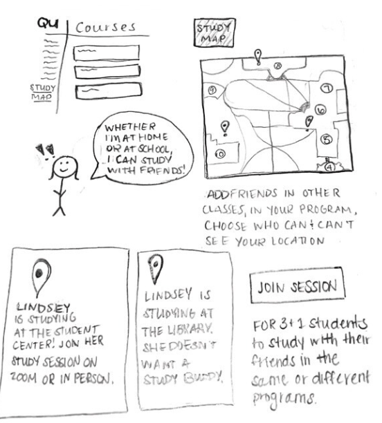
Category: ICM512

  • Balancing User vs. Business Requirements in Design

    Photo by Photo By: Kaboompics.com on Pexels.com

    User Requirements

    User requirements are the features a product should have to ensure satisfaction from the user (Baxter et al., 2015). In design, it’s important that the products being created are properly serving the targeted users, because that’s what deems a product useful. For example, when I log onto a website to shop for clothes, it’s crucial that the website functions properly. I don’t want a cluttered landing page with flashing headlines. I want the navigation center to be clear and organized. I want the checkout process to go seamlessly. It may even be nice to browse a section where the website puts together outfits for me. I want to order a new outfit (or two!) and leave as a satisfied customer.

    In order to find out what’s important to users in the design process, we must conduct user experience research. Different methods can be used to collect data–– such as surveys, focus groups, field studies, card sorts, and more. Once we collect and analyze the data, we can create a user-centered design.

    Business Requirements

    When designing a useful product, we need to make sure that it also makes sense in business. Believe it or not, business requirements are often confused with user requirements, but these requirements apply to two different groups involved in the design process. “You cannot assume that what the salesperson wants to see in the sales product is the same as what the user wants to see in the product” (Baxter et al., 2015).

    Business requirements may be things like features that the marketing or sales team wants to add to a product to help it sell… even if those features aren’t what the actual user wants. A salesperson or marketer might want the product to be #1 on the market, or a tool to give the fastest results, but that isn’t always what’s most important to the user.

    Often times, business requirements revolve around money. Think about it this way: you’ve designed a product, with user requirements in mind, but you also want to make sure it sells, right?

    Does one come before the other?

    I decided to do some of my own research on the relationship between user requirements and business requirements, because I found myself wondering which should be prioritized. They’re both important, but how do you decide which requirements to favor if they differ?

    I found a YouTube short that summed it up perfectly. The key is to favor the user requirements. Since business requirements often revolve around money, the product or service needs to sell. So, in order to sell, the product needs to appeal to the user first. Think of the user requirements as augmenting the business requirements.

    Knowing this allows the designer to focus on satisfying the user requirements first, thus fulfilling the business requirements of the product or service. But remember—they aren’t one in the same!

    References: Baxter, K., Courage, C., & Caine, K. (2015). Understanding your users : a practical guide to user research methods. Elsevier, Morgan Kaufmann.
  • Creating Customer Journey Maps

    Photo by Tiana on Pexels.com

    Customer journey maps are a tool used by many designers to learn more about their users and understand what may influence their decisions, and their journeys with specific products. With a customer journey map, the story is supposed to be told from the user’s perspective in a way that will inform designers. They’re useful to display information found when research is gathered.

    Elements of a Customer Journey Map

    According to UX Mastery, a customer journey map must have the following components:

    1. Personas: Remember when we talked about personas? They’re the main characters in the customer journey map.
    2. Timeline: How long is the process?
    3. Emotions: What emotions does the user (or persona) run into during different moments in the process? What feelings do they feel when they cross paths with your product?
    4. Touchpoints: Anything that the customer is doing.
    5. Channels: Where does the customer come into contact with your product? In person? Online? And in what context?

    Honorable mentions also include moments of truth and any supporting characters. Moments of truth can be any “eureka moment” that the customer will likely remember. It’s something that causes frustration or anxiety. Any supporting characters are exactly how it sounds— it’s anyone else involved in the decision-making process.

    The customer journey map should help work out all of the “kinks” that may be evident when a customer is interacting with your product. A Forbes article stated that “the map helps you see which touchpoints your customers love, so you can emphasize those, and where there are common pain points you want to improve. You can use the map to create standard operating procedures in your business, train your staff, help all team members better understand your customers, and improve your product or service for a better user experience.”

    Starbucks Customer Journey Map

    When creating my customer journey map, I wanted to walk through a routine that I go through often. For me, that’s getting coffee in the morning. I often make coffee at home, but when I do decide to buy one, there’s a lot of thought and context that goes into my decision making.

    Where do I want to go? What kind of coffee do I want? Do I have any coupons? Am I hungry too, or do I just want coffee? How much time do I have? Should I order ahead of time or when I get there? Do I want to go inside or through the drive-through?

    In my map, I included my entire routine, as well as a persona, moment of truth, touchpoints, and emotions I often feel while waiting for my coffee. The journey map helped me identify where I come in contact with Starbucks most, and issues that I often run into when I go to order coffee. I realized that the best way to go is to always order ahead of time. But, I’m always happy with my cold brew. If you’d like to see my journey map in full swing, look below! ☕️

  • Effective Ideation Techniques to Spark Creativity

    Photo by Pixabay on Pexels.com

    Have you ever tried to come up with something new— an idea, design, or opportunity— to feel like you keep drawing blanks? Like your brain simply isn’t doing what it needs to do? No matter how hard you try, you just feel stuck? It’s not just you. Most of us have faced this situation once or twice. Here are some ideation techniques to help spark new ideas, or at the least, get some wheels turning so you can start making progress.

    What is Ideation?

    According to Interactive Design Foundation, ideation is at the heart of the design thinking process. There are literally hundreds of ideation techniques, such as brainstorming, brain-dumping, sketching, SCAMPER, and prototyping. Ideation involves taking ideas from your conscious and subconscious mind, to come up with the best solution. In other words, let your mind run wild! Let’s discuss a few techniques in detail.

    Brainstorming

    Brainstorming is probably the most common ideation technique. I can think back to my early school years and remember my teachers introducing this concept. In my eyes, I’ve always just thought of it as a fancy term for bouncing ideas around (by yourself or with others), to come up with a solution. During a brainstorm, you should be able to share ideas without fear of judgement.

    Sketching

    Sketching is a great way to bring ideas to life. Visuals sometimes help come up with new ideas a bit better than words do. Your sketches don’t have to be pretty, or well-thought out. It’s actually better if they’re messier and rough, as it leaves room for further development and improvement. Sketches are also great for sharing ideas with others.

    Analogies

    Using analogies to spark new ideas is exactly what it sounds like. The idea is to come up with similar situations or concepts, and build off of ideas that pop up. To me, using analogies sounded a bit weird and like it could be considered copying, but some designers believe that “all design is re-design.”

    Ideation on Nike Training Club App

    I wanted to see the above techniques in action, and decided to use them to come up with new ideas for a few different workout apps. I analyzed and compared three different workout apps and created two POV statements for each, after I collected enough data on user experiences. Then, I brainstormed, sketched, and analyzed each POV statement to try to come up with an idea to solve each statement.

    The Nike Training app for example, had some issues with users feeling like it wasn’t beginner friendly. Users also wanted a way to track their previous workouts in a calendar form to stay organized and even plan future workouts.

    POV Statement: Users who like to plan their workouts need a calendar feature to view their history and future workouts because there’s no way to see what they’ve completed, or the ability to track progress.

    And here were my 3 different ideation techniques in action:

    Notice how they differ? And how each technique comes up with different ideas? Off of one POV statement, I was able to build 5+ new ideas using just three techniques.

    Try some of these new techniques if you’re feeling stuck, and I can almost guarantee that you’ll come up with something new. If you’d like to look more into my presentation on ideation techniques on my POV statements from last week, see below.

  • The Importance of POV the in Design Process

    Photo by Maksim Goncharenok on Pexels.com

    A crucial part of the design process involves understanding the user’s point of view. Up until this point, I’ve covered empathy pretty deeply — but wanted to touch on POV and problem statements in design.

    What’s a problem statement and why are they important?

    A problem statement is sometimes thought of as the most challenging part of the design process. It forces designers to either come up with a problem statement to solve or focus on a problem statement that’s already been brought to their attention. When you have a clear statement that guides you in the direction of brainstorming solutions, it makes the design process more clear and helps you to stay focused. When you have a clear objective, you’re much more likely to stay on track.

    Problem statements aren’t just random words strung together. They have to be well thought-out. There are a few qualities that a successful problem statement should have, according to Interaction Design Foundation. These qualities are to be:

    1. Human-Focused. Have you noticed a theme in design thus far? Hint: the user comes first. 😆
    2. Broad enough to allow creativity. Don’t get stuck in a box! Your statement needs to be focused with room for flow and creativity.
    3. Narrow enough to stay organized. I know, it’s a bit of a juxtaposition. Just don’t go overboard. Keep it simple and to the point.

    Where does POV come in?

    A point of view (POV) is a meaningful and actionable problem statement which will allow you to ideate in a goal-oriented manner.

    Empathize with the user, know what they need, and why they need it. Take this information and structure it in a sentence like this:

    [User . . . (descriptive)] needs [need . . . (verb)] because [insight. . . (compelling)]

    There you have it! Your POV. I’ll show you an example.

    App POVs: Alive by Whitney Simmons

    I decided to take a look at a few workout apps, analyze reviews and collect data, then compare their problems to each other. After I got an idea of what worked/didn’t work for each app and what could be improved, I created a POV statement to reflect the user’s needs. One of the three apps I looked at was Alive by Whitney Simmons. I’m a frequent user of this app, and while I’ve had a great experience, it was interesting to see how other users were interacting with the product.

    The app is rated 4.9/5 stars on the Apple App Store. It’s a workout app that provides different programs from ones at home to ones at the gym (all for different experience levels). Most users have had a positive experience, but there were also some that hadn’t. There were other users who provided helpful feedback and suggestions to improve the app itself. Here’s some of what they had to say:

    In summary, most users loved the app but had ideas to add a nutrition element, a way to keep track of weights/reps, tips on workout form, and more. I took this information and developed two POV statements using the sentence template I talked about before.

    Users who like to track their reps and their weights need a feature that automatically recommends or calculates the last weight used because it’s inconvenient to have to look elsewhere or remember what you may have lifted last.

    Users who want to track their calories and/or macros need a nutrition element within the app because it’s frustrating to use other apps to track food. If everything was in one place, it would be easier and more worth the money.

    The problem statements above reflect what’s important to the user and provides insight on what could be improved. It’s a clear statement that shows the designer what to work on, but allows creative freedom and room for different ideas that would solve the problem.

    I analyzed two other workout apps in comparison to Alive; Nike Training Club and Peloton. If you’d like to dive into POV in the design process a bit more, find my presentation below.

  • Understanding User Personas for Effective Design

    Photo by Ivan Samkov on Pexels.com

    When designing a new item, product, or service, it’s helpful to know who you’re designing for. Not only must you empathize with your target audience, but you should also know their demographics, hobbies, who they’re influenced by, and what their day-to-day looks like. These details are crucial because they keep the important part of design (humans!) at the forefront of the conversation. Now, picture this information neatly wrapped in a little box with a bow. These little boxes are called personas.

    Here’s the fancy definition of personas according to UX Magazine:

    A persona represents a cluster of users who exhibit similar behavioral patterns in their purchasing decisions, use of technology or products, customer service preferences, lifestyle choices, and the like. Behaviors, attitudes, and motivations are common to a “type” regardless of age, gender, education, and other typical demographics. In fact, personas vastly span demographics.

    Companies use personas to help them design for groups of people, rather than make a product for one person with one individual problem. Personas are either made up, or created based on patterns found after conducting research. There’s no “right or wrong” when it comes to personas, and there are a few different versions of them.

    1. Goal-directed personas. These kinds of personas are developed to focus on one thing: what does the user want to achieve with my product? What are some issues that the user might run into? How do we move through these issues? Basically, how can they achieve the goal we want them to achieve, with our product or service?
    2. Role-based personas. Role-based personas are a perfect mix of goal-directed personas and human behavior. They include lots of data and focus on the user’s role in the process.
    3. Engaging personas. Engaging personas take into consideration the emotions of the user, as well as their psychology and behavior. Designers use engaging personas to make them seem more “real” to inspire more ideas.
    4. Fictional personas. Fictional personas are exactly how they sound – fictional. They come from experience, assumptions, and sometimes stereotypes of the people creating them. Many argue that these personas can be flawed because they’re not based on data. Although this may be true, I think fictional personas are the most fun to create and work with.

    This week, after creating a few personas based on my A&F website analysis, I realized how much more difficult I found it to create one around myself, rather than make one up. It took me a while to pinpoint what I thought was worth including and what might be better left out. For some reason, this was probably the most difficult exercise for me in the graduate program thus far, and I’m not exactly sure why. While I appreciate the use of personas, I do know that there are designers who feel that they’re sometimes unnecessary.

    Whatever your opinion is on personas, I believe that they’re useful to get your creative juices flowing. Next time you’re engaged in the design thinking process, give them a try.

    And, if you’d like to take a look at my personas I created for A&F, they’re embedded below.

  • The Role of Empathy in Design

    We know that in the design thinking process, the first step is to empathize. As designers, we must think about other human experiences as if they were our own. How can we design a useful product if we don’t empathize with the people using the product? How do we foster better experiences? Think about your target audience and product in a much broader, but deeper sense.

    Here’s an example of empathetic thinking in action. As long as you are able, I’m assuming you’ve grown up with the ability to use kitchen tools without any issues. You know how to eat with a fork, cut with a knife, and peel vegetables with a potato peeler. There’s virtually nothing wrong with the kitchen utensils themselves — they serve their purpose, right?

    But what if you have arthritis? What if holding kitchen utensils causes pain? Or you can’t move your fingers correctly?

    Sam Farber, the founder of OXO, noticed these issues and designed a new and improved peeler, “that was easy to hold and control, no matter the size or shape of your hand or the strength of your grip.” It’s soft to the touch, non-slip, dishwasher safe, and easier to use. Over three decades later, this style of design is still used when engineering kitchen tools. And it all started because his wife developed arthritis and struggled to use her peeler.

    How do we empathize like Sam?

    1. Service Safari. This research method gives us a front-row seat to the issues that some people may be facing. It allows us to literally “walk in someone else’s shoes.” Think about following someone throughout their day, and noticing frequent obstacles they might encounter in the wild. What could make their day-to-day lives easier?
    2. Love Letter/Breakup Letter. Write a letter to a product or service that you enjoy. Include what you “value and expect from the objects in your everyday life”. This will show what people really like or dislike about a specific product or service. Then, you can hone in and brainstorm solutions to refine the result.
    3. Co-creation. It’s exactly what it sounds like. Co-creation is especially helpful in the early steps of design thinking but can be effective no matter where you’re at in the process. Bring people together who are of similar demographics, live in the same area, or go to the same school. Discuss the problems they face and bounce ideas off of one another. With lots of different perspectives involved, you might find that you learn much more about your product or service much earlier on. This allows you to keep refining and understanding until you get your product right.

    Empathizing allows us to not only be better designers, but better people. It’s important to embrace experiences from all backgrounds so that we can better understand how to solve problems. Empathy is crucial to design success.

  • A&F Website Analysis: Leveraging Psychology in UX Design

    A&F Website Analysis: Leveraging Psychology in UX Design

    I never really thought much about UX Design until it was something I started learning about in school. As a chronically-online society, we’re being psychologically influenced by every website we visit. And when we’re not online, we’re shopping in stores that showcase items with packaging that encourages us to buy. Design influences behavior, attitude, and mood.

    Unfortunately (or, fortunately), I’m the type of person who will buy something that looks prettier — just because it’s pretty. I’ll choose the product that’s new, trendy, and aesthetically pleasing over something that might be more reliable but less attractive. This summer, I fell victim to cute packaging once again.

    Packaging over Product?

    I was on my way to the beach and realized that I had forgotten sunscreen. I stopped at Target on the way, and they had a small kiosk with sunscreens and tanning oils. As I scanned the shelves, the old, trusty Banana Boat or Sun Bum wasn’t speaking to me. And then I saw a new brand, that had nostalgic 80s-inspired packaging and a whipped-cream style bottle. I decided I needed it. I waited in line to cash out and wondered how much it was going to be. I hadn’t even looked at the price. It was $22.00. I looked at my friend, appalled at the price. I couldn’t remember the last time I spent $22.00 on sunscreen. Was it inflation, or was I a victim of pretty packaging?

    I wanted to see how the psychology of design translated into websites that I frequently shop on. Then, I picked a website that I don’t ever use. Overall, I found that the website that I tend to favor much more is the website that seems to be more psychologically appealing to me.

    Abercrombie & Fitch

    There was a much more personal connection for me on A&F’s website. I thought about the fact that it’s a brand that rose to fame in my middle school years… maybe there’s a nostalgic element to it that I don’t realize. But, let’s consider logistics.

    A&F’s website was seamless, clean, and easy to use. There weren’t colors, pictures, or carousels flashing in your face. I didn’t come across a single pop-up. I thought it was interesting that when they did want to include color, they used green. They highlighted a limited-time sale on the landing page in green, and the “Add to Bag” and “Checkout” buttons were green. Green brings positive emotions and feelings. It’s most associated with feelings of wealth, nature, renewal, and growth.

    The website and brand also offered a variety of collections to make customers “feel a sense of belonging” and “feel a sense of freedom”. These collections included an NFL Collection, Pride Collection, and a collection personalized to each shopper. A&F also offers plus size sizes which aren’t available on every site. When customers feel like they belong, they’re more likely to stay loyal to the brands that they love.

    Typography, page layout, personality, and photos were all in A&F’s favor on their website. If you want to read my comparison between A&F’s UX and UI design versus H&M, my presentation is below.

  • Enhancing the 3+1 Graduate Student Experience at QU through Design Thinking

    Design thinking helps us create innovative solutions to problems while keeping humans as the main focus. Being a college student can come with pros and cons in different areas, such as curriculum, types of learning, workload, professors, and more. As a student at QU, I was tasked with meeting with a classmate to learn about their unique experience at Quinnipiac. After interviewing them, the goal was to come up with a solution to whatever problem they were facing. It was crucial to follow the process of design thinking.

    My partner, Lindsey, is a 3+1 student at Quinnipiac. She’s finishing her final year as a graduate student at only 21 years old. By the end of the program, she’ll have a bachelor’s degree and a master’s degree. Lindsey has been a student at Quinnipiac for much longer than I have, so I felt she was very “in the know” about what needed improvement. Since Lindsey is in the ICM program, the graduate portion is done remotely. This is different from the 40+ other graduate programs at QU, which happen to be held in person.

    Empathize

    Since this was our first time meeting, we gave each other a quick summary of our education, what we planned to do with our future, and what our lives currently looked like. I couldn’t believe how much work Lindsey had completed in school thus far. I asked how she had managed her time so well — at one point, she was taking 7 classes in one semester! The key to managing her time was to time block and plan for everything. She’d schedule time for homework, dinner, and even when she wanted to take time away from school to go on a walk with friends.

    Lindsey works best in a loud environment. Her favorite place to study was the student center at QU. Her friends always knew how to find her, because she’d always be there. The library was always too quiet. She said one of the things that helped her most while in school, was being surrounded by like-minded students who were in the same program. It helped being around other people who were working towards the same goal. Lindsey explained how she made some of her best friends at school during this time.

    The main issue that I kept picking up on, was the fact that she missed being in a college environment with her friends. She felt like she was missing out every time she’d get a text or video of her friends showing her what they were up to. Because Lindsey is in the 3+1 program, and her final year is the graduate school portion, she’s finishing her degree(s) at home. Whereas her friends who are completing their bachelor’s in 4 years, are still at school. I immediately wanted to figure out how we could bring Quinnipiac to Lindsey, for her fourth year. How do we make her feel included, motivated, and like she’s having the same 4-year college experience as her friends?

    Define

    The remote (communications) graduate program is a challenge for Lindsey because she’s used to an in-person learning environment and college experience.

    HMW: How might we ensure that 3+1 students in remote graduate programs still have the quintessential, 4-year experience that undergraduates have [had]?

    Ideate

    I knew that first and foremost, human interaction was very important for Lindsey. I started thinking of ways to bring QU to Long Island, where Lindsey was completing her degree. Or, how do we bring Lindsey to QU (without actually bringing her there)?

    I knew that it wasn’t realistic for Lindsey to move back to school, either. And the same goes for many other grad students. I also thought of sports events or other things that might bring people together. But we still faced the fact that Lindsey was hours away.

    As you’ll see in my presentation below, once Lindsey and I reviewed a few of my ideas, we decided that the best option would have a co-work type of vibe, and would allow students who were at school or working online, to be able to study together or just hang-out over Zoom.

    Prototype

    I wanted to create a program that would be accessible on Blackboard, as that’s a platform that many college students already use. I thought of creating a “Study Map” option, where students could see where their classmates were studying. You’d be able to make your location available to whoever you choose. There’d be an option to send invites (or, “e-vites”) to ask your friends to study with you. It would be available for graduate students, undergraduates, students living on campus, and remote learners. To make it more unique, especially for the remote students, there would be an option to add a VR background to their zooms, to make it feel like they were on campus at QU.

    Test

    Overall, Lindsey liked the idea. She thought the campus map was cool, and liked the interactive features that showed if the person does or doesn’t want to co-work. This way, you wouldn’t disturb others if they want to complete work alone. She thought it might be a good idea to create this outside of Blackboard, but understood why it could work. It might be easier to share assignments/due dates/information if everything was on the same platform.

    This idea isn’t perfect and could go through lots of re-runs within the design thinking process. But isn’t that the point? Doing this assignment helped me further understand what design thinking is, and how it differs from other problem-solving processes.

    If you’d like to take a look at my presentation, it’s embedded below:

  • Your Guide to Design Thinking

    I learned about design thinking during my first semester of graduate school. As a new student in the program, I couldn’t understand why the design thinking process differed from how someone came up with a new invention. You create a solution to a problem. Test it out. Go through lots of trial and error. Keep working until you get it right. 

    I thought about the process of design thinking while I was at work; packaging take-out orders, making drinks, and serving food. After contemplation while mixing espresso martinis, I realized that the thought process in design thinking is not solely about fixing an error or an inconvenience, it’s about who you’re designing for. Let me explain. 

    GE Healthcare is Putting Pediatric Patients First

    Esther Han, a Harvard Business School Online writer, wrote an article listing examples of design thinking in businesses. One of the companies she spoke about was GE Healthcare, a medical equipment manufacturer. GE Healthcare created an MRI machine that was seemingly free of any error, but what they didn’t think about, was how children were going to react to getting MRIs done. If you’ve ever gotten an MRI, you probably know that they’re loud, dark, cold, and just plain uncomfortable. Pediatric patients were experiencing extreme anxiety during these scans, which would sometimes result in unsuccessful images. 

    So, instead of changing the product itself, GE changed the way they presented the product to pediatric patients. Introducing, GE’s “Adventure Series”. Instead of lying down in a scary, loud machine, take a trip to the jungle or explore under the sea. These designs were so successful, that practitioners noticed patients were excited to get their scans completed. Not only did this design improve the anxiety levels of the patients, but it increased the chances of a successful scan.

    GE Healthcare’s “Adventure Series”

    How Do I “Design Think”?

    This exact scenario is design thinking in action. Now that you have an example of what design thinking looks like, we can talk about what the process entails on the back end.

    Here are the steps, in no particular order: 

    1. Empathize. In other words, how do people experience the problem at hand? Put yourselves into others’ shoes. Pay attention to all of the details that come up when you observe with an open mind. Gather information.
    2. Define. Do some deeper research to understand the problem and then, state your problem. The key here is to think of the problem from the user’s perspective. For example, instead of, ‘“we need to increase our food product market share among teenage girls by 5%,” try, “teenage girls need to eat nutritious food in order to thrive, be healthy and grow.”’ 
    3. Ideate. Brainstorm different solutions! Bounce ideas off of other people. Think about what works and what doesn’t. 
    4. Prototype. Build your idea. It doesn’t have to be perfect, just sketch or create something concrete to present to your ideal audience. 
    5. Test. Try out your product or idea with its intended audience. Record feedback. Make changes. Empathize more. Define again. Brainstorm new and improved ideas. Rinse and repeat.

    It’s important to remember that, unlike some other rigid processes, this process is non-linear. It’s okay to take one step forward and two steps back to refine your idea(s). Tim Brown, the CEO and president of design firm IDEO, explained it like this; “The design process is best described metaphorically as a system of spaces rather than a predefined series of orderly steps.” Don’t get caught up in trying to follow the guidelines to a T.

    With design thinking, the goal is to empathize with humans. Instead of thinking critically, mix in a bit more creativity and imagination. Challenge yourself to find the best ideas and ultimate solutions.